TUI components have three built-in themes by default: Light, Lively, and Serious. You can switch or modify the built-in themes, or add new themes as needed.
Note:
Only the classic UI supports switch, modification, and addition of themes. The minimalist UI does not support these functions.
Theme Resources
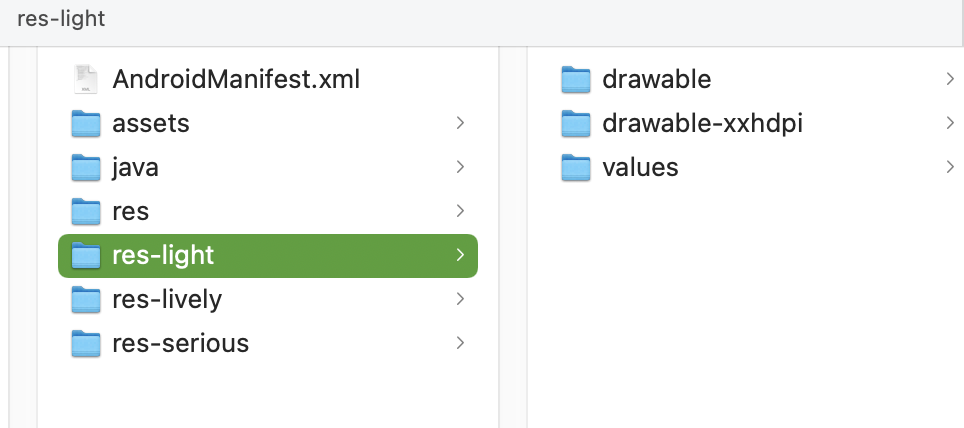
You can see the theme resources supported by any TUI component in the res folder inside that component. For example, in TUIChat/tuichat/src/main/ of the TUIChat component, you can see the built-in theme resources Light, Serious, and Lively of TUIChat in the res-light, res-serious, and res-lively folders respectively and the general resources in the res folder.
The directory structures of the theme resource folders are the same as that of the general resource folder.
Applying Themes
TUIKit uses the Light theme by default. If you want to set a theme for TUI components and your app's main project, you can call the changeTheme method of TUIThemeManager to set the current theme.
Theme attributes are defined in the src/main/res/values/tui_theme_attrs.xml file of each component, and the attribute names cannot be duplicated.
After a theme is applied successfully, you can call the TUIThemeManager.getAttrResId(context, attrID) method in Java code to obtain the resource ID based on the theme attributes and then use the resource ID obtained to obtain the real resource.
The preceding two methods can obtain only the resource IDs of themes that have been successfully applied, but cannot obtain the resource IDs of themes that have not been applied.
Modifying Built-in Themes
You can follow the steps below to customize the colors, fonts, images, and other resources of the built-in themes of TUI components:
1. Locate the specific resource of a theme to modify.
2. Replace or modify the resource.
3. Switch to the corresponding theme and check the modification effect.
For example, the TUIChat component allows you to set different bubble chat background colors for the text messages sent by yourself under different themes.
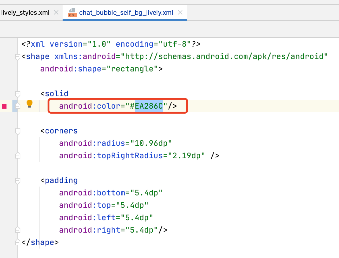
Assume that the current color value of the bubble chat background of the built-in "Lively" theme is #FF9D85 and you want to change it to #EA286C. Then, you only need to perform the following steps:
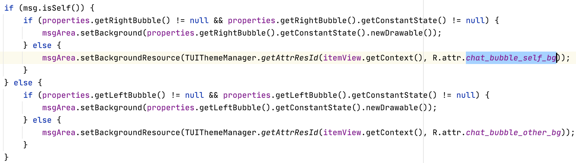
1. In the TUIChat source code, locate the R.attr.chat_bubble_self_bg attribute, which specifies the background of the bubbles of text messages sent by yourself.
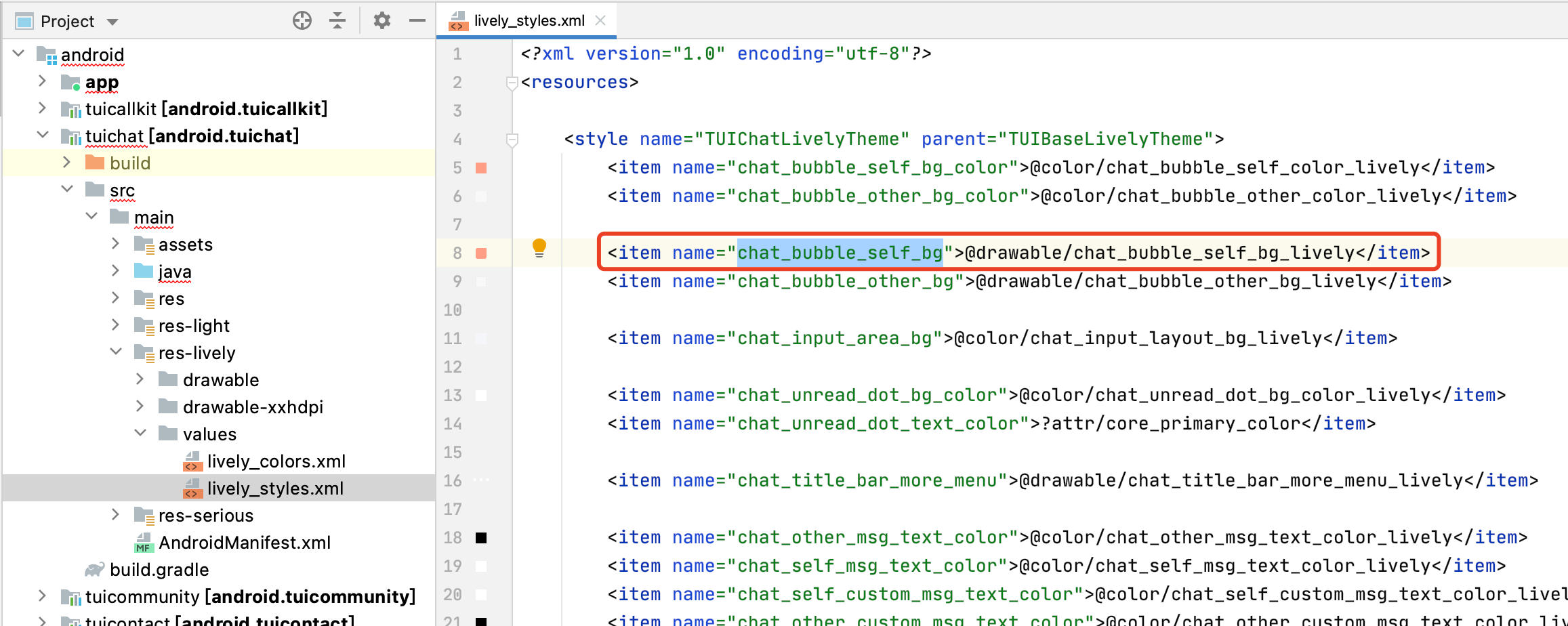
In the tuichat/src/main/res-lively/values/lively_styles.xml file, locate the @drawable/chat_bubble_self_bg_lively resource corresponding to the chat_bubble_self_bg attribute.
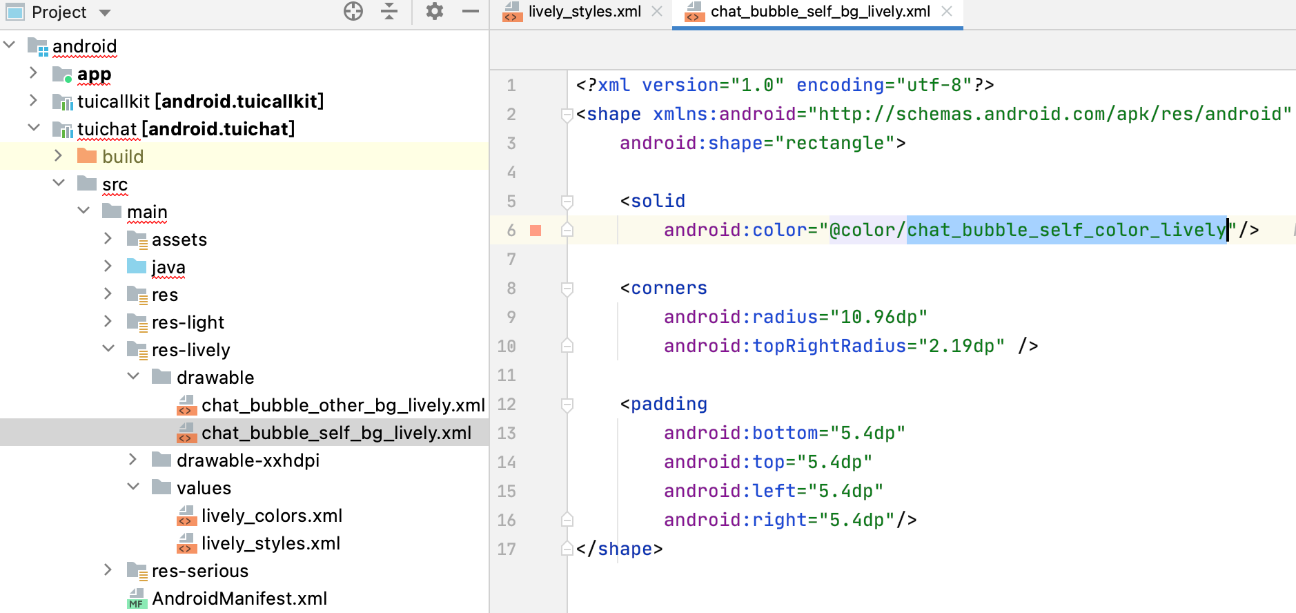
Open the corresponding resource file, and you can see that the background color is @color/chat_bubble_self_color_lively:
2. Replace the @color/chat_bubble_self_color_lively color value in the @drawable/chat_bubble_self_bg_lively resource, which is found in the previous step, with #EA286C:
3. Save the file, re-compile and install the app, and switch the current theme to the Lively theme. Then you can see the effect.
Creating a Theme
If the three built-in themes do not meet your needs, you can create a theme for a component as needed.
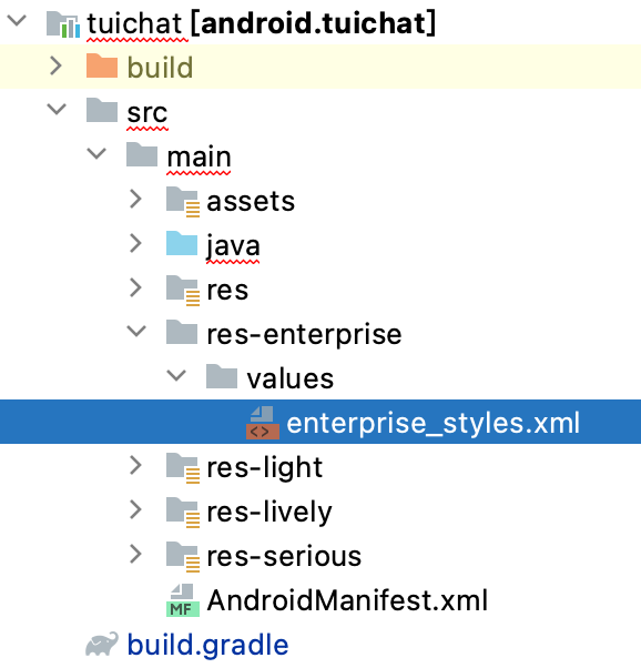
Assume that you want to create a theme called Enterprise. The steps are as follows:
1. In each component, under the same directory as other themes, create the res-enterprise directory in the resource directory.
In the res-enterprise/values/ directory, create the enterprise_styles.xml file enterprise_styles.xml, which stores the mapping between theme attributes and real resources.
Caution:
1. The res-enterprise directory must contain all the resources of the theme to be switched to. Otherwise, the app will crash due to the resource obtaining failure when switching to the Enterprise theme.
2. The theme resource name cannot be the same as the system resource name or an existing resource name. Otherwise, errors may occur at compilation and runtime. Therefore, ensure that the theme resource name is globally unique.
2. Create the theme resource mapping in the enterprise_styles.xml file:
The src/main/res/values/tui_theme_attrs.xml file of the component specifies the attributes of the theme to be switched to, and the attributes must have corresponding implementation under each theme.
The src/main/res/values/enterprise_styles.xml file stores the mapping between attributes and resources. The following is an example:
3. In the build.gradle file of each component, add configuration to specify the resource directory.
Include the resource directory in App packaging. You need to add the compilation of the resource directory to the build.gradle file of each component.
android {
...
// Theme resourcce folder
sourceSets {
main {
res.srcDirs +="src/main/res-light"
res.srcDirs +="src/main/res-lively"
res.srcDirs +="src/main/res-serious"
res.srcDirs +="src/main/res-enterprise"
}
}
}
4. Register the theme upon app start.
The Enterprise theme can be applied only after it is registered with each component and the app.
The earlier a theme is registered, the better. Generally, a theme is registered when the Application is started so that the theme can be used when Activity is created.
Caution:
Numbers 0-2 are the IDs of built-in themes. Therefore, the ID of a created theme must be equal to or greater than 3.
5. After switching to the Enterprise theme, you can see the new theme style.
Theme Styles
Basic styles
Storage location
All basic styles are stored in the TUICore component and are referenced by each component.
Basic styles provide common UI specifications, such as the preferred background color and dividing line color. Modifications on the basic styles apply to all components.
You can find all theme attributes of TUICore in the TUICore/tuicore/src/main/res/values/tui_theme_attrs.xml file. The corresponding resources of the theme attributes are placed in the tuicore/src/main/res-*** folder.
UI styles
Icons
Attribute
Description
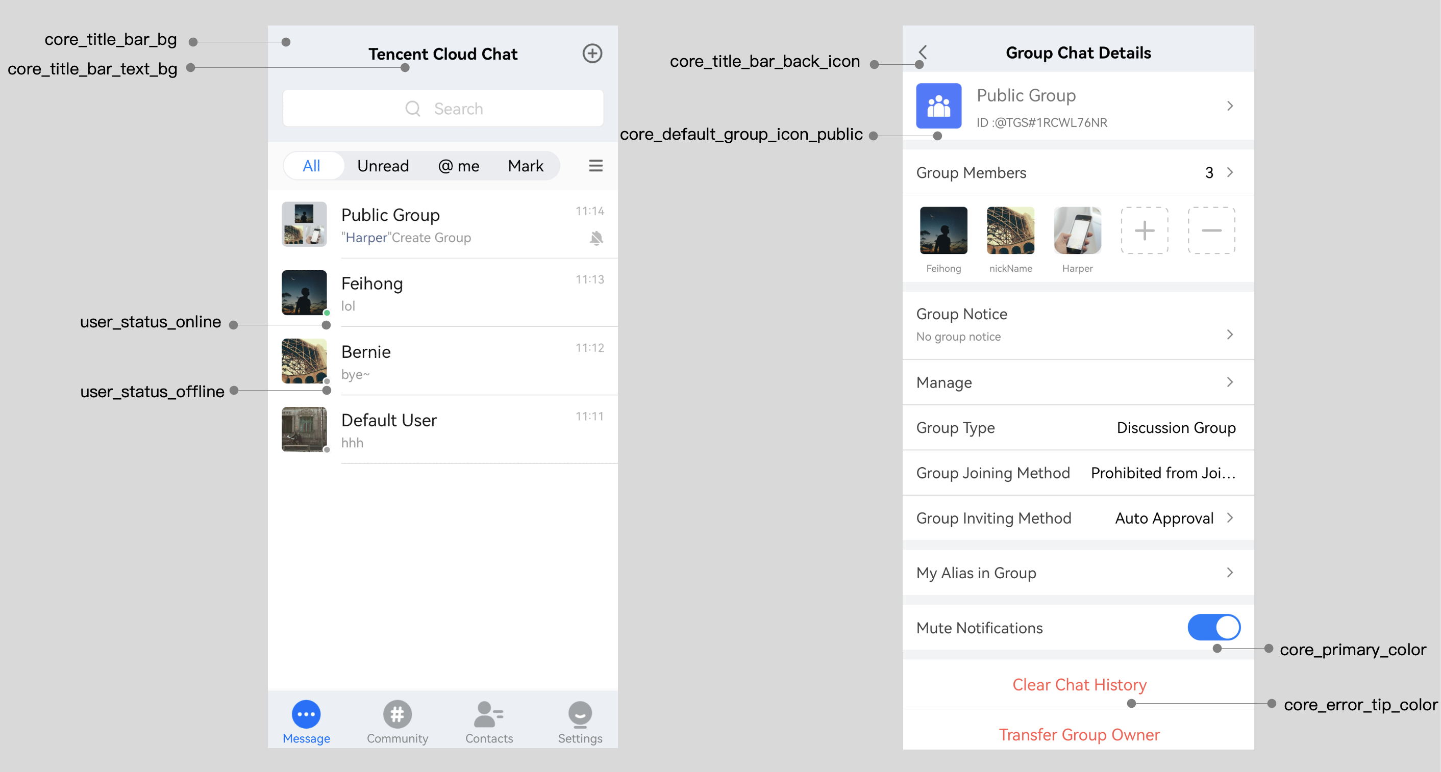
core_title_bar_back_icon
Icon of the return button on the title bar
core_default_group_icon_public
Icon of the default profile photo of a Public group
core_default_group_icon_work
Icon of the default profile photo of a Work group
core_default_group_icon_meeting
Icon of the default profile photo of a Meeting group
core_default_group_icon_community
Icon of the default profile photo of a Community group
core_default_user_icon
Icon of the default profile photo of a user
user_status_online
Online state icon of a user
user_status_offline
Offline state icon of a user
core_selected_icon
Selected icon
Background color
Attribute
Description
core_light_bg_title_text_color
Title text color on a light background
core_light_bg_primary_text_color
Primary text color on a light background
core_light_bg_secondary_text_color
Secondary text color on a light background
core_light_bg_secondary2_text_color
Next secondary text color on a light background
core_light_bg_disable_text_color
Disabled text color on a light background
core_dark_bg_primary_text_color
Primary text color on a dark background
core_bg_color
Primary background color
core_primary_color
Primary color
core_error_tip_color
Error message color
core_success_tip_color
Success message color
core_bubble_bg_color
Bubble chat background color
core_divide_color
Dividing line color
core_border_color
Border color
core_header_start_color
Title bar start color
core_header_end_color
Title bar end color
core_btn_normal_color
Normal color of a button
core_btn_pressed_color
Color of a pressed button
core_btn_disable_color
Color of a disabled button
core_title_bar_bg
Title bar background
core_title_bar_text_bg
Text background color of a title bar
Chat UI styles
Storage location
You can find all theme attributes of TUIChat in the TUIChat/tuichat/src/main/res/values/tui_theme_attrs.xml file. The corresponding resources of the theme attributes are placed in the tuichat/src/main/res-*** folder.
UI styles
Icons
Attribute
Description
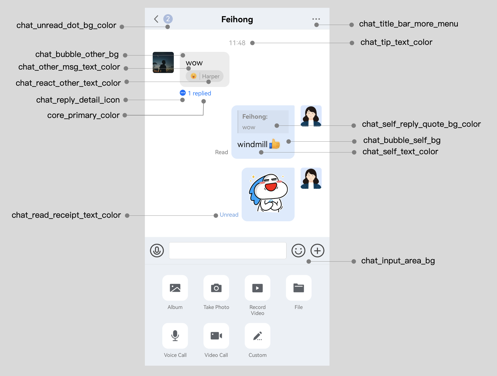
chat_title_bar_more_menu
Title bar menu icon
chat_reply_detail_icon
Reply details icon
chat_jump_recent_down_icon
Downward redirection icon of the message list
chat_jump_recent_up_icon
Upward redirection icon of the message list
Background color
Attribute
Description
chat_bubble_self_bg
Bubble background of messages sent by yourself
chat_bubble_other_bg
Bubble background of messages sent by the peer party
chat_bubble_self_bg_color
Bubble background color of messages sent by yourself
chat_bubble_other_bg_color
Bubble background color of messages sent by the peer party
chat_input_area_bg
Background color of the input interface
chat_unread_dot_bg_color
Background color of the unread icon
chat_unread_dot_text_color
Text color on the unread icon
chat_other_msg_text_color
Text color of messages sent by the peer party
chat_self_msg_text_color
Text color of messages sent by yourself
chat_self_custom_msg_text_color
Text color of messages customized by yourself
chat_other_custom_msg_text_color
Text color of messages customized by the peer party
chat_self_custom_msg_link_color
Link text color of messages customized by yourself
chat_other_custom_msg_link_color
Link text color of messages customized by the peer party
chat_tip_text_color
Tip text color
chat_self_reply_quote_bg_color
Background color of messages replied and quoted by yourself
chat_other_reply_quote_bg_color
Background color of messages replied and quoted by the peer party
chat_self_reply_line_bg_color
Background color of the vertical bar of messages replied by yourself
chat_other_reply_line_bg_color
Background color of the vertical bar of messages replied by the peer party
chat_self_reply_quote_text_color
Original message text color of messages replied by yourself
chat_other_reply_quote_text_color
Original message text color of messages replied by the peer party
chat_self_reply_text_color
Text color of messages replied by yourself
chat_other_reply_text_color
Text color of messages replied by the peer party
chat_read_receipt_text_color
Text color of read receipts
chat_react_text_color
Text color of emojis replied by yourself
chat_react_other_text_color
Text color of emojis replied by the peer party
chat_pressed_bg_color
Background color of a tapped and held-on button in a pop-up window
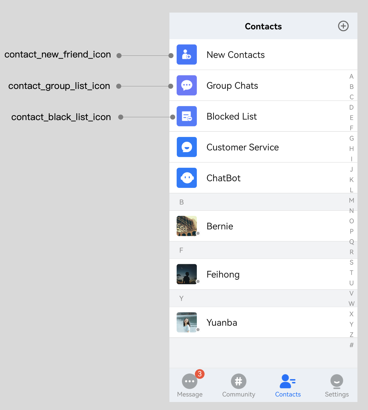
Contacts UI styles
Storage location
You can find all theme attributes of TUIContact in the TUIContact/tuicontact/src/main/res/values/tui_theme_attrs.xml file. The corresponding resources of the theme attributes are placed in the tuicontact/src/main/res-*** folder.