Release Notes
Announcements
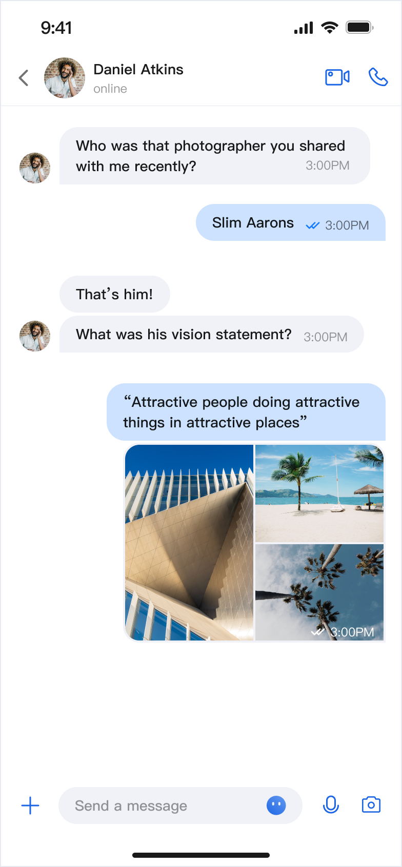
Chat Message List | Message Long-Press Menu |
 |  |
Method | Parameters | Description |
init | conversationID: String | Initializes the component and sets the conversation ID. |
| config: MessageListConfigProtocol & MessageActionConfigProtocol = ChatMessageListConfig() | Initializes the component and sets the message list style. |
| locateMessage: MessageInfo? = nil | Initializes the component and sets the located message. Typically used when navigating from the message search results page to the message page and locating the target message. |
| onUserClick: ((String) -> Void)? = nil | Initializes the component and sets the event handler for clicking on the user avatar. |
| customActions: [MessageCustomAction] = [] | Initializes the component and sets custom message menu options. |
import AtomicXimport SwiftUIstruct ContentView: View {var body: some View {MessageList(conversationID: "conversation_123",onUserClick: { userID in// Handle user avatar click event})}}
MessageListConfigProtocol protocol to define a custom style:struct MyCustomConfig: MessageListConfigProtocol & MessageActionConfigProtocol {let alignment: Int = 0let isShowTimeMessage: Bool = truelet isShowLeftAvatar: Bool = truelet isShowLeftNickname: Bool = truelet isShowRightAvatar: Bool = truelet isShowRightNickname: Bool = truelet isSupportCopy: Bool = false// ... other properties}// Apply custom styleMessageList(conversationID: "conversation_123",config: MyCustomConfig())
MessageListConfigProtocol Property Descriptions:Property | Type | Description | Remarks |
alignment | Int | Message alignment | 1: Left align. 2: Right align. 3: Both sides align. |
isShowTimeMessage | Bool | Show time message | Controls whether to display message timestamps. |
isShowLeftAvatar | Bool | Show left avatar | Controls whether to display sender avatar for received messages. |
isShowLeftNickname | Bool | Show left nickname | Controls whether to display sender nickname for received messages. |
isShowRightAvatar | Bool | Show right avatar | Controls whether to display your own avatar for sent messages. |
isShowRightNickname | Bool | Show right nickname | Controls whether to display your own nickname for sent messages. |
isShowTimeInBubble | Bool | Show time inside bubble | Controls whether the timestamp is displayed inside the message bubble. |
cellSpacing | CGFloat | Message spacing | Controls the spacing between adjacent messages. |
isShowSystemMessage | Bool | Show system notification | Controls whether to display system notification messages. |
isShowUnsupportMessage | Bool | Show unsupported messages | Controls whether to display unsupported message types. |
horizontalPadding | CGFloat | Horizontal padding | Controls the left and right padding of the message list. |
avatarSpacing | CGFloat | Avatar spacing | Controls the spacing between the avatar and message content. |
MessageActionConfigProtocol Property Descriptions:Property Name | Type | Description |
isSupportCopy | Bool | Whether to enable copy function in the message action menu: true: Display the copy action.false: Do not display the copy action. |
isSupportDelete | Bool | Whether to enable the delete function in the message action menu: true: Display the delete action.false: Do not display the delete action. |
isSupportRecall | Bool | Whether to enable the recall function in the message action menu: true: Display the recall action.false: Do not display the recall action. |
isSupportCopy, isSupportDelete, and isSupportRecall in the config when initializing MessageList to control which actions are shown:struct CustomMessageView: View {var body: some View {MessageList(conversationID: "conversation_123",config: ChatMessageListConfig(isSupportCopy: false))}}
customActions when initializing MessageList. Your custom actions will be appended to the default action list:struct CustomMessageView: View {var body: some View {MessageList(conversationID: "conversation_123",// Add custom actioncustomActions: [MessageCustomAction(title: "Share", iconName: "forward_icon_figma", systemIconFallback: "square.and.arrow.up") { _ inprint("share Message")}])}}
AppBuilderConfig:// Configure at app launchAppBuilderConfig.shared.messageActionList = [.copy, // Enable copy.delete, // Enable delete.recall // Enable recall]// Then initialize MessageList; all MessageList instances will use this configurationMessageList(conversationID: "conversation_123")
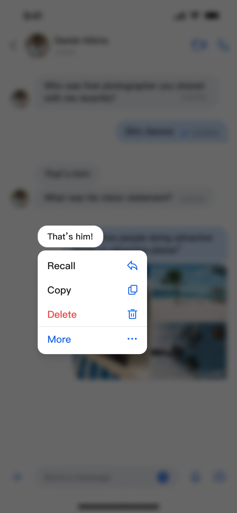
Message List Actions (Default Options) | Message List Actions (Hide Copy Option) | Message List Actions (Add Share Option) |
 | 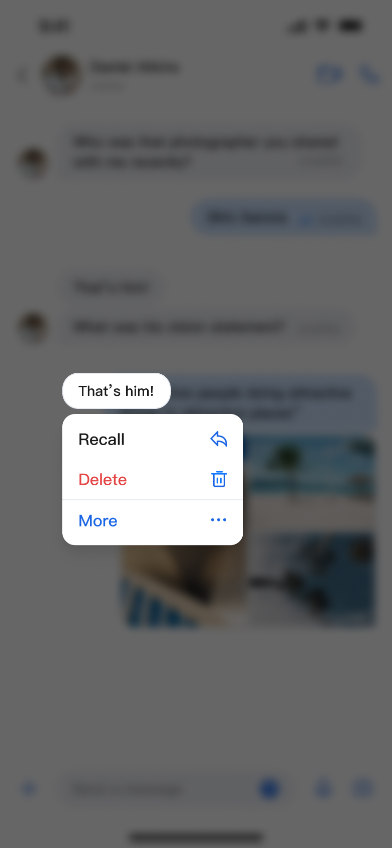 |  |
Was this page helpful?
You can also Contact sales or Submit a Ticket for help.
Help us improve! Rate your documentation experience in 5 mins.
Feedback