Web H5(React)
Unduh
Mode fokus
Ukuran font
TUIKit is a React component library built on the Tencent Cloud Chat SDK. It offers a set of essential UI components for conversations, chat, groups, and more. This guide walks you through integrating TUIKit and enabling its core features.
AI Assistant Usage Instructions:
Chat Knowledge Query
Skill provides the Chat Knowledge Query feature. You can use Skill to directly query information about the SDK, UIKit, server-side API, product billing, and more within your IDE. Try the AI Query Assistant now.
AI Integration
MCP introduces a new AI integration method. Describe your requirements, and it will automatically generate integration code, significantly boosting development efficiency. Try the AI Integration Assistant now.
Key Concepts
chat-uikit-react consists of core UI components such as ConversationListH5, MessageListH5, ChatHeaderH5, MessageInputH5, ChatSettingH5, SearchH5, and ContactH5. Each component is responsible for displaying specific content.
1. ConversationListH5 displays the conversation list.
2. Chat serves as the conversation container.
3. MessageListH5 shows the conversation message list.
4. ChatHeaderH5 displays conversation header information.
5. MessageInputH5 provides the message input box.
6. ChatSettingH5 manages C2C Chat and Group features.
7. SearchH5 enables Cloud Search.
8. ContactH5 displays the contact list.
Prerequisites
Node.js v18 or later. The current LTS version is recommended.
React^18.2 or React^19.0.0
TypeScript@^5.0.0
Project Setup
Use Vite to create a new React project named chat-integration-react-h5. Follow the prompts to complete the project initialization.
Once the project starts successfully, remove the sample files generated by the scaffolding (default styles in src/App.css, src/index.css, src/assets, icons in public, etc.), keeping only src/main.tsx and index.html.
Note:
1. It is recommended to use npm for installation. npm will automatically download the required peerDependencies.
2.
npm create vite@latest uses the latest version of Vite. The latest Vite may conflict with older versions of Node.js. Please verify your environment configuration.npm create vite@latest◇ Project name:│ chat-integration-react-h5│◇ Select a framework:│ React│◇ Select a variant:│ TypeScript + React Compiler│◇ Use ESLint instead of Oxlint?│ Yes (ESLint)│◇ Install with npm and start now?│ Yes
Installation and Setup
Step 1. Install Dependencies
npm install @tencentcloud/chat-uikit-react @tencentcloud/uikit-base-component-react @trtc/calls-uikit-react
Step 2. Import Components
1. Configure mobile viewport
For optimal mobile experience, update the viewport meta tag in index.html at the project root as follows. This ensures full-screen coverage, disables zoom, and provides an app-like feel.
<!DOCTYPE html><html lang="en-US"><head><meta charset="UTF-8" /><!-- H5 viewport: covers the notch, locks zoom for an app-like experience. --><metaname="viewport"content="width=device-width, initial-scale=1, maximum-scale=1, user-scalable=no, viewport-fit=cover"/><title>Chat UIKit H5 Quickstart (React)</title></head><body><div id="root"></div><script type="module" src="/src/main.tsx"></script></body></html>
2. Configure global baseline styles
Create src/styles.css
/* ------- Mobile baseline ------- */* {box-sizing: border-box;}html,body,#root {width: 100%;height: 100%;margin: 0;}body {/* dvh fallback handles the iOS Safari address bar. */min-height: 100vh;min-height: 100dvh;font-family: -apple-system, BlinkMacSystemFont, 'Segoe UI', Roboto, sans-serif;color: #1f2329;background: #f5f6f8;/* Remove the gray tap flash on mobile webkit. */-webkit-tap-highlight-color: transparent;}button {font: inherit;cursor: pointer;}/* 16px keeps iOS from auto-zooming when an input is focused. */input {font-size: 16px;}
3. Configure application entry
Add the following to src/main.tsx
import { createRoot } from 'react-dom/client';import App from './App';import './styles.css';createRoot(document.getElementById('root')!).render(<App />,);
4. Configure homepage
Add the following to src/App.tsx
import { useState } from 'react';import { LoginStatus, UIKitProvider, useLoginState } from '@tencentcloud/chat-uikit-react';import { TUICallKit } from '@trtc/calls-uikit-react';import { LoginView } from './LoginView';import { ChatLayout } from './ChatLayout';import { languageResources } from './i18n';function App() {const { status } = useLoginState();const isLogined = status === LoginStatus.SUCCESS;// `language` controls both UIKit strings and demo strings.const [language, setLanguage] = useState('en-US');return (<UIKitProvider theme="light" language={language} languageResources={languageResources}>{isLogined? (<><ChatLayout onChangeLanguage={setLanguage} /><div className="call-kit"><TUICallKit /></div></>): <LoginView language={language} onChangeLanguage={setLanguage} />}</UIKitProvider>);}export default App;
5. Configure login page and main chat page
Create src/LoginView.tsx and src/LoginView.css and add the following code:
import { useState, type SubmitEvent } from 'react';import { useLoginState, useUIKit } from '@tencentcloud/chat-uikit-react';import './LoginView.css';// Languages shown in the switcher. Labels stay in their own language so users// can always recognize their option regardless of the current UI language.const LANGUAGES = [{ value: 'en-US', label: 'English' },{ value: 'ko-KR', label: '한국인' },];interface LoginViewProps {language: string;onChangeLanguage: (language: string) => void;}export function LoginView({ language, onChangeLanguage }: LoginViewProps) {const { login } = useLoginState();const { t } = useUIKit();const [sdkAppId, setSdkAppId] = useState<number>();const [userId, setUserId] = useState('');const [userSig, setUserSig] = useState('');const [loading, setLoading] = useState(false);const [error, setError] = useState('');const handleSubmit = async (e: SubmitEvent) => {e.preventDefault();setError('');if (!sdkAppId || !userId || !userSig) {setError(t('demo.error.required'));return;}setLoading(true);try {await login({ SDKAppID: Number(sdkAppId), userID: userId, userSig });// On success, the login gate in App.tsx switches to ChatLayout automatically.} catch (err) {setError(err instanceof Error ? err.message : t('demo.error.loginFailed'));} finally {setLoading(false);}};return (<div className="login"><div className="login__lang" role="group" aria-label="Language">{LANGUAGES.map(item => (<buttonkey={item.value}type="button"className={item.value === language ? 'login__lang-btn login__lang-btn--active' : 'login__lang-btn'}onClick={() => onChangeLanguage(item.value)}>{item.label}</button>))}</div><form className="login__card" onSubmit={handleSubmit}><h1 className="login__title">{t('demo.appTitle')}</h1><label className="login__field"><span>{t('demo.field.sdkAppId')}</span><inputtype="number"placeholder={t('demo.placeholder.sdkAppId')}value={sdkAppId || ''}onChange={e => setSdkAppId(Number(e.target.value))}/></label><label className="login__field"><span>{t('demo.field.userId')}</span><inputtype="text"placeholder={t('demo.placeholder.userId')}value={userId}onChange={e => setUserId(e.target.value)}/></label><label className="login__field"><span>{t('demo.field.userSig')}</span><inputtype="text"placeholder={t('demo.placeholder.userSig')}value={userSig}onChange={e => setUserSig(e.target.value)}/></label>{error && <p className="login__error">{error}</p>}<button className="login__submit" type="submit" disabled={loading}>{loading ? t('demo.loggingIn') : t('demo.login')}</button></form></div>);}
.login {position: relative;display: flex;width: 100%;height: 100dvh;align-items: center;justify-content: center;padding: max(20px, env(safe-area-inset-top)) 20px max(20px, env(safe-area-inset-bottom));/* Soft natural-white backdrop with a subtle top-down gradient for depth. */background: linear-gradient(180deg, #ffffff 0%, #f3f5f8 100%);}/* Segmented language switcher, pinned to the top-right. */.login__lang {position: absolute;top: calc(16px + env(safe-area-inset-top));right: 16px;display: inline-flex;padding: 3px;border-radius: 999px;background: #eef0f3;}.login__lang-btn {min-width: 56px;padding: 6px 12px;border: 0;border-radius: 999px;background: transparent;color: #6b7280;font-size: 13px;font-weight: 500;transition: background 0.2s, color 0.2s;}.login__lang-btn--active {background: #fff;color: #1f2329;box-shadow: 0 1px 2px rgb(16 24 40 / 10%);}.login__card {display: flex;width: 100%;max-width: 360px;flex-direction: column;gap: 16px;padding: 28px 24px;border-radius: 16px;background: #fff;/* Layered, low-opacity shadow for a soft, natural lift off the white bg. */border: 1px solid rgb(16 24 40 / 4%);box-shadow:0 1px 2px rgb(16 24 40 / 4%),0 12px 32px rgb(16 24 40 / 8%);}.login__title {margin: 0 0 4px;font-size: 20px;font-weight: 600;text-align: center;}.login__field {display: flex;flex-direction: column;gap: 6px;font-size: 13px;color: #6b7280;}.login__field input {padding: 12px 14px;border: 1px solid #e8eaed;border-radius: 10px;outline: none;appearance: none;}.login__field input:focus {border-color: #1464ff;}.login__error {margin: 0;color: #e34d59;font-size: 13px;}.login__submit {padding: 13px;border: 0;border-radius: 10px;background: #1464ff;color: #fff;font-size: 16px;font-weight: 600;}.login__submit:disabled {opacity: 0.6;}
Create src/ChatLayout.tsx and src/ChatLayout.css and add the following code:
import { useEffect, useRef, useState, type ReactNode } from 'react';import {Chat,ChatHeaderH5,ChatSettingH5,ContactInfoH5,ContactListH5,ConversationListH5,MessageInputH5,MessageListH5,SearchH5,VariantType,useChatContext,useLoginState,useUIKit,} from '@tencentcloud/chat-uikit-react';import { IconBulletpoint, IconSearch } from '@tencentcloud/uikit-base-component-react';import './ChatLayout.css';type MobileView = 'conversations' | 'chat' | 'contacts' | 'contactInfo' | 'search' | 'setting';interface ChatLayoutProps {onChangeLanguage: (language: string) => void;}/** A full-screen view; only the active one is visible (kept mounted for state). */function Screen({ active, children }: { active: boolean; children: ReactNode }) {return (<section className="screen" style={{ zIndex: active ? 1 : 0, visibility: active ? 'visible' : 'hidden' }}>{children}</section>);}export function ChatLayout({ onChangeLanguage }: ChatLayoutProps) {const { activeConversationID, activeConversation, sendMessage, setActiveConversation } = useChatContext();const { loginUserInfo, logout } = useLoginState();const { t, language } = useUIKit();const [activeView, setActiveView] = useState<MobileView>('conversations');const [previousView, setPreviousView] = useState<MobileView>('chat');const defaultOpenConversationID = 'C2Cadministrator';const activeViewRef = useRef(activeView);const prevConversationIDRef = useRef(activeConversationID);const sendWelcomeMessageOnce = useRef(false);useEffect(() => {activeViewRef.current = activeView;}, [activeView]);useEffect(() => {const changed = prevConversationIDRef.current !== activeConversationID;prevConversationIDRef.current = activeConversationID;if (changed && activeConversationID && activeViewRef.current === 'conversations') {setActiveView('chat');}}, [activeConversationID]);useEffect(() => {const timer = setTimeout(() => {if (activeConversation?.conversationID === defaultOpenConversationID && !sendWelcomeMessageOnce.current) {sendMessage({type: 'textMessage',text: `Welcome to the Chat React mobile web application demo!You can experience the core IM functions in the following order:1. Send a text message in the input box.2. The toolbar on the input box supports extended functions such as voice calls, video calls, sending images, videos, and files.3. If you want to add friends, you can go to the contacts page and click "Add Friends/Group Chat".`,});sendWelcomeMessageOnce.current = true;}}, 1000);return () => clearTimeout(timer);// eslint-disable-next-line react-hooks/exhaustive-deps}, [activeConversation?.conversationID]);const openFromChat = (view: 'search' | 'setting') => {setPreviousView(activeView);setActiveView(view);};const handleChatBack = () => {setActiveConversation(undefined);setActiveView('conversations');};return (<div className="app-shell"><Screen active={activeView === 'conversations'}><header className="topbar"><span className="topbar__title">{t('demo.chats')}{loginUserInfo?.userId ? ` · ${loginUserInfo.userId}` : ''}</span><div className="chat-pane__actions"><buttonclassName="topbar__text-btn"type="button"onClick={() => onChangeLanguage(language === 'zh-CN' ? 'en-US' : 'ko-KR')}>{language === 'en-US' ? 'EN' : 'KR'}</button><button className="topbar__text-btn" type="button" onClick={logout}>{t('demo.logout')}</button></div></header><div className="screen__body"><ConversationListH5style={{ height: '100%' }}onSelectConversation={() => setActiveView('chat')}/></div><nav className="tabbar"><button className="tabbar__item tabbar__item--active" type="button">{t('demo.chats')}</button><button className="tabbar__item" type="button" onClick={() => setActiveView('contacts')}>{t('demo.contacts')}</button></nav></Screen><Screen active={activeView === 'contacts'}><header className="topbar"><span className="topbar__title">{t('demo.contacts')}</span></header><div className="screen__body"><ContactListH5 onContactItemClick={() => setActiveView('contactInfo')} /></div><nav className="tabbar"><button className="tabbar__item" type="button" onClick={() => setActiveView('conversations')}>{t('demo.chats')}</button><button className="tabbar__item tabbar__item--active" type="button">{t('demo.contacts')}</button></nav></Screen><Screen active={activeView === 'contactInfo'}><div className="screen__body screen__body--surface"><ContactInfoH5onClose={() => setActiveView('contacts')}onSendMessage={() => setActiveView('chat')}onEnterGroup={() => setActiveView('chat')}/></div></Screen><Screen active={activeView === 'chat'}><Chat className="chat-pane"><ChatHeaderH5className="chat-pane__header"enableUserStatusonBack={handleChatBack}ChatHeaderRight={(<div className="chat-pane__actions"><button className="icon-btn" type="button" aria-label={t('demo.search')} onClick={() => openFromChat('search')}><IconSearch size="20px" /></button><button className="icon-btn" type="button" aria-label={t('demo.setting')} onClick={() => openFromChat('setting')}><IconBulletpoint size="20px" /></button></div>)}/><MessageListH5 /><MessageInputH5 /></Chat></Screen><Screen active={activeView === 'search'}><div className="screen__body"><SearchH5variant={VariantType.EMBEDDED}onBack={() => setActiveView(previousView)}onResultItemClick={(_item, type) => {if (type === 'chat_message') {setActiveView('chat');}}}/></div></Screen><Screen active={activeView === 'setting'}><div className="screen__body screen__body--surface"><ChatSettingH5 onBack={() => setActiveView('chat')} /></div></Screen></div>);}
/* ------- Shell + stacked screens ------- */.app-shell {position: relative;width: 100vw;height: 100vh;height: 100dvh;overflow: hidden;background: #fff;}/* Each full-screen view is stacked; only the active one is visible. */.screen {position: absolute;inset: 0;display: flex;flex-direction: column;background: #fff;}.screen__body {flex: 1;min-height: 0;overflow: hidden;}.screen__body--surface {overflow: auto;background: #f5f6f8;}/* ------- Top bar ------- */.topbar {display: flex;flex: 0 0 auto;min-height: 52px;align-items: center;justify-content: space-between;padding: calc(8px + env(safe-area-inset-top)) 16px 8px;border-bottom: 1px solid #e8eaed;}.topbar__title {overflow: hidden;font-size: 17px;font-weight: 600;text-overflow: ellipsis;white-space: nowrap;}.topbar__text-btn {border: 0;background: transparent;color: #1464ff;font-size: 14px;font-weight: 500;}/* ------- Tab bar ------- */.tabbar {display: flex;flex: 0 0 auto;gap: 8px;padding: 6px 12px calc(6px + env(safe-area-inset-bottom));border-top: 1px solid #e8eaed;}.tabbar__item {flex: 1;min-height: 40px;border: 0;border-radius: 12px;background: transparent;color: #6b7280;font-size: 14px;font-weight: 600;}.tabbar__item--active {background: #eef4ff;color: #1464ff;}/* ------- Chat pane ------- ** The library's <Chat> root is already `display:flex; flex-direction:column;* height:100%`, so it fills the screen on its own. The demo only arranges the* three slotted children: header (fixed) / message list (grow + scroll) /* input (fixed). `min-height:0` on the list breaks the flexbox min-height* chain so it scrolls instead of stretching the pane.*/.chat-pane__header {flex: 0 0 auto;padding-top: env(safe-area-inset-top);border-bottom: 1px solid #e8eaed;}.chat-pane > :nth-child(2) {flex: 1;min-height: 0;}.chat-pane > :last-child {flex: 0 0 auto;padding-bottom: env(safe-area-inset-bottom);border-top: 1px solid #e8eaed;}.chat-pane__actions {display: flex;align-items: center;gap: 4px;}.icon-btn {display: inline-flex;width: 36px;height: 36px;align-items: center;justify-content: center;border: 0;border-radius: 10px;background: transparent;color: #1f2329;}.icon-btn:active {background: #eef0f3;}
6. Configure internationalization content
Create src/i18n.ts and add the following:
// Translations for this demo's OWN strings (the chat components are translated// by the UIKit itself via the `language` prop). Keys are namespaced under// `demo.` so they never collide with the library's i18next resources.//// `languageResources` is passed to <UIKitProvider>; read the strings anywhere// with `const { t } = useUIKit()` and `t('demo.chats')`.// Mirror of the library's ILanguageResource (not re-exported publicly).type TranslationTree = { [key: string]: string | TranslationTree };interface LanguageResource {lng: string;translation: TranslationTree;}const en = {demo: {appTitle: 'Chat UIKit H5',field: { sdkAppId: 'SDKAppID', userId: 'UserID', userSig: 'UserSig' },placeholder: {sdkAppId: 'Your SDKAppID',userId: 'e.g. user_001',userSig: 'Test UserSig from IM console',},error: {required: 'Please fill in SDKAppID, UserID and UserSig.',loginFailed: 'Login failed, please check your credentials.',},login: 'Login',loggingIn: 'Logging in…',chats: 'Chats',contacts: 'Contacts',logout: 'Logout',search: 'Search',setting: 'Setting',},};const kr = {demo: {appTitle: 'Chat UIKit H5',field: { sdkAppId: 'SDKAppID', userId: '사용자 ID', userSig: '사용자 서명' },placeholder: {sdkAppId: 'SDKAppID를 입력하세요',userId: '예: user_001',userSig: '콘솔에서 발급한 테스트 UserSig',},error: {required: 'SDKAppID, 사용자 ID, 사용자 서명을 입력하세요.',loginFailed: '로그인 실패, 로그인 정보를 확인하세요.',},login: '로그인',loggingIn: '로그인 중…',chats: '채팅',contacts: '연락처',logout: '로그아웃',search: '검색',setting: '설정',},};export const languageResources: LanguageResource[] = [{ lng: 'en-US', translation: en },{ lng: 'ko-KR', translation: kr },];
Step 3. Obtain SDKAppID, userID, and userSig
When logging in, you need to fill in the relevant authentication information, as shown in the table below:
Parameter | Type | Note |
userID | String | Unique identifier of the user, defined by you, it is allowed to contain only upper and lower case letters (a-z, A-Z), numbers (0-9), underscores, and hyphens. |
SDKAppID | Number | |
SDKSecretKey | String | |
userSig | String | A security protection signature used for user login authentication to confirm the user's identity and prevent malicious attackers from stealing your cloud service usage rights. |
Explanation of UserSig:
Development environment: If you are running a demo locally and developing or debugging, you can use the
genTestUserSig (Refer to Step 3.2) function in the debug file to generate a 'userSig'. In this method, SDKSecretKey is vulnerable to decompilation and reverse engineering. Once your key is leaked, attackers can steal your Tencent Cloud traffic.Production environment: If your project is going live, please use the Server-side Generation of UserSig method.
1. Log in to Chat Console .
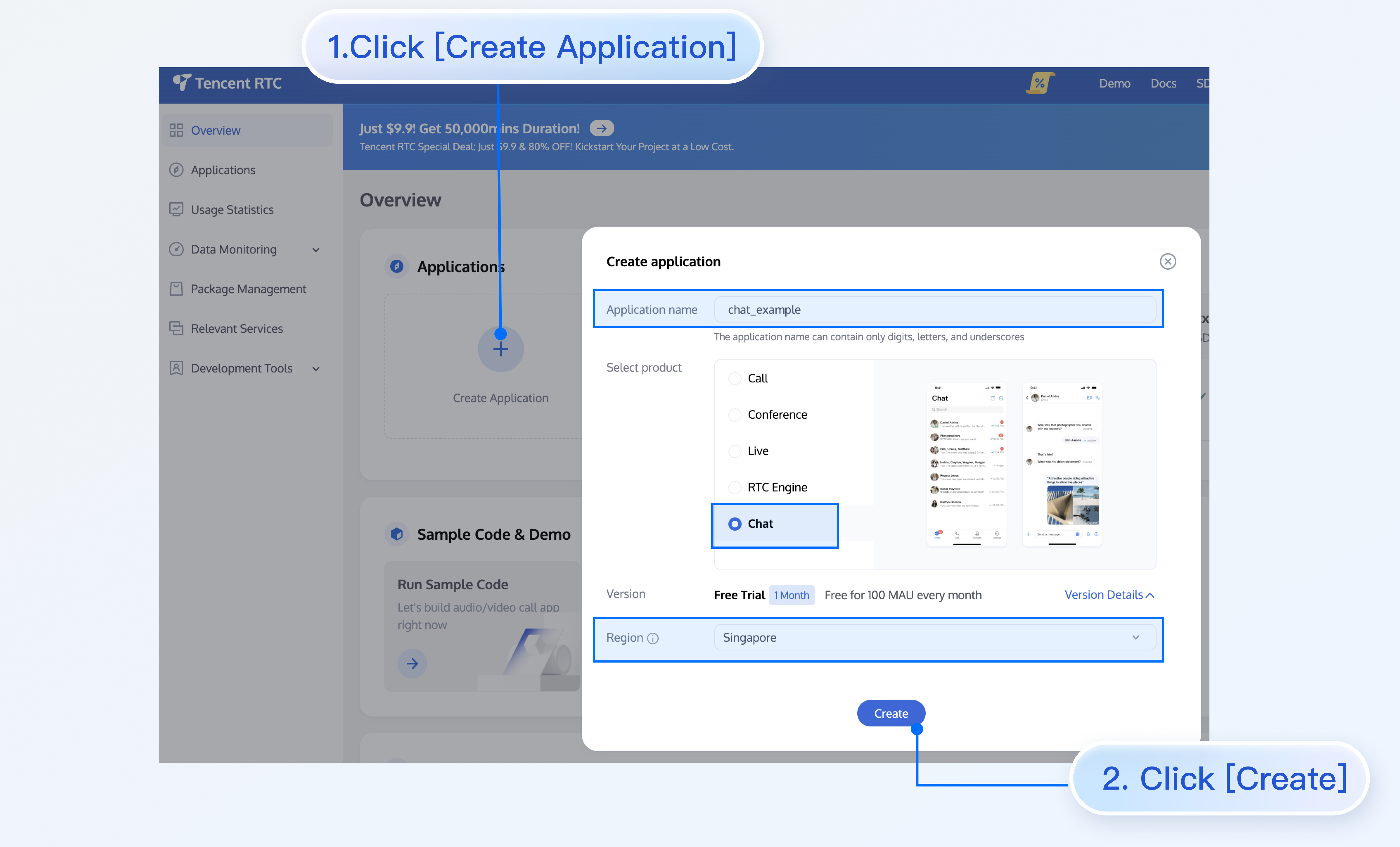
2. Click Create Application, enter your application name, then click Create.
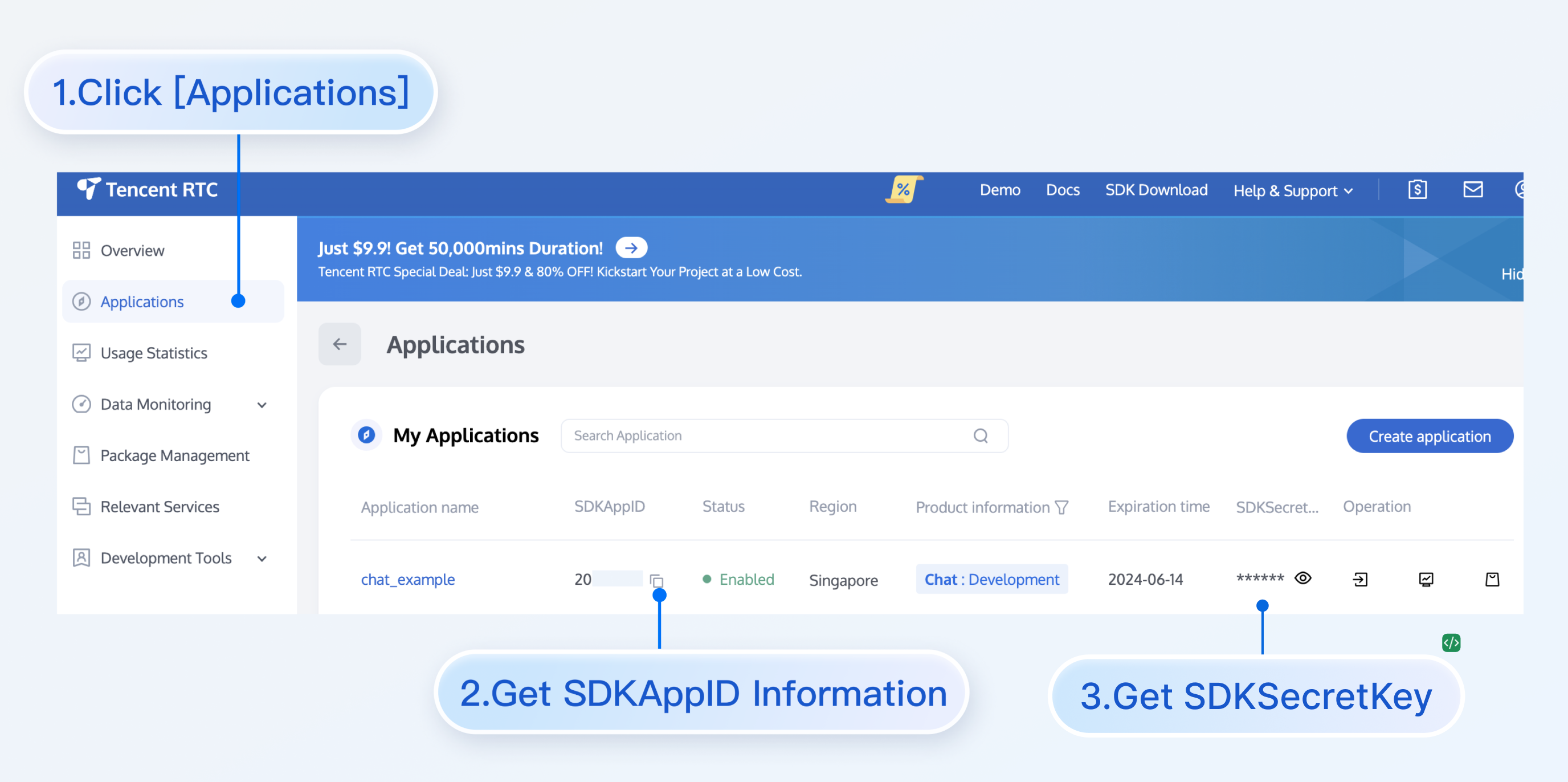
3. After creation, you can view the Application Status, service version, SDKAppID, creation time, Tag, and expiration time of the new application on the console overview page.
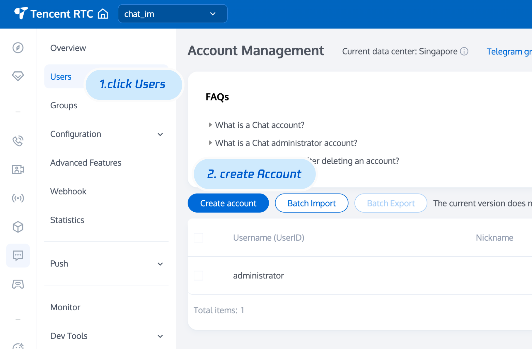
4. Go to the user management page, create 2–3 test accounts for experience in C2C chat and group chat.
5. UserSig info. Click IM console > development tool > UserSig tool, fill in the created userID, and just generate userSig.
Run and Test
After entering your authentication information, run the project to start testing.
npm run dev
Note:
userID and userSig are paired one-to-one. For details, see Generating UserSig (User Authentication).
If the project fails to start, verify that your development environment meets the requirements.
Integrate More Advanced Features
Audio/Video Calls
Note:
TUICallKit is a UI component for audio/video calls from Tencent Cloud. Integrate this component to add audio/video call functionality to your chat app with minimal code. For more details, see: Audio/Video Calls - Enable Service.
TUICallKit has been integrated in the above process. If you do not need the audio and video call function, you can refer to the following process to remove the integrated code.
1. Install the
@trtc/calls-uikit-react dependencynpm install @trtc/calls-uikit-react
2. Import
TUICallKit from @trtc/calls-uikit-react and mount it to a DOM node.Add the following code to
src/App.tsx:import { useState } from 'react';import { LoginStatus, UIKitProvider, useLoginState } from '@tencentcloud/chat-uikit-react';import { TUICallKit } from '@trtc/calls-uikit-react';import { LoginView } from './LoginView';import { ChatLayout } from './ChatLayout';import { languageResources } from './i18n';function App() {const { status } = useLoginState();const isLogined = status === LoginStatus.SUCCESS;// `language` controls both UIKit strings and demo strings.const [language, setLanguage] = useState('en-US');return (<UIKitProvider theme="light" language={language} languageResources={languageResources}>{isLogined? (<><ChatLayout onChangeLanguage={setLanguage} />{/* Audio/video calls. Mount once at the app root; it shares the chatlogin session, so no extra login is needed. The call buttons arealready built into the chat header. */}<div className="call-kit"><TUICallKit /></div></>): <LoginView language={language} onChangeLanguage={setLanguage} />}</UIKitProvider>);}export default App;
3. If you do not need to integrate audio and video calling, you can remove the audio and video calling capability by removing
<TUICallKit /> and modifying the actions property of the MessageInputH5 component.<MessageInputH5 actions={['EmojiPicker', 'ImagePicker', 'VideoPicker', 'FilePicker']} />
Cloud Search
Note:
Search is essential for scenarios like customer service, social, online education, healthcare, OA, etc. It helps users quickly find groups, users, and messages, improving product experience and engagement.
Due to the limitations of Web platform local storage, cannot support local search. To meet search requirements, Cloud Search is provided. Cloud Search supports global and conversation search, including groups, users, and messages.
This feature is a value-added service. You need to purchase the Cloud Search plugin. Please click Purchase.
Cloud Search is integrated by default in "Step 2". To disable Cloud Search, follow these steps:
1. Comment out the
ChatHeader property ChatHeaderRight and related code for the conversation search sidebar<ChatHeaderH5className="chat-pane__header"enableUserStatusonBack={handleChatBack}ChatHeaderRight={(<div className="chat-pane__actions">{/* <button className="icon-btn" type="button" aria-label={t('demo.search')} onClick={() => openFromChat('search')}><IconSearch size="20px" /></button> */}<button className="icon-btn" type="button" aria-label={t('demo.setting')} onClick={() => openFromChat('setting')}><IconBulletpoint size="20px" /></button></div>)}/>
2. Disable Cloud Search on the
ConversationList component<ConversationListH5 enableSearch={false} enableCreate={false} />
FAQs
What is UserSig?
UserSig is the password for user authentication in Chat. It is an encrypted string generated from UserID and other information.
How do I generate UserSig?
To issue UserSig, integrate the UserSig calculation code into your server and provide an API for your project. When UserSig is needed, your project requests the business server for a dynamic UserSig. For details, see Server-side UserSig Generation.
Note:
The sample code in this guide uses UserSig obtained from the Chat Console. This method is only for local feature debugging. For proper UserSig issuance, see Server-side UserSig Generation.
Is React 17 supported?
React v17.x is not supported. Only React v18.2+ and above are supported.
Can I use third-party component libraries, such as Ant Design?
You can use other component libraries for glue code between core components, as shown in the sample code. For example, you can wrap
ChatSettingH5 as a full-screen drawer component. However, internal components within core components cannot be modified at this time.import { Drawer } from 'antd';const [isChatSettingShow, setIsChatSettingShow] = useState(false);function onChatSettingClose() {setIsChatSettingShow(false);}<Drawertitle="Settings"open={isChatSettingShow}onClose={onChatSettingClose}><ChatSettingH5 /></Drawer>
Using Emoji Packs
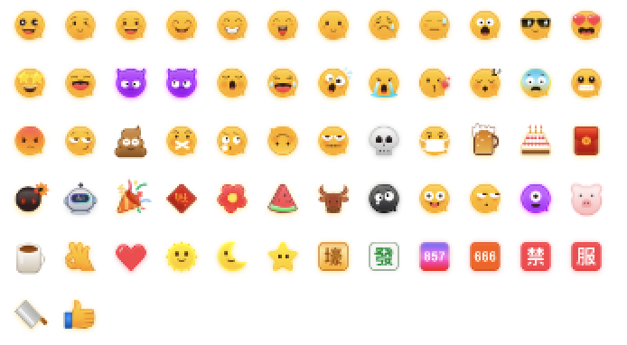
To respect copyright, the IM Demo/TUIKit project does not include large emoji element sprites by default. Before launching commercially, please replace them with emoji packs you designed or have copyright for. The default yellow face emoji pack shown below is copyrighted by Tencent Cloud and can be licensed for a fee. To obtain authorization, you can upgrade to the IM Enterprise Edition Package to use this emoji pack for free.
Contact Us
Join the Telegram Technical Exchange Group or WhatsApp Exchange Group to enjoy support from professional engineers and solve your problems.
Bantuan dan Dukungan
Apakah halaman ini membantu?
Anda juga dapat Menghubungi Penjualan atau Mengirimkan Tiket untuk meminta bantuan.
masukan