An individual value plot describes a single metric, typically a key metric of business value. It is suitable for collecting daily, weekly, or monthly metrics such as PV and UV.
Operation Steps
1. Log in to the CLS console, choose Dashboard > Dashboard List, and then select the dashboard you want to view.
2. Select the target dashboard to go to its view page, click Edit, and then enter the edit page.
3. Click Add Chart to create a chart, and select Stat as the chart type.
4. Configure the chart as needed.
General configuration
Configuration Item
Description
Basic Info
Chart Name: Set the display name of the chart, which can be left empty.
Description: Set the description information for the chart.
Number Format
Set the unit of all metric-type fields in the chart. For more information, see Unit Configuration.
Statistical Analysis Fields
An individual value plot must have a metric field. When a data mismatch occurs, you need to manually select the appropriate statistical analysis fields.
Configuration Item
Description
Dimension Fields
Classification field. By default, fields with the string data type are selected. If no string field exists, you must manually specify a field.
Metric Fields
A numerical field. By default, the first field of the number data type is selected. If no such field is available, you must manually specify a field.
Chart Styles
Configuration Item
Description
Displayed Content
Controls whether to display the metric name in the single-value chart.
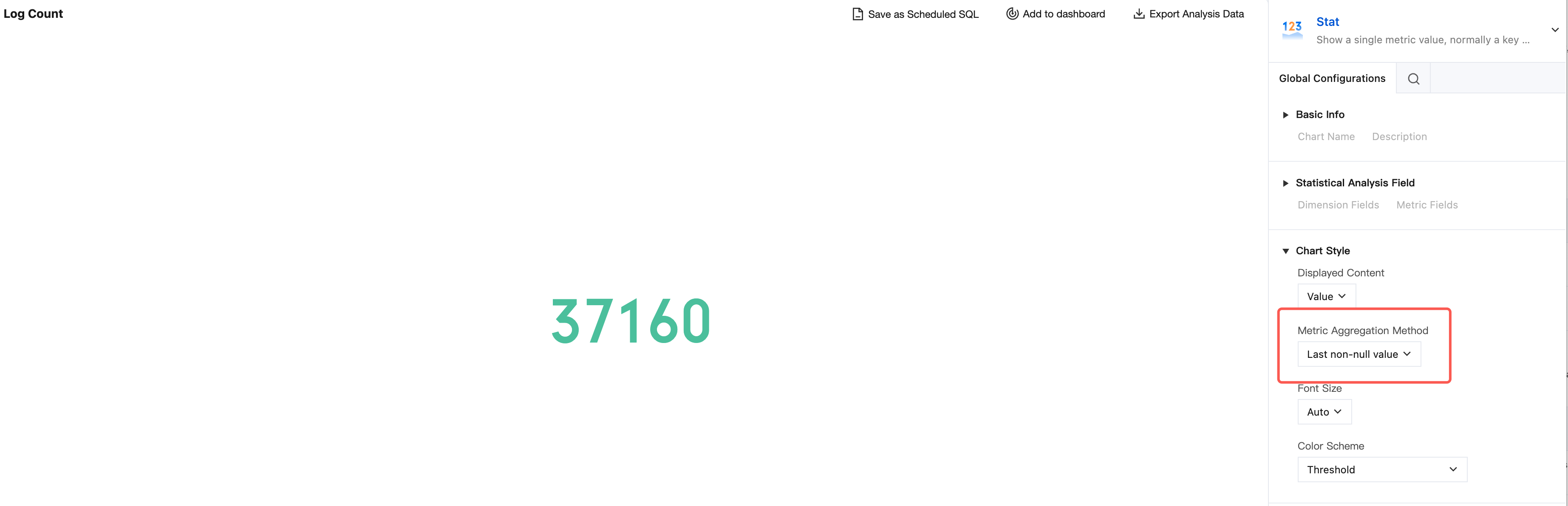
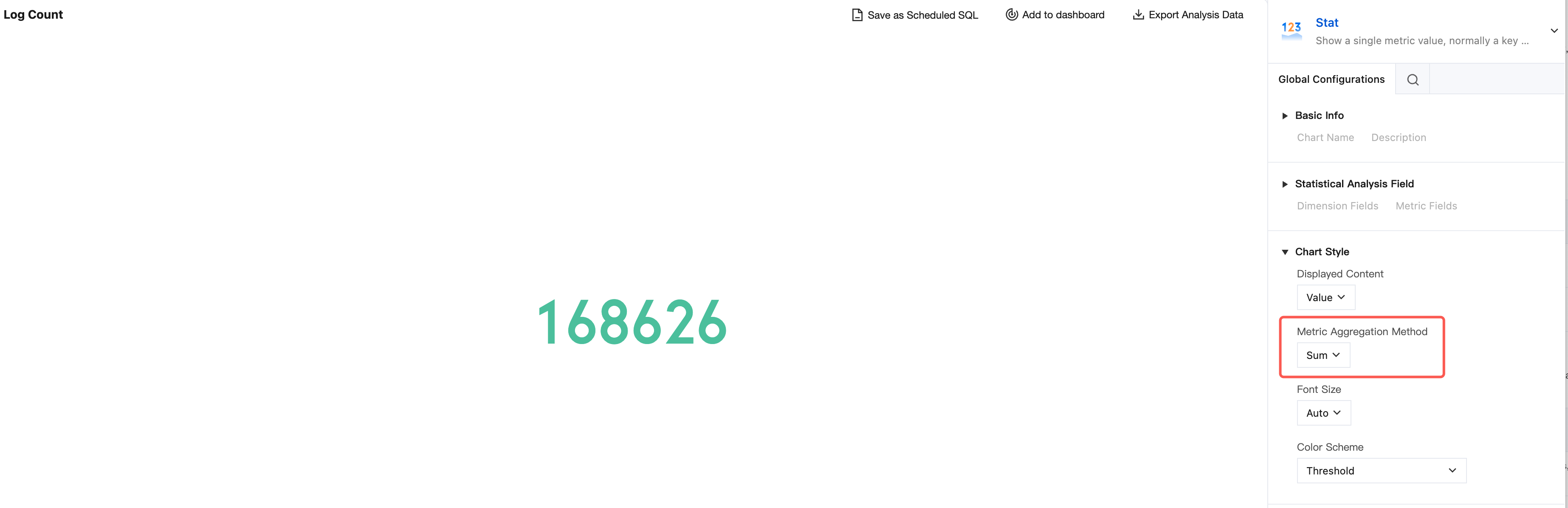
Metric Aggregation Method
When a metric has multiple results in the statistical results, the single-value chart needs to aggregate the results into a single value for display or select one of them for display. The most recent non-null value is used by default.
Font Size
When the font for the single-value chart is configured to a fixed size, it remains fixed. When the font is configured to automatic, the font size automatically adapts based on the chart dimensions.
Color Scheme
Configures the display color of the chart.
Statistical method example:
When multiple data entries are returned, the latest non-null value is selected and displayed by default. If you change the setting to sum the values, all data results will be summed and then displayed.
Displaying a Trend Chart
Configuration Item
Description
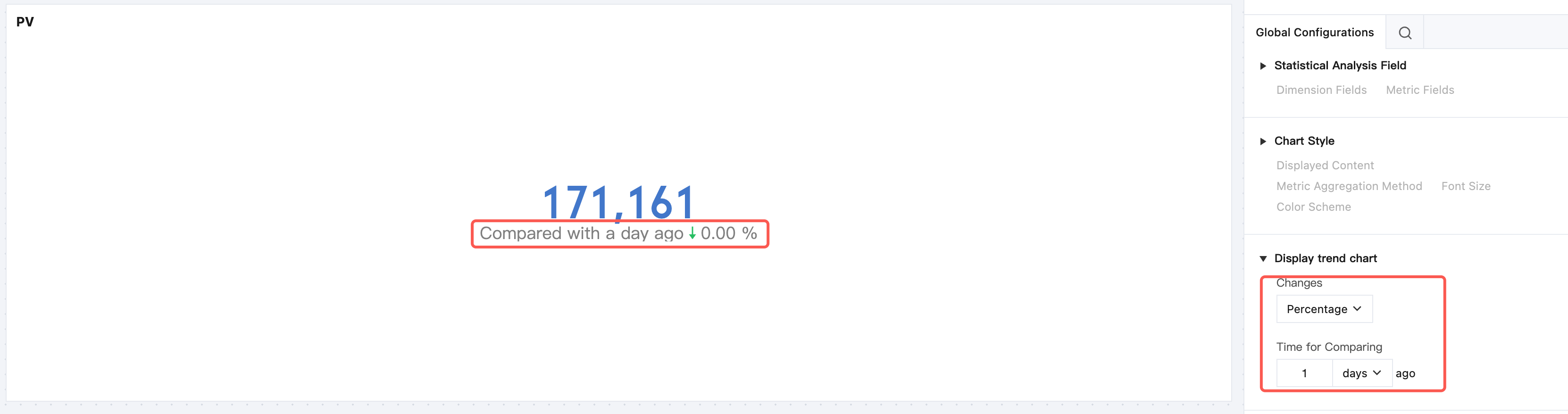
Changes
After the changes feature is enabled, you can compare the data in a time period with the data in the same period X hours, days, months, or years ago. You can choose to compare absolute values or percentages.
Interaction Events
Configuration Item
Description
Interaction event
Configures chart interaction events to support adding interactive behaviors such as jump links and filter conditions.
Threshold configuration
Configuration Item
Description
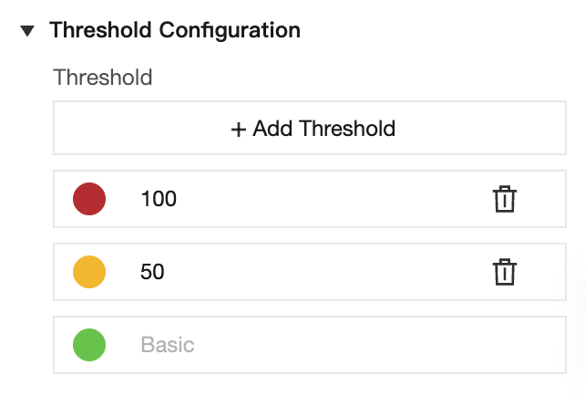
Threshold
Sets threshold points and allows adding multiple threshold intervals. Click the color corresponding to a threshold to open the color palette and customize the color.