MessageList
ダウンロード
フォーカスモード
フォントサイズ
Component Overview
MessageList is a robust message list component for chat applications, offering flexible message display, rich interaction, and extensive customization. It supports core chat functionality including message aggregation, message read receipts, configurable message actions, scroll management, and advanced customization, making it suitable for a wide range of business scenarios.
Props
Field | Type | Default | Description |
'left' |'right' |'two-sided' | 'two-sided' | Sets message alignment mode. left: All messages are left-aligned. right: All messages are right-aligned. two-sided: Sent messages are right-aligned, received messages are left-aligned. | |
boolean | false | Enables the message read receipt feature. | |
IMessageAction[] | ['copy', 'recall', 'quote', 'forward', 'delete'] | Customizes the list of message actions (e.g., copy, recall, delete, etc.). | |
number | 300 | Sets the message aggregation interval (seconds). Consecutive messages from the same sender within this interval are grouped together. | |
(message: MessageInfo) => boolean | undefined | Message filter function to control which messages are shown. | |
boolean | false | Whether to display avatar in the messages you send. | |
string | undefined | Custom CSS class for the root container. | |
React.CSSProperties | undefined | Custom inline styles for the root container. | |
React.ComponentType | Message | Custom message component renderer. | |
React.ComponentType | MessageTimeDivider | Custom time divider component between messages. |
Detailed Props
alignment
Type:
'left' | 'right' | 'two-sided'The
alignment prop determines how messages are aligned:two-sided: Messages sent by others are left-aligned; messages sent by you are right-aligned (default).left: All messages are left-aligned.right: All messages are right-aligned.enableReadReceipt
Type:
booleanEnables or disables message read receipts for each message. Default is
false.messageActionList
Type:
IMessageAction[]Customizes the available message actions (such as copy, recall, delete, etc.). By default, all actions are enabled:
['copy', 'recall', 'quote', 'forward', 'delete'].interface IMessageAction {key: 'copy' | 'recall' | 'quote' | 'forward' | 'delete' | string;label?: string;icon?: React.ReactNode;onClick?: (message: MessageInfo) => void;visible?: ((message: MessageInfo) => boolean) | boolean;component?: React.ComponentType<{ message: MessageInfo }>;style?: React.CSSProperties;}
Use
useMessageActions to retrieve and customize the full set of message actions.Example 1: Reorder message actions
To display actions in the order:
forward, copy, recall, quote, delete:import { Chat, MessageList, useMessageActions } from '@tencentcloud/chat-uikit-react';const App = () => {const actions = useMessageActions(['forward', 'copy', 'recall', 'quote', 'delete']);return (<Chat><MessageList messageActionList={actions} /></Chat>);}
Example 2: Show only selected message actions
To display only
forward, copy, and recall:import { Chat, MessageList, useMessageActions } from '@tencentcloud/chat-uikit-react';const App = () => {const actions = useMessageActions(['forward', 'copy', 'recall']);return (<Chat><MessageList messageActionList={actions} /></Chat>);}
Example 3: Customize a message action
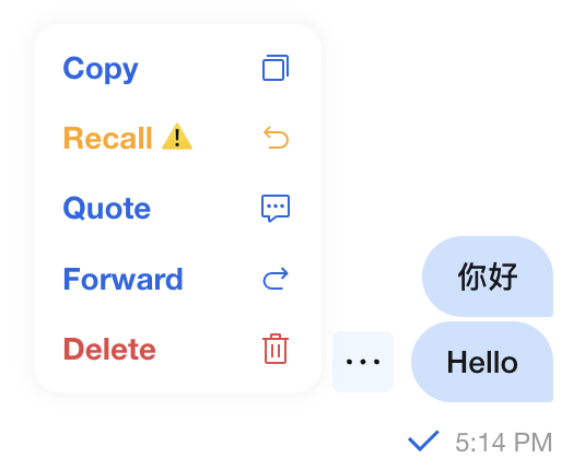
For example, to modify the recall action:
1. Set the label to 'Recall ⚠️'
2. Change color to orange
3. Only allow recall for text messages
4. Use the original key
recallimport { Chat, MessageList, useMessageActions, MessageType } from '@tencentcloud/chat-uikit-react';const ChatApp = () => {const actions = useMessageActions(['copy', {key: 'recall',label: 'Recall ⚠️',style: {color: 'orange'},visible: (message) => message.messageType === MessageType.Text,}, 'quote', 'forward', 'delete']);return (<Chat><MessageList messageActionList={actions} /></Chat>);}
Result:
Example 4: Add a custom message action
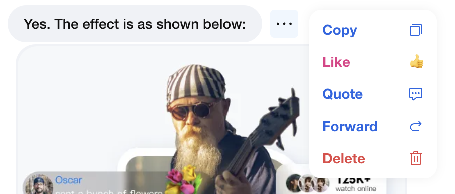
To add a custom action, such as 'Like', only for messages sent by others, and insert after 'recall':
import { useMessageAction } from '@tencentcloud/chat-uikit-react';import { yourApi } from '@/api/yourApi';const customActions = {key: 'like',label: 'Like',icon: <span>👍</span>,style: {color: '#E53888',},visible: (message) => message.isSentBySelf === false,onClick: (message) => {yourApi.likeMessage(message.msgID);}}function ChatApp() {const actions = useMessageAction(['forward', 'copy', 'recall', customActions, 'quote', 'delete']);return <MessageList messageActionList={actions} />;}
Result:
messageAggregationTime
Type:
numberDefines the time interval for aggregating messages from the same sender. Messages sent within this interval are grouped together. Default value:
300 seconds.filter
Type:
(message: MessageInfo) => booleanProvides a filter function to control which messages are displayed. Default is
undefined.Example: Filtering bot error messages
import { MessageList, MessageType } from '@tencentcloud/chat-uikit-react';const messageFilter = (message) => {// Hide text messages sent by users whose nickname contains '_robot' and content contains 'operation-failed'if (message.from.nickname?.includes('_robot')&& message.messageType === MessageType.Text&& message.messagePayload?.text?.includes('operation-failed')) {return false;}return true;};function ChatApp() {return <MessageList filter={messageFilter} />;}
showSelfAvatar
Type:
booleanTo better utilize screen efficiency, messages sent by the user do not display the profile picture by default; the default value is false.
className
Type:
stringSets a custom CSS class name for the root container. Default is
undefined.style
Type:
React.CSSPropertiesApplies custom inline styles to the root container. Default is
undefined.Message
Type:
React.ComponentTypeProvides a custom message component, replacing the default renderer. Default is the built-in
Message component.Example: Custom component for messages with link navigation
import { Chat, MessageList, Message, MessageType } from '@tencentcloud/chat-uikit-react';function CustomMessage(props) {const { message } = props;if (message.messageType === MessageType.Custom) {const { businessID, ...restData } = JSON.parse(message.messagePayload.data);if (businessID === 'text_link') {return (<div><div>{restData.text}</div><a href={restData.link}>Go to external site {restData.link}</a></div>);}} else {// Use default message component for other message typesreturn <Message {...props} />;}}function ChatApp() {return (<Chat><MessageList Message={CustomMessage} /></Chat>);}
MessageTimeDivider
Type:
React.ComponentTypeLets you specify a custom component to display time dividers between messages. Default is the built-in
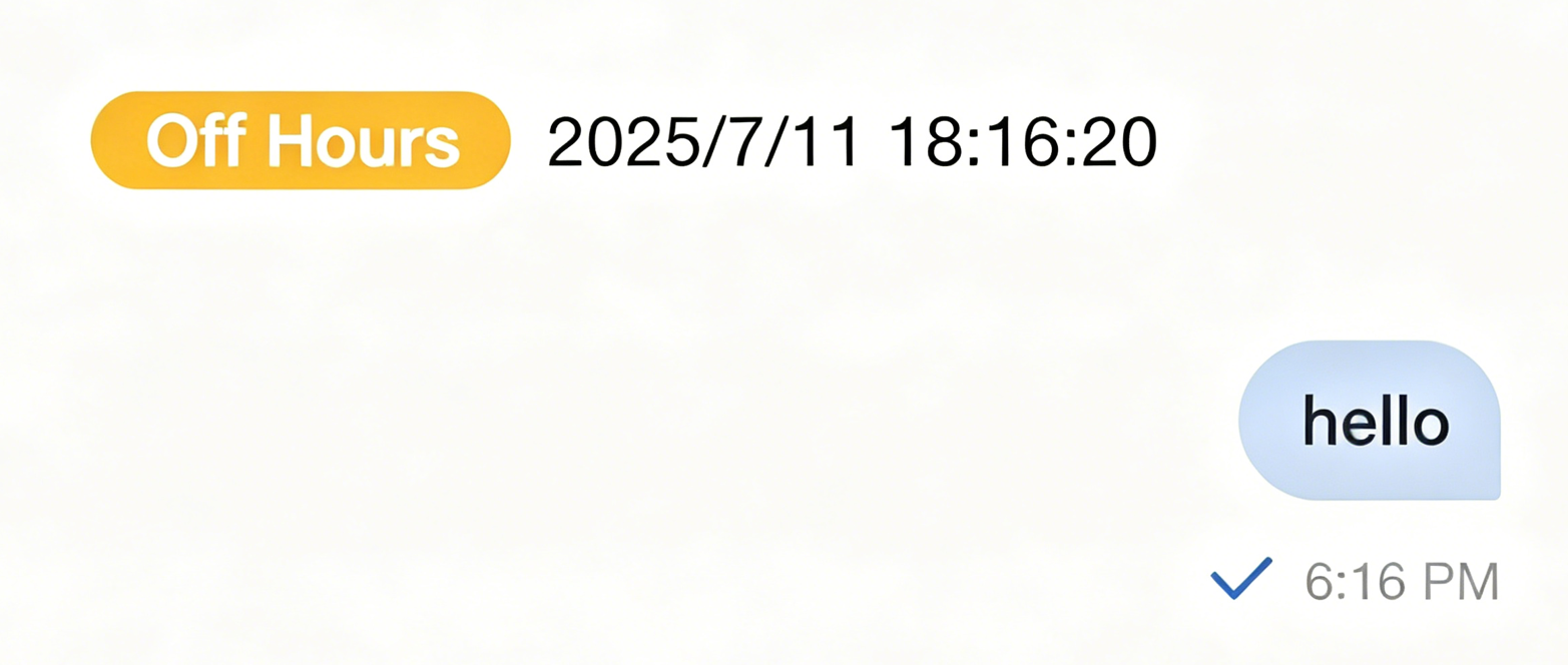
MessageTimeDivider.Example: Time divider indicating working hours
import { Chat, MessageList, type MessageInfo } from '@tencentcloud/chat-uikit-react';const BusinessTimeDivider = ({ prevMessage, currentMessage }: { prevMessage: MessageInfo, currentMessage: MessageInfo }) => {if (!prevMessage || !currentMessage) return null;// For each message, compare timestamps to determine if a divider is neededconst currentTime = currentMessage.timestamp ?? new Date();const prevTime = prevMessage.timestamp ?? new Date();// Show divider if it's a new day or more than 4 hours apartconst shouldShow = currentTime.toDateString() !== prevTime.toDateString() ||(currentTime.getTime() - prevTime.getTime()) > 4 * 60 * 60 * 1000;if (!shouldShow) return null;// Check for working hours (9:00-18:00, Monday to Friday)const isWorkingTime = () => {const hour = currentTime.getHours();const day = currentTime.getDay();return day >= 1 && day <= 5 && hour >= 9 && hour <= 18;};const timeLabel = isWorkingTime() ? 'Working Hours' : 'Off Hours';const timeColor = isWorkingTime() ? '#52c41a' : '#faad14';return (<div style={{ textAlign: 'center', margin: '16px 0' }}><span style={{backgroundColor: timeColor,color: 'white',padding: '2px 8px',borderRadius: '12px',marginRight: '8px'}}>{timeLabel}</span>{currentTime.toLocaleString()}</div>);};function ChatApp() {return (<Chat><MessageList MessageTimeDivider={BusinessTimeDivider} /></Chat>);}
The renderings are shown as follows:
Summary
MessageList provides a comprehensive set of message list features and powerful customization options. By configuring props and custom components as needed, you can build chat interfaces tailored to your business requirements. Choose configuration options based on your use case for optimal results.
フィードバック