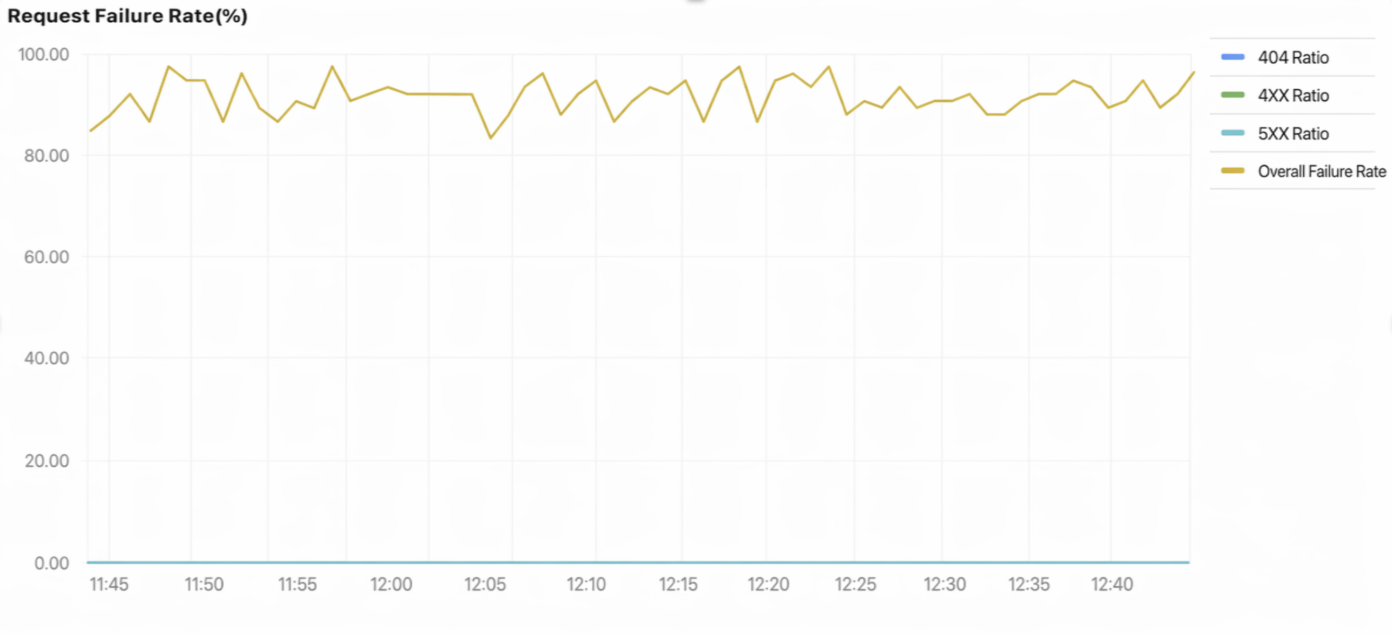
A time series chart requires statistics to have a time series field, so that it can organize and aggregate the metric in chronological order. It visually reflects the change trend of a metric over time. It is suitable for trend analysis scenarios, for example, analyzing the trend of the daily number of 404 errors in the past week.
Operation Steps
1. Log in to the CLS console, choose Dashboard > Dashboard List, and then select the dashboard you want to view.
2. Select the target dashboard to go to its view page, click Edit, and then enter the edit page.
3. Click Add Chart to create a new chart, select Custom Chart or Quick Chart, and then set the chart type to Time Series.
4. Configure the chart as needed.
General Configuration
Configuration Item
Description
Basic Info
Chart Name: Set the display name of the chart, which can be left empty.
Description: Set the description information of the chart.
Legend
The style and position of the legend can be controlled by setting the legend content of the chart. It also supports adding comparison data to the legend.
Numeric format
Sets the unit of measurement for all metric-type fields within the chart.
Interaction event
Custom interaction event feature. Clicking chart elements can trigger interactions such as opening the search and analysis page, navigating to a dashboard, or accessing a third-party URL. For details, see Interaction Events.
Statistical Analysis Fields
For a sequence diagram, you must select the time field, dimension field, and metric field. When data mismatches occur, you need to manually select the statistical analysis field.
Configuration Item
Description
Time field
The time-type field used for the time series chart's X-axis. By default, fields with the time data type are selected. If no time field exists, you must manually specify a field.
Dimension field
Classification field. By default, fields with the string data type are selected. If no string field exists, you must manually specify a field.
Metric field
Numerical field. By default, fields with the number data type are selected. If no number field exists, you must manually specify a field.
Changes
Configuration Item
Description
Trend Comparison
After the trend comparison is enabled, you can choose to compare it with data of the same period before X hours, days, months, or years. The comparison data is shown in the chart as a dotted line.
Sequence Diagram Configuration
Configuration Item
Description
Chart Style
Color Scheme: Configure the display colors of the chart.
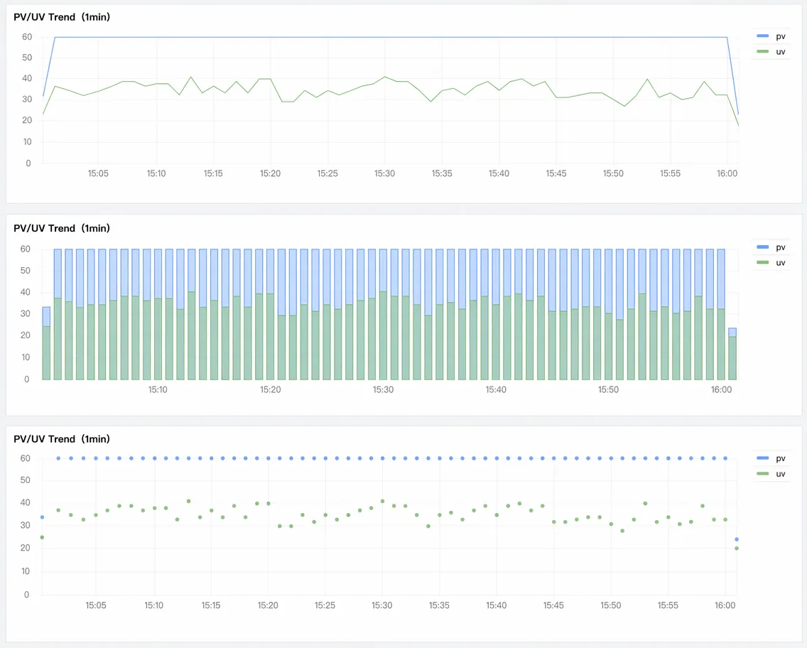
Drawing Style: display style of data on the coordinate axis. Options: Line (line chart), Bar (histogram), and Point (scatter plot).
Connection Style: Choose between a straight line or a smooth curve for connections between points.
Line Width: Control the thickness of lines.
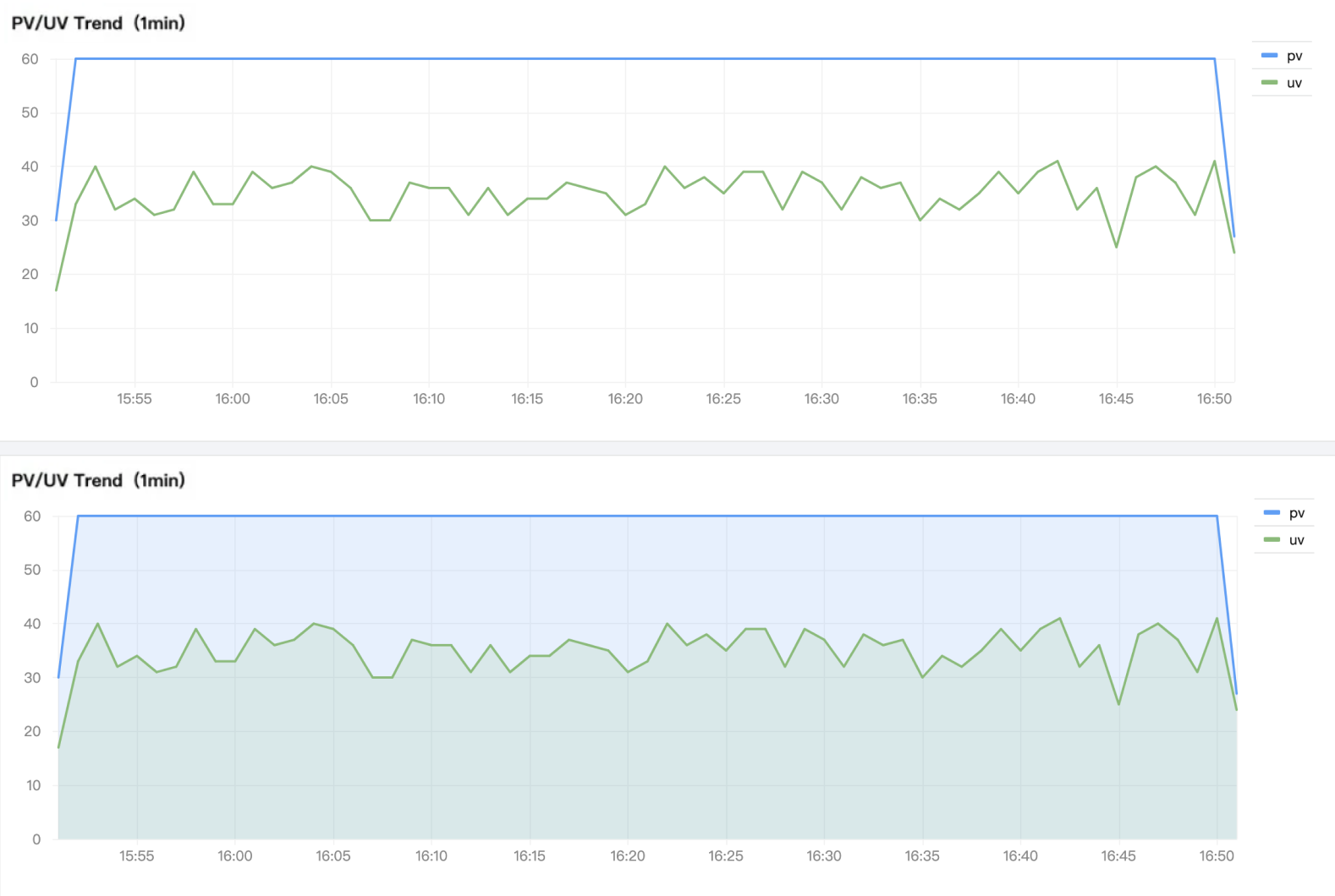
Fill: Set the style for area fill.
Opacity: Controls the opacity of filled areas.
Show Points: Display data points. Data points are not displayed if no data is available.
Dot size: Sets the dot size.
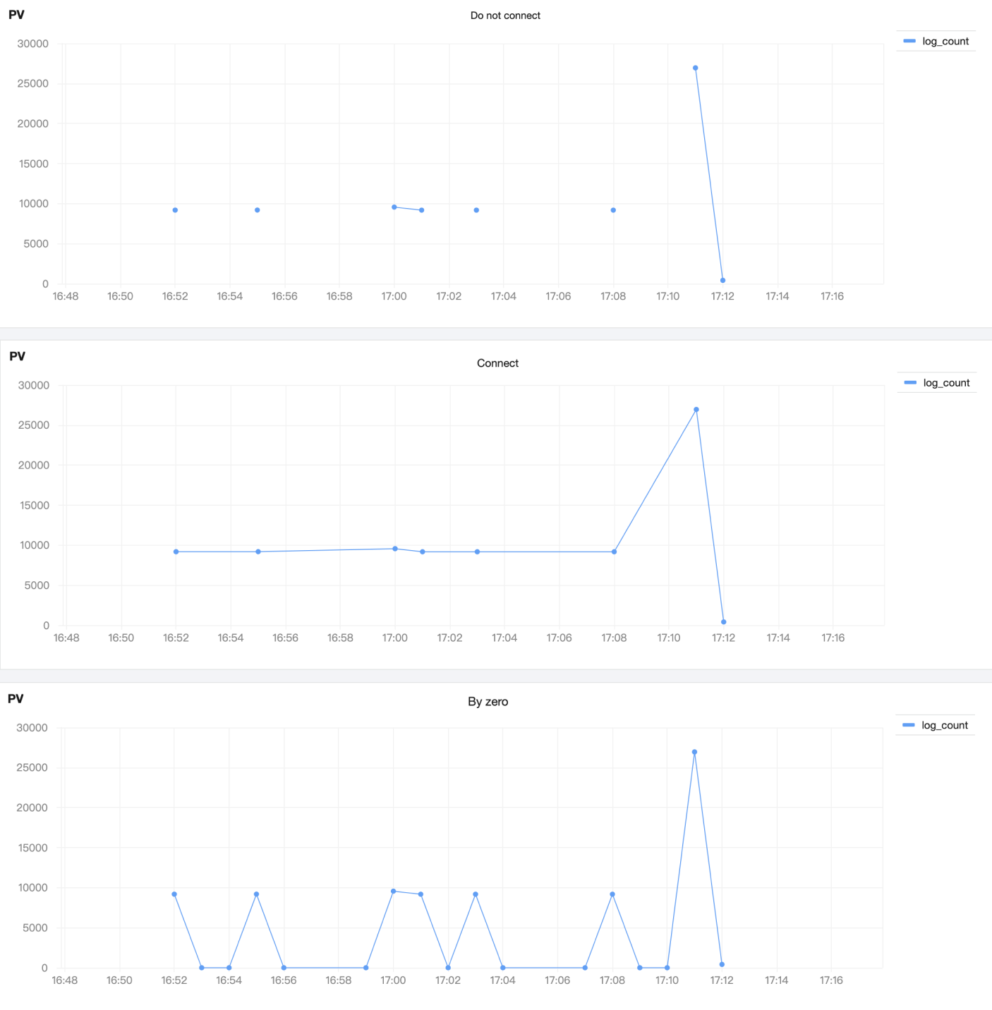
Null Values: Handles null data points on the line chart. By default, the line connects across them.
Stack Mode: Whether to display data in a stacked manner.
Maximum Number of Series to Display: The default maximum number of metrics (lines) to display. Any exceeding series are collapsed and hidden.
Coordinate axis
Y-axis Position: Controls the display/hide state of the Y-axis and its placement.
Y-axis Maximum/Minimum: Sets the maximum and minimum values displayed on the Y-axis. Coordinate areas with values greater than the maximum or less than the minimum are not displayed.
Y-axis scale: Controls the Y-axis scale, supporting both linear and logarithmic scales.
Plot Style Examples:
Fill Examples:
Null Value Examples:
Threshold Configuration
Configuration Item
Description
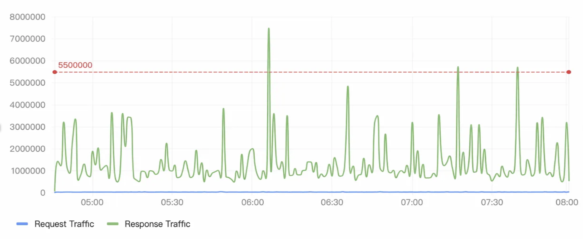
Threshold Points
Set threshold points, add multiple threshold intervals, and click the color corresponding to a threshold to open the color palette for customizing colors.
Threshold Style
Controls the display style of thresholds, including three modes: threshold line, area fill, and both threshold line and area fill. When the display style is disabled, thresholds are not used.
Field Configuration
Configuration Item
Description
Field configuration
Field configuration supports configuration items that apply only to selected fields, which will overwrite the default chart configuration.
Example:
Creating a combined line and bar chart
When a chart has multiple metrics (such as bandwidth and page views), you can display bandwidth as a line chart and page views as a bar chart. To achieve this, select Add Field Configuration, select Access PV, set the Unit to "Count", select "Bar" as the Plot Style, and set Fill to "100".
The effect of the combined line and bar chart:
Creating a dual-axis chart
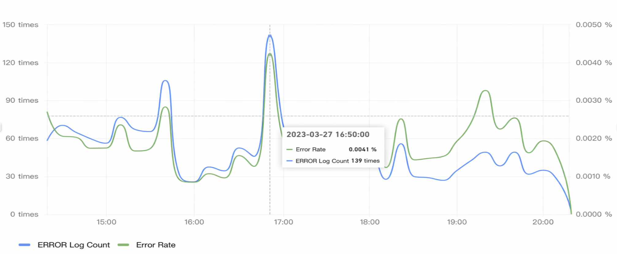
When a time series chart has multiple metrics with different units (such as, error count in "Count" and error rate in "%"), you can display them on the same chart using dual Y-axes. To achieve this, select Add Field Configuration, select "Error Log Count" and set its Unit to "Count", and select "Error Rate" and set its Unit to "%".
The effect of the dual-axis chart:
Chart Operations
Time Range
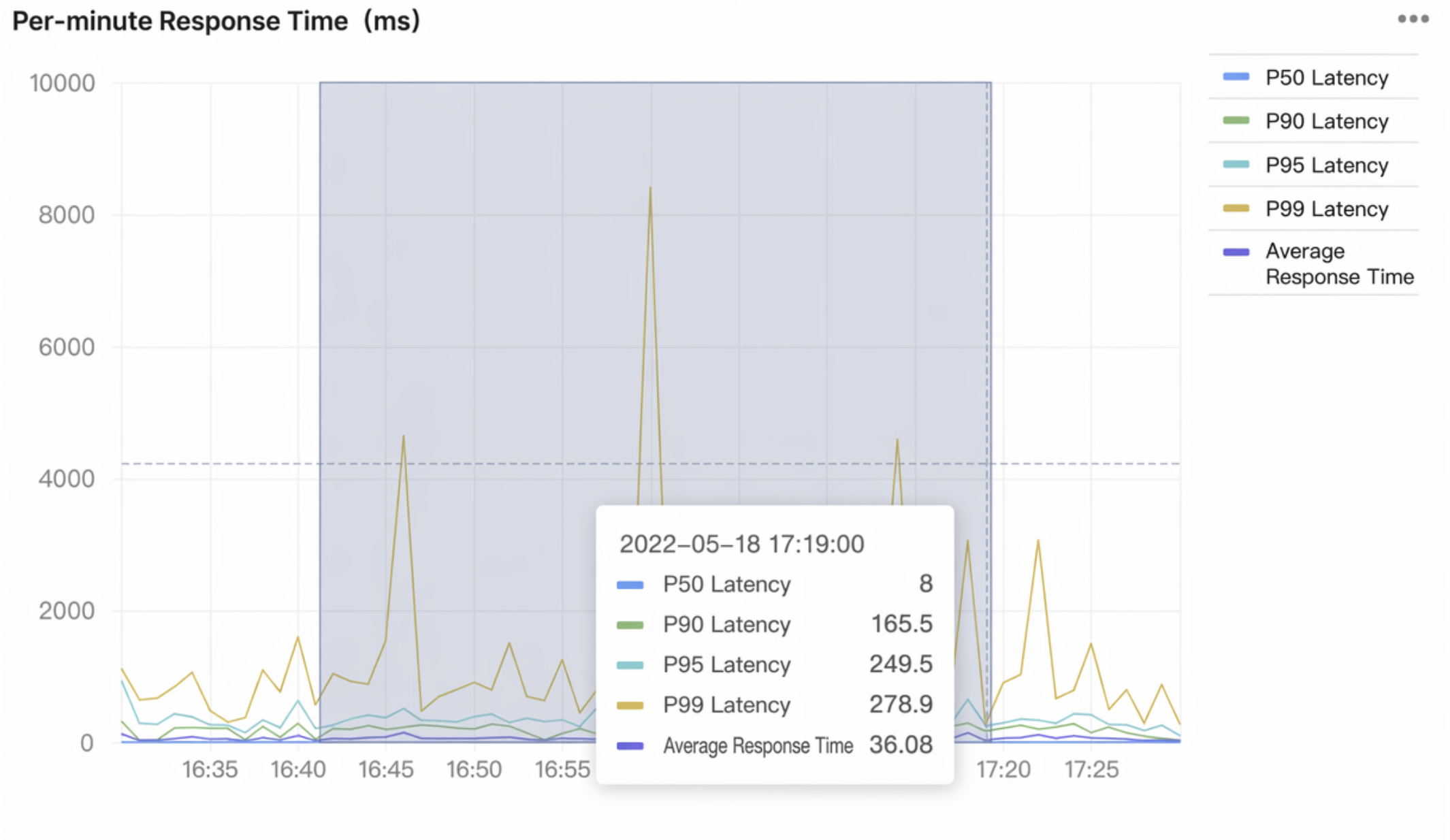
Hover over the chart, press and hold the left mouse button, and drag to trigger the selector and use time in the selected area as the time range. This is suitable for scenarios such as drilling down into the time range of abnormal points.
Statement Example
A time field is required to create a time series chart, and various functions need to be used to process the time field. For more time functions for time series charts, see Time and Date Functions.
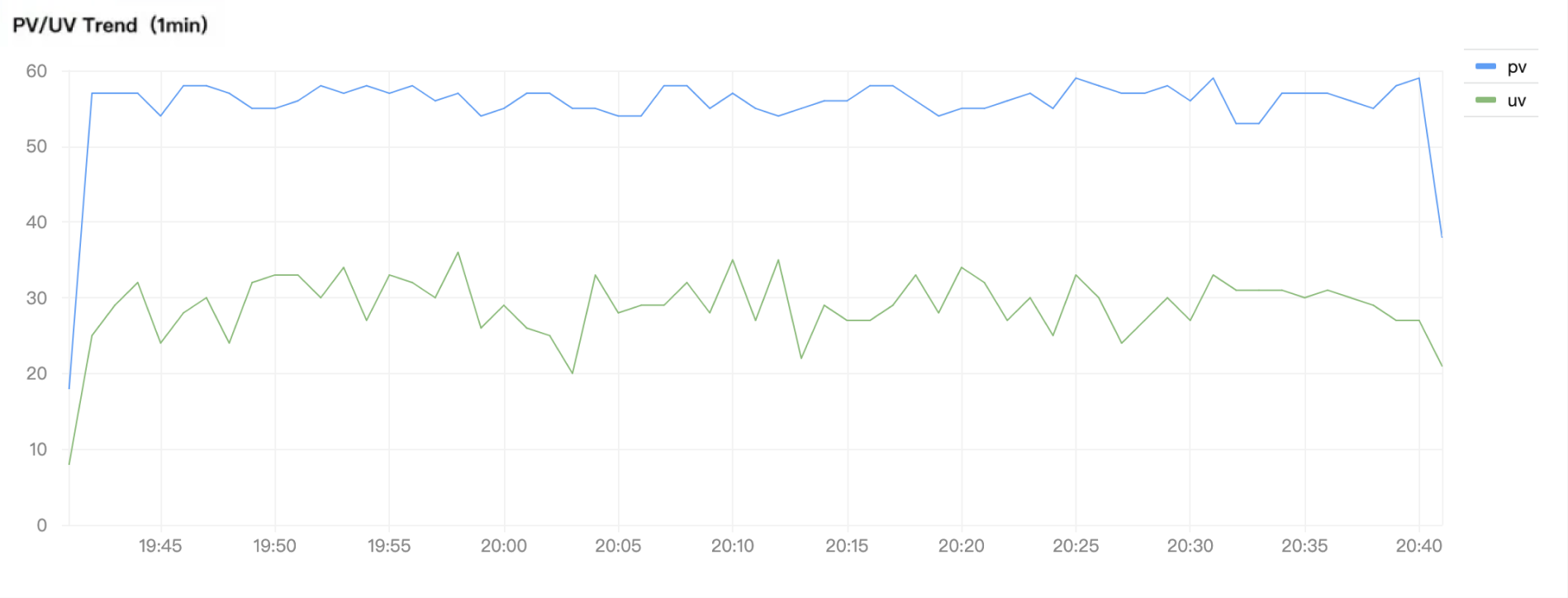
Calculate the PV and UV per minute:
* |select histogram( cast(__TIMESTAMP__ as timestamp),interval 1 minute) as time, count(*) as pv,count( distinct remote_addr) as uv group by time order by time desc limit 10000
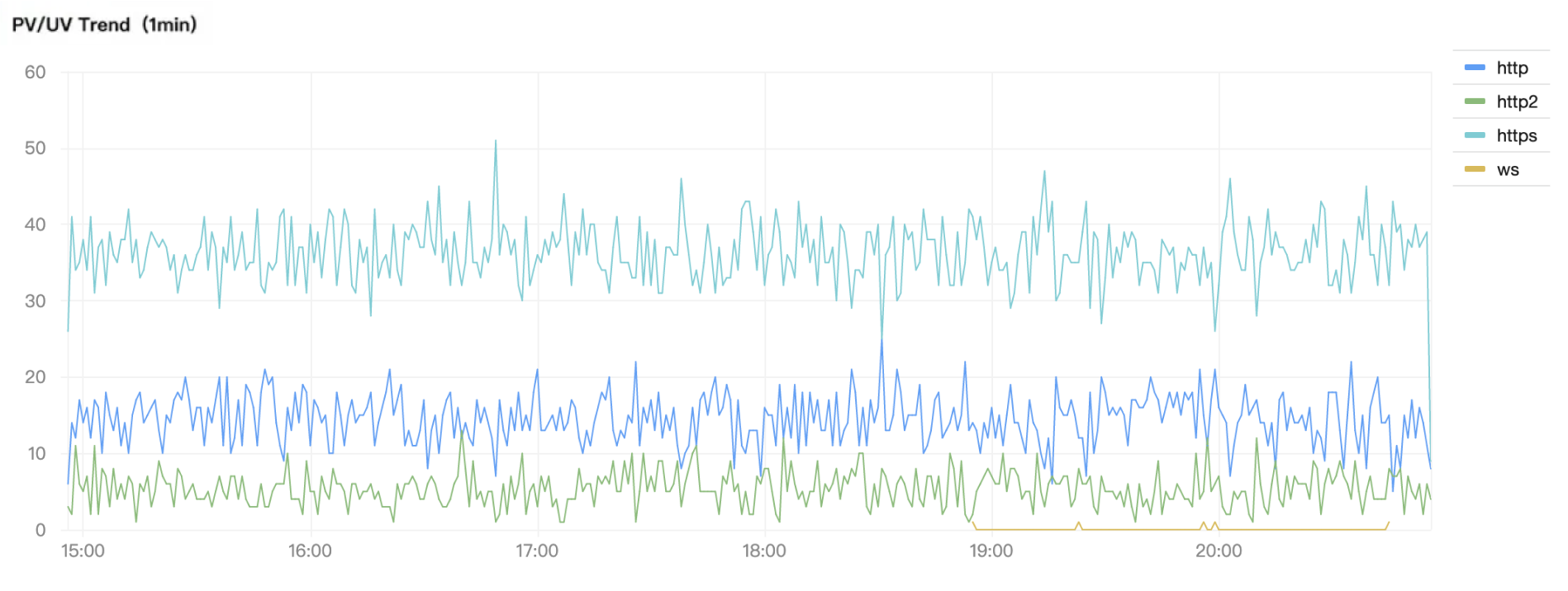
Calculate the PV for each protocol type per minute:
* |select histogram( cast(__TIMESTAMP__ as timestamp),interval 1 minute) as time, protocol_type, count(*) as pv group by time, protocol_type order by time desc limit 10000
Calculate the request failure rate (%) per minute:
* |select date_trunc('minute', __TIMESTAMP__) as time, round(sum(case when status =404then1.00else0.00 end)/ cast(count(*) as double)*100,3) as "404 proportion", round(sum(case when status >=500then1.00else0.00 end)/cast(count(*) as double)*100,3) as "5XX proportion", round(sum(case when status >=400 and status <500then1.00else0.00 end)/cast(count(*) as double)*100,3) as "4XX proportion", round(sum(case when status >=400then1.00else0.00 end)/cast(count(*) as double)*100,3) as "total failure rate" group by time order by time limit 10000