- Release Notes and Announcements
- Product Introduction
- Getting Started
- Guidelines for Code Integration
- Get Demo and SDK
- Accessing via Android Devices
- Accessing via iOS Devices
- Accessing with Flutter
- Guide to Mini Program Development
- Mini program introduction and development environment
- Mini program code composition
- Framework
- API
- API Overview
- Fundamentals
- Routing
- Redirect
- Forwarding
- Interface
- Network
- Data Caching
- Data Analysis
- canvas
- Media
- WXML
- File
- Device
- Contact person
- Vibration
- Battery Level
- Screen
- Memory
- Device Orientation
- Accessibility
- Network
- Keyboard
- Phone number
- Accelerometer
- Compass
- Gyroscope
- SMS
- Code scanning
- Encryption
- NFC-Ndef
- NFC-NfcA
- NFC-NfcB
- NFC-NfcF
- NFC-NfcV
- WiFi
- Calendar
- Clipboard
- NFC-getNFCAdapter
- NFC-NFCAdapter
- NFC-IsoDep
- NFC-MifareClassic
- NFC-MifareUltralight
- Bluetooth - Low Energy Central Device
- Bluetooth - Low Energy Peripheral Device
- Bluetooth - Beacon
- Bluetooth - General
- Location
- Open Interfaces
- Custom APIs
- Sensitive API
- Components
- Open source component statement
- FAQs
- Agreements
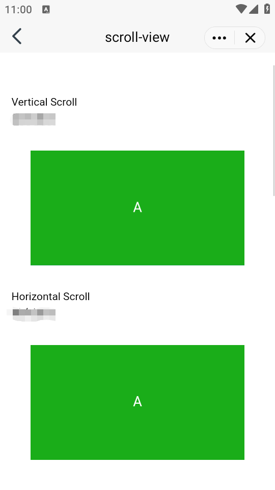
scroll-view
Feature Description: A scrollable view area. When using vertical scrolling, it is necessary to assign a fixed height to the
<scroll-view> through the application of WXSS height settings.Parameter and Description:
Attribute name | Type | Default value | Description |
scroll-x | boolean | false | Allows horizontal scrolling |
scroll-y | boolean | false | Allows vertical scrolling |
upper-threshold | number / string | 50 | Distance from the top/left at which the scrolltoupper is triggered |
lower-threshold | number/tring | 50 | Distance from the bottom/right at which the scrolltolower is triggered. |
scroll-top | number / string | - | Set the position of the vertical scrollbar |
scroll-left | number / string | - | Set the position of the horizontal scrollbar |
scroll-into-view | string | - | The value should be the id of a certain sub-element (the id cannot start with a number). Set which direction can be scrolled, then scroll to that element in that direction. |
scroll-with-animation | boolean | false | Use animation transition when setting the scrollbar position |
enable-back-to-top | boolean | false | When the top status bar is clicked on iOS, or the title bar is double-clicked on Android, the scrollbar returns to the top. This only applies to the vertical orientation. |
bindscrolltoupper | eventhandle | - | Triggered when scrolling to the top/left side |
bindscrolltolower | eventhandle | - | Triggered when scrolling to the bottom/right side |
bindscroll | eventhandle | - | Triggered during scrolling, event.detail = {scrollLeft, scrollTop, scrollHeight, scrollWidth, deltaX, deltaY} |
aria-label | string | false | - |
enhanced | boolean | true | - |
bounces | boolean | true | - |
show-scrollbar | boolean | false | - |
paging-enabled | boolean | false | - |
fast-deceleration | boolean | false | - |
Sample Code
Corresponding WXML file
<view class="section"><view class="section__title">vertical scroll</view><view class="section__title">Vertical Scrolling</view><scroll-viewscroll-ystyle="height: 200px;"bindscrolltoupper="upper"bindscrolltolower="lower"bindscroll="scroll"scroll-into-view="{{toView}}"scroll-top="{{scrollTop}}"><view id="green" class="scroll-view-item bc_cyanblue">A</view><view id="red" class="scroll-view-item bc_blue">B</view></scroll-view></view><view class="section section_gap"><view class="section__title">horizontal scroll</view><view class="section__title">Horizontal Scrolling</view><scroll-view class="scroll-view_H" scroll-x style="width: 100%"><view id="green" class="scroll-view-item_H bc_cyanblue"></view><view id="red" class="scroll-view-item_H bc_blue"></view></scroll-view></view>
Corresponding js file
const order = ['red', 'yellow', 'blue', 'green', 'red']Page({data: {toView: 'red',scrollTop: 100},upper(e) {console.log(e)},lower(e) {console.log(e)},scroll(e) {console.log(e)},tap(e) {for (let i = 0; i < order.length; ++i) {if (order[i] === this.data.toView) {this.setData({toView: order[i + 1]})break}}},tapMove(e) {this.setData({scrollTop: this.data.scrollTop + 10})}})
Note:
Refrain from using textarea, map, canvas, video components within the scroll-view.
The priority of scroll-into-view supersedes that of scroll-top.
Scrolling within the scroll-view will prevent page bounce-back. Hence, it is impossible to trigger onPullDownRefresh while scrolling in the scroll-view.
To use the pull-down refresh feature, employ the page's scrolling instead of the scroll-view. This method also allows returning to the top of the page by clicking on the status bar.
swiper
Feature Description: Slider view container. The
change event returns a detail that includes a source field, indicating the cause of the change. Possible values are as follows:autoplay triggers automatic playback, causing changes in the swiper.touch User sliding causes changes in the swiper.Any other reasons will be represented by an empty string.
Note:
It can only accommodate the
<swiper-item/> component; otherwise, it may lead to undefined behavior.Parameter and Description:
Attribute name | Type | Default value | Description |
indicator-dots | boolean | false | Whether to display panel indicator points. |
indicator-color | color | rgba(0, 0, 0, .3) | Indicator point color |
indicator-active-color | color | #000000 | Color of the currently selected indicator point. |
autoplay | coolean | false | Whether to switch automatically. |
current | number | 0 | Index of the current slider. |
interval | number | 5000 | Time interval of automatic switching |
duration | number | 500 | Duration of the sliding animation |
circular | boolean | false | Whether to adopt seamless sliding |
vertical | boolean | false | Is the sliding direction vertical? |
previous-margin | string | "0px" | Front margin, which can be used to reveal a small part of the previous item, supporting px and rpx values. |
next-margin | string | "0px" | Rear margin, which can be used to reveal a small part of the subsequent item, supporting px and rpx values. |
display-multiple-items | number | 1 | The number of sliders displayed simultaneously. |
skip-hidden-item-layout | boolean | false | Whether to skip the layout of sliders not displayed. Setting this to true can optimize sliding performance in complex situations, but will lose layout information of sliders in hidden status. |
bindchange | eventhandle | - | The change event will be triggered when 'current' changes, with event.detail = {current: current, source: source}. |
bindtransition | eventhandle | - | The transition event will be triggered when the position of the swiper-item changes, with event.detail = {dx: dx, dy: dy}. |
bindanimationfinish | eventhandle | - | The animationfinish event will be triggered when the animation ends, with event.detail as previously described. |
swiper-item
Feature Description: Can only be placed within the
<swiper> component, with width and height automatically set to 100%.Parameter and Description:
Attribute name | Type | Default value | Description |
item-id | string | “” | The identifier of this swiper-item. |
Sample Code
Corresponding WXML file
<swiperindicator-dots="{{indicatorDots}}"autoplay="{{autoplay}}"interval="{{interval}}"duration="{{duration}}"><block wx.for="{{imgUrls}}"><swiper-item><image src="{{item}}" class="slide-image" width="355" height="150" /></swiper-item></block></swiper><button bindtap="changeIndicatorDots">indicator-dots</button><button bindtap="changeAutoplay">autoplay</button><slider bindchange="intervalChange" show-value min="500" max="2000" />interval<slider bindchange="durationChange" show-value min="1000" max="10000" />duration
Corresponding js file
Page({data: {imgUrls: ['https://img02.tooopen.com/images/20150928/tooopen_sy_143912755726.jpg','https://img06.tooopen.com/images/20160818/tooopen_sy_175866434296.jpg','https://img06.tooopen.com/images/20160818/tooopen_sy_175833047715.jpg'],indicatorDots: false,autoplay: false,interval: 5000,duration: 1000},changeIndicatorDots(e) {this.setData({indicatorDots: !this.data.indicatorDots})},changeAutoplay(e) {this.setData({autoplay: !this.data.autoplay})},intervalChange(e) {this.setData({interval: e.detail.value})},durationChange(e) {this.setData({duration: e.detail.value})}})
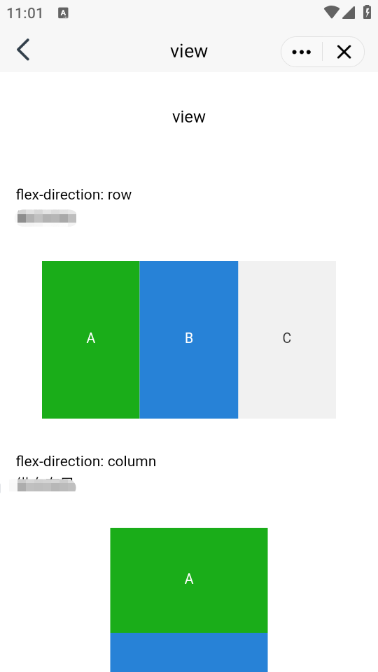
view
Feature Description: A view container.
Parameter and Description:
Attribute name | Type | Default value | Description |
hover-class | string | none | Specifies the style class when pressed. When hover-class="none", there is no click status effect. |
hover-stop-propagation | boolean | false | Specifies whether to prevent the ancestor nodes of this node from appearing in the click status. |
hover-start-time | number | 50 | The duration before the click status appears after pressing, measured in milliseconds. |
hover-start-time | number | 400 | The retention time of the click status after the finger is released, measured in milliseconds. |
aria-role | string | - | Accessibility, (Role) identifies the role of the element. |
aria-label | string | - | Accessibility, (Attribute) Additional description of the element. |
Sample Code
Corresponding WXML file
<view class="section"><view class="section__title">flex-direction: row</view><view class="flex-wrp" style="flex-direction:row;"><view class="flex-item bc_cyanblue">A</view><view class="flex-item bc_blue">B</view><view class="flex-item bc_grey">C</view></view></view><view class="section"><view class="section__title">flex-direction: column</view><view class="flex-wrp" style="height: 300px;flex-direction:column;"><view class="flex-item bc_cyanblue">A</view><view class="flex-item bc_blue">B</view><view class="flex-item bc_grey">C</view></view></view>
Note:
movable-area
Feature Description: The movable area of the movable-view.
Parameter and Description:
Attribute name | Type | Default value | Description |
scale-area | boolean | false | When the movable-view within is set to support two-finger scaling, setting this value can modify the effective area of the scaling gesture to the entire movable-area. |
Note:
When the movable-view is smaller than the movable-area, the range of movement for the movable-view is within the movable-area.
When the movable-view is larger than the movable-area, the range of movement for the movable-view must encompass the movable-area, considering the x-axis and y-axis directions separately.
Sample Code
Corresponding WXML file
<view class="section"><view class="section__title">When the movable-view area is smaller than the movable-area</view><movable-area style="height: 200px; width: 200px; background: red;"><movable-viewstyle="height: 50px; width: 50px; background: blue;"x="{{x}}"y="{{y}}"direction="all"></movable-view></movable-area><view class="btn-area"><button size="mini" bindtap="tap">click me to move to (30px, 30px)</button></view><view class="section__title">When the movable-view area is larger than the movable-area</view><movable-area style="height: 100px; width: 100px; background: red;"><movable-viewstyle="height: 200px; width: 200px; background: blue;"direction="all"></movable-view></movable-area><view class="section__title">Scalable</view><movable-areastyle="height: 200px; width: 200px; background: red;"scale-area><movable-viewstyle="height: 50px; width: 50px; background: blue;"direction="all"bindchange="onChange"bindscale="onScale"scalescale-min="0.5"scale-max="4"scale-value="2"></movable-view></movable-area></view>
Corresponding js file
Page({data: {x: 0,y: 0},tap(e) {this.setData({x: 30,y: 30})},onChange(e) {console.log(e.detail)},onScale(e) {console.log(e.detail)}})
movable-view
Feature Description: A movable view container that can be dragged and slid across the page.
Parameter and Description:
Attribute name | Type | Default value | Description |
direction | string | none | The direction of movement for the movable-view, with attribute values including all, vertical, horizontal, and none. |
inertia
| boolean | false | Whether the movable-view has inertia. |
out-of-bounds | boolean | false | Whether the movable-view can still be moved after exceeding the movable area. |
x | number / string | - | Defines the offset in the x-axis direction. If the value of x is not within the movable range, it will automatically move to the movable range; changing the value of x will trigger an animation. |
y | number / string | - | Defines the offset in the y-axis direction. If the value of y is not within the movable range, it will automatically move to the movable range; changing the value of y will trigger an animation. |
damping | number | 20 | The damping coefficient, used to control the animation when x or y changes and the animation of the boundary rebound. The larger the value, the faster the movement. |
friction | number | 2 | The friction coefficient, used to control the animation of inertial sliding. The larger the value, the greater the friction, and the quicker the sliding stops. The friction coefficient must be greater than 0. Otherwise, it will be set to the default value. |
disabled | boolean | false | Whether to disable |
scale | boolean | false | Whether to support two-finger zooming. The default effective area for the zoom gesture is within the movable-view. |
scale-min | number | 0.5 | Defines the minimum value of the scaling factor. |
scale-max | number | 10 | Defines the maximum value of the scaling factor. |
scale-value | number | 1 | Defines the scaling factor, with a value range of 0.5 - 10. |
animation | boolean | true | Defines the scaling factor, with a value range of 0.5 - 10. |
bindchange | eventhandle | - | Event triggered during the dragging process, event.detail = {x: x, y: y, source: source}, where source indicates the cause of the movement. The value can be touch (dragging), touch-out-of-bounds (exceeding the moving range), out-of-bounds (bounce back after exceeding the moving range), friction (inertia), and an empty string (setData). |
bindscale | eventhandle | - | Event triggered during the scaling process, event.detail = {x: x, y: y, scale: scale}. |
In addition to basic events, movable-view offers two special events.
Type | Trigger condition |
htouchmove | The initial movement after the finger touches is horizontal. If this event is caught, it implies that the touchmove event has also been caught. |
vtouchmove | The initial movement after the finger touches is vertical. If this event is caught, it implies that the touchmove event has also been caught. |
Note:
The movable-view must have the width and height attributes set. Otherwise, they will default to 10 px.
By default, movable-view is absolutely positioned, with top and left attributes set to 0 px.
The movable-view must be within the <movable-area/> component and must be a direct child node. Otherwise, it will not be movable.
cover-image
Feature Description: An image view that overlays native components. The native components that can be overlaid are the same as cover-view, and can be nested within cover-view.
Parameter and Description:
Attribute name | Type | Default value | Description |
src | string | - | Icon path, supporting temporary paths, network addresses, and cloud file IDs. Base64 format is currently not supported. |
bindload | eventhandle | - | Triggered when the image fails to load. |
binderror | eventhandle | - | Triggered when the image fails to load. |
aria-role | string | - | Accessibility, (Role) Identifies the function of the element. |
aria-lable | string | - | Accessibility, (Role) Identifies the function of the element. |
Note:
The aria-role of <cover-view> and <cover-image>can only be set to button, which allows for clicking and reading out "button" in screen reading mode; when empty, it can be focused but not clicked.
The event model follows the bubbling model, but it does not bubble up to native components.
It is recommended to enclose all text within the cover-view tag to prevent layout errors.
Only basic positioning, layout, and text styles are supported. Setting individual border, background-image, shadow, overflow: visible, etc., are not supported.
It is advised that child nodes should not overflow their parent nodes.
The default style settings are: white-space: nowrap; line-height: 1.2; display: block.
When custom components are nested within a cover-view, the custom component's slot and its parent node do not currently support visibility control through wx:if, as this may result in the cover-view not being displayed.
Sample Code
Corresponding WXML file
<videoid="myVideo"src="https://qzonestyle.gtimg.cn/qzone/qzact/act/external/qq-video/qq-video.mp4"controls="{{false}}"event-model="bubble"><cover-view class="controls"><cover-view class="play" bindtap="play"><cover-image class="img" src="/path/to/icon_play" /></cover-view><cover-view class="pause" bindtap="pause"><cover-image class="img" src="/path/to/icon_pause" /></cover-view><cover-view class="time">00:00</cover-view></cover-view></video>
Corresponding WXSS file
.controls {position: relative;top: 50%;height: 50px;margin-top: -25px;display: flex;}.play,.pause,.time {flex: 1;height: 100%;}.time {text-align: center;background-color: rgba(0, 0, 0, 0.5);color: white;line-height: 50px;}.img {width: 40px;height: 40px;margin: 5px auto;}
Corresponding js file
Page({onReady() {this.videoCtx = wx.createVideoContext('myVideo')},play() {this.videoCtx.play()},pause() {this.videoCtx.pause()}})
cover-view
Function Description: A text view that overlays native components, including
map, video, canvas, camera, live-player, live-pusher. It only supports nesting cover-view, cover-image, and button can be used within cover-view.Parameter and Description:
Attribute name | Type | Default value | Description |
scroll-top | number / string | - | Set the top scroll offset, which only takes effect after overflow-y: scroll is set to become a scrolling element. |
aria-role | string | - | Accessibility, (Role) Identifies the function of the element. |
aria-label | string | - | Accessibility, (Attribute) Additional description of the element. |

 Yes
Yes
 No
No
Was this page helpful?