ConversationPreview
Download
포커스 모드
폰트 크기
ConversationPreview is used for previewing session content in the list. The component displays session information, unread count, and provides conversation action feature.With the aid of atomic information display components, you can freely design and combine your desired
ConversationPreview layout.Meanwhile, you can also use the
onConversationSelect function to define selected session behavior.Props
Parameter Name | Type | Default Value | Description |
conversation(Required) | ConversationInfo | - | Required parameter to indicate the currently rendered conversation list item. |
isSelected | Boolean | false | Control if the conversation list item UI is in selected status. |
enableActions | Boolean | true | Control whether to display the conversation operation feature. |
actionsConfig | ConversationActionsConfig | - | For custom session operation configuration. |
highlightMatchString | String | - | Conversation list item Title highlights matching keywords, commonly used for Conversation Search results. |
Title | String | JSX.Element | ConversationPreviewTitle | Render the title area of the conversation list item. |
LastMessageAbstract | String | JSX.Element | ConversationPreviewAbstract | Render the latest message abstract area of the conversation list item. |
LastMessageTimestamp | String | JSX.Element | ConversationPreviewTimestamp | Render the latest message timestamp area of the conversation list item. |
Unread | String | JSX.Element | ConversationPreviewUnread | Render the unread indicator area of the conversation list item. |
ConversationActions | ReactElement | ConversationActions | Render the conversation operations area of the conversation list item. |
Avatar | ReactElement | Avatar | Render the avatar area of the conversation list item. |
onConversationSelect | (conversation: ConversationInfo) => void; | - | Specify the attributes of receiving callback when selecting a dialogue in the conversation list. |
className | String | - | Set a custom name for the root element class in CSS. |
style | React.CSSProperties | - | Set custom styles for the root element. |
Custom Case
Discord-Like Style
Discord is a popular chat application, similar to Skype or Telegram. The message content in Discord is as shown below:
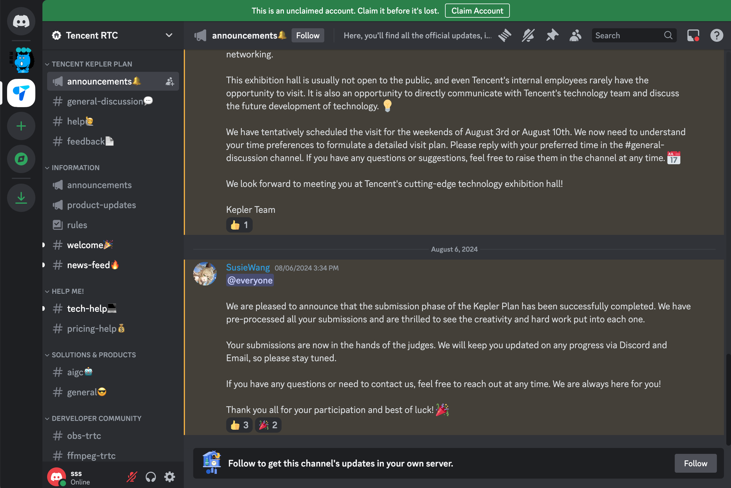
By customizing the
ConversationPreview layout, features, and style, we can quickly achieve a Discord-like effect.1. Customize the
ConversationListPreview 2. Switch theme to dark mode
import { UIKitProvider, ConversationList, ConversationPreviewUI } from '@tencentcloud/chat-uikit-react';type ConversationPreviewUIProps = Parameters<typeof ConversationPreviewUI>[0];const CustomConversationPreview = (props: ConversationPreviewUIProps) => {const { Title } = props;return (<ConversationPreviewUI {...props}><span> # </span><span>{Title}</span></ConversationPreviewUI>);};const App = () => {<UIKitProvider theme={'dark'}><ConversationListstyle={{ maxWidth: '300px', height: '600px' }}Preview={CustomConversationPreviewUI}/>...</UIKitProvider>}
.custom-preview-ui {height: 34px;border-radius: 6px;padding: 10px;margin: 0 10px;.custom-preview-ui__tag {margin-right: 10px;font-size: 16px;color: #b3b3b4;}.custom-preview-ui__title {font-size: 14px;color: #b3b3b4;}&.uikit-conversation-preview--active {background-color: #3b3d43;.custom-preview-ui__tag {color: #ffffff;}.custom-preview-ui__title {.uikit-conversation-preview__title {color: #ffffff;}}}}
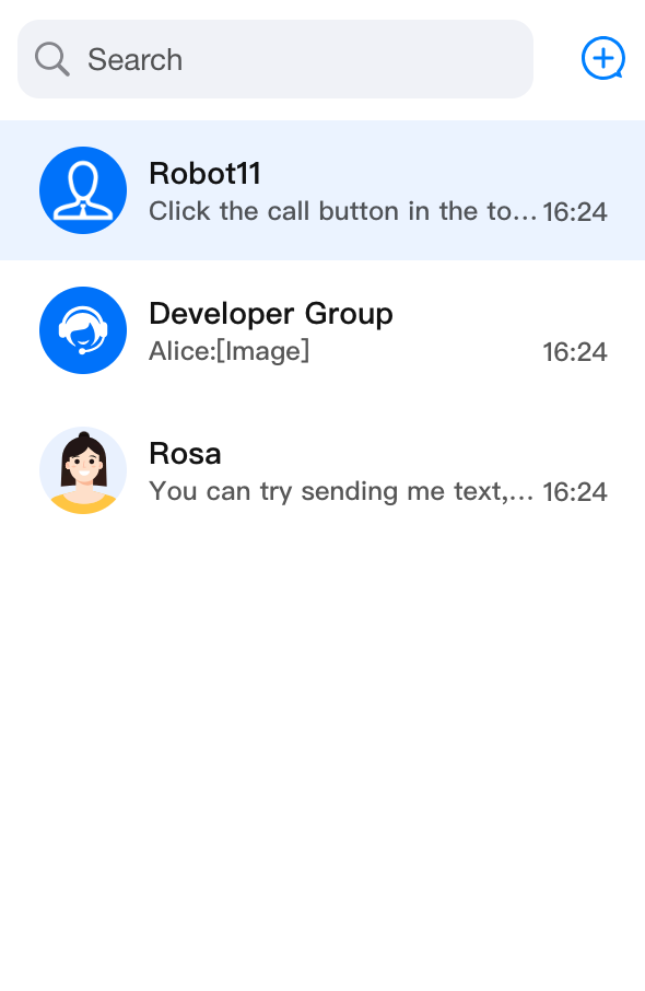
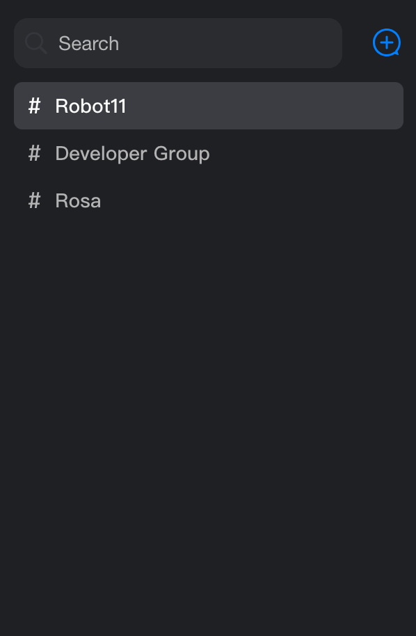
ConversationListPreview effect as follows after customization:Before Modification | Modified |
 |  |
피드백