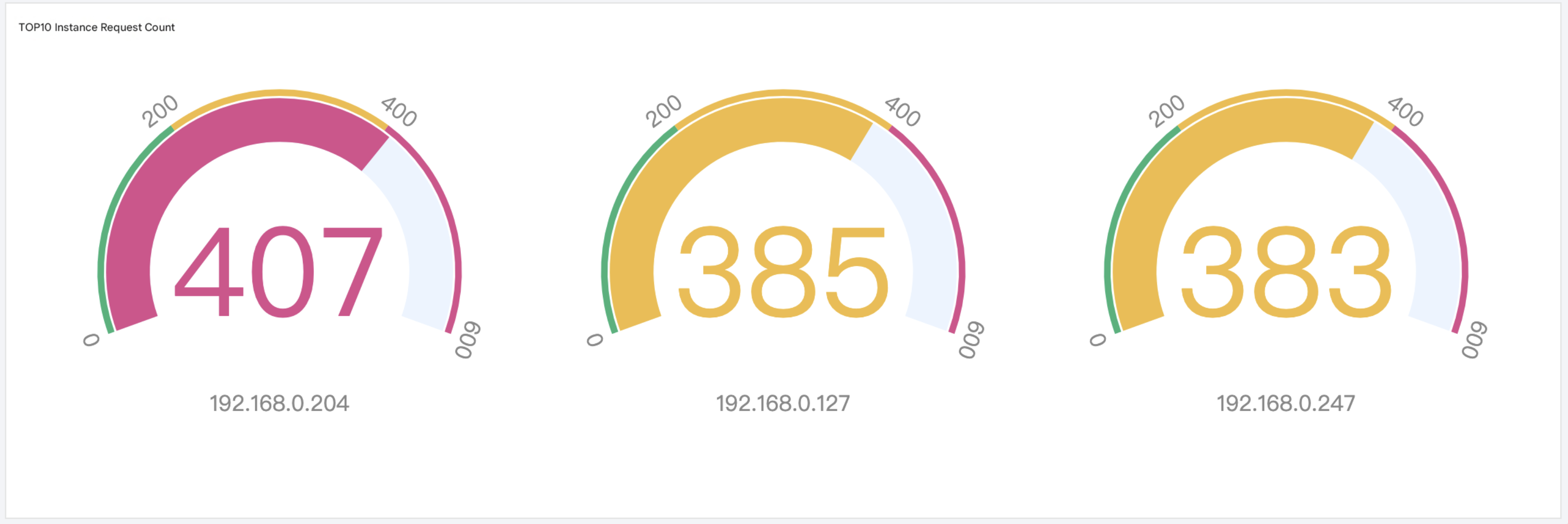
A gauge chart describes a single metric. Unlike an individual value plot, it is generally used with a threshold to measure the metric status. It is suitable for rating scenarios, such as system health monitoring.
Operation Steps
1. Log in to the CLS console, choose Dashboard > Dashboard List, and then select the dashboard you want to view.
2. Select the target dashboard to go to its view page, click Edit, and then enter the edit page.
3. Click Add Chart to create a chart, and select Gauge as the chart type.
4. Configure the chart as needed.
General configuration
Configuration Item
Description
Basic Info
Chart Name: Set the display name of the chart, which can be left empty.
Description: Set the description information of the chart, which can be left empty.
Numeric format
Set the unit of all metric-type fields in the chart. For more information, see Unit Configuration.
Statistical Analysis Fields
Select at least a metric field for a gauge chart. When a data mismatch occurs, you need to manually select the appropriate statistical analysis fields.
Configuration Item
Description
Dimension Field
Classification field. By default, fields with the string data type are selected. If no string field exists, you must manually specify a field.
Metric Field
Numerical field. By default, fields with the number data type are selected. If no number field exists, you must manually specify a field.
Gauge Chart
Configuration Item
Description
Chart Style
Show Threshold Scale: Display the configured threshold scale on the chart.
Metric Aggregation: This is an advanced feature. Select an aggregation method for metrics, aggregate the results of identical metrics, and then plot the chart (for example, if a metric returns a range value that contains metric results from multiple time points, first aggregate the sum of all time points and then plot the chart). By default, no aggregation is performed.
Maximum Display Quantity for Gauge: Set the maximum number of metrics to display. Any exceeding metrics will be hidden.
Color Scheme: Configure the display colors of the chart.
Threshold configuration
Configuration Item
Description
Threshold Configuration
Threshold Points: Set threshold points. You can add multiple threshold ranges. Click the color corresponding to a threshold to open the color palette and customize the color.
MAX/MIN: Control the maximum and minimum values on the gauge. Data outside the range will not be displayed on the chart.