Multi-Statement Charting Example
Baixar
Modo Foco
Tamanho da Fonte
Overview
Dashboard statistical charts support rendering data from multiple topics and statements, enabling cross-topic data association and calculation. It applies to scenarios requiring multi-statement, multi-topic data comparison display and cross-topic data association analysis.
Chart Type | Multi-Statement Charting | Default Display Logic |
Table | Supported. | Merge and display the results of multiple statements. |
Sequence diagram | Supported. | Merge and display the results of multiple statements. |
Pie chart | Supported. | Merge and display the results of multiple statements. |
Gauge | Supported. | Merge and display the results of multiple statements. |
Single value chart | Supported. | Select one metric from the results of multiple statements and display it. |
Funnel chart | Supported. | Merge and display the results of multiple statements. |
Bar chart | Supported. Statements are combined by JOIN. | Display the result after statements are combined by JOIN. If JOIN is not used, only the result of the first statement is displayed. |
Sankey diagram | Supported. Statements are combined by JOIN. | Display the result after statements are combined by JOIN. If JOIN is not used, only the result of the first statement is displayed. |
Map | Supported. Statements are combined by JOIN. | Display the result after statements are combined by JOIN. If JOIN is not used, only the result of the first statement is displayed. |
Word cloud | Supported. Statements are combined by JOIN. | Display the result after statements are combined by JOIN. If JOIN is not used, only the result of the first statement is displayed. |
Radar chart | Supported. Statements are combined by JOIN. | Display the result after statements are combined by JOIN. If JOIN is not used, only the result of the first statement is displayed. |
Heat map | Supported. Statements are combined by JOIN. | Display the result after statements are combined by JOIN. If JOIN is not used, only the result of the first statement is displayed. |
Topology | Supported. Statements are combined by JOIN. | Display the result after statements are combined by JOIN. If JOIN is not used, only the result of the first statement is displayed. |
Logs | Not supported. | / |
Example
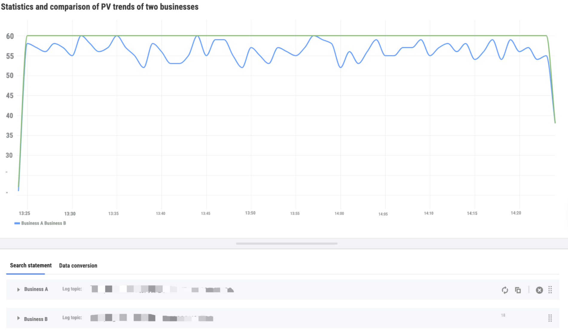
Currently, there are two business services, A and B. The access logs of both businesses are saved in log topics A and B, respectively. Statistical analysis is needed, as shown below.
Statistics and Comparison of PV Trends for Businesses A and B
Step 1: Add a chart on the dashboard. Select sequence diagram as the chart type, add query statements for the two log topics A and B, and input SQL query statements for their PV trends, respectively.
Statement for business A:
* | select histogram(__TIMESTAMP__,interval 1 minute) as time, count(*) as "PV" group by time order by time limit 10000
Statement for business B:
* | select histogram(__TIMESTAMP__,interval 1 minute) as time, count(*) as "PV" group by time order by time limit 10000
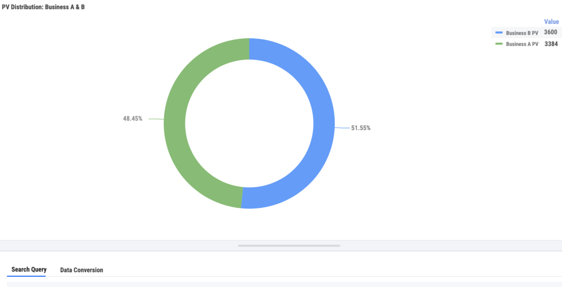
PV Distribution of Businesses A and B in the Total PV
Step 1: Add a chart on the dashboard, select the type as pie chart, add query statements for the two log topics A and B, and input the PV query statements respectively.
Statement for business A:
* | select count(*) as "PV"
Statement for business B:
* | select count(*) as "PV"
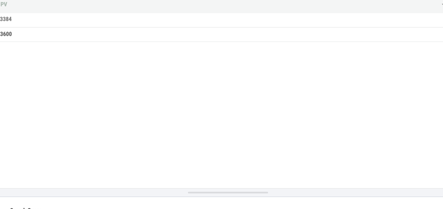
Total PV of Businesses A and B
Step 1: Add a chart on the dashboard, select single value chart as the type, add query statements for the two log topics A and B, and input the PV query statements respectively to get the PVs of the two businesses.
Statement for business A:
* | select count(*) as "PV"
Statement for business B:
* | select count(*) as "PV"
Step 2: Choose Add Data Conversion > JOIN Statement, and select Outer Join to merge PVs of the two businesses into one table.
Note:
JOIN is based on the same field name. Ensure the two metrics have the same name.
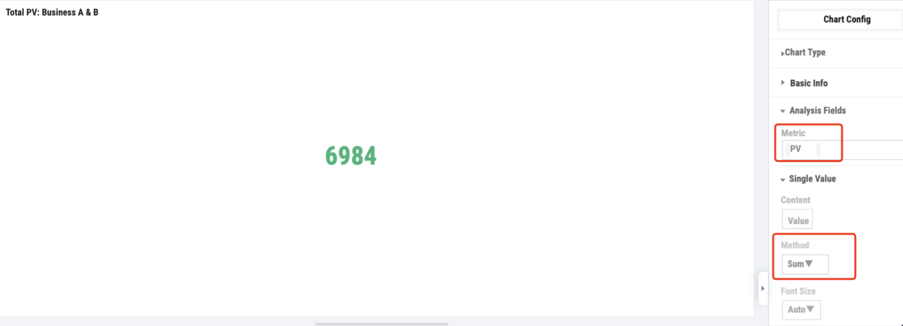
Step 3: Select PV as the statistical metric for the single value chart, set the statistical method to sum the PVs, and get the total PV for both businesses.
Request Error Count Distribution by server_name for All Businesses
Only business A has the server_name field, and business B does not have this field. Both businesses A and B have the server IP address field, which can be associated with server_name.
Step 1: Add a chart on the dashboard, select table as the type, and add query statements for the two log topics A and B.
Statement for business A, querying the request error count distribution for server_name and server IP address.
status>=400 | select server_name,server_addr as "serverIP",count(*) as "Request error count" group by server_name,server_addr limit 10000
Statement for business B, querying the request error count distribution for the server IP address.
status>=400 | select sys_address as "serverIP",count(*) as "Request error count" group by sys_address limit 10000
Step 2: Add data conversion, select Outer Join in the JOIN Statement section, and merge the two statements into one table.
Note:
JOIN is based on name same field name, serverIP.
Step 3: Choose Add Data Conversion > Column Calculation, and calculate the total request error count of business A and business B for each serverIP.
Step 4: Choose Add Data Conversion > Group Aggregation to regroup the data by server_name and calculate the error count distribution across all businesses by server_name.
Ajuda e Suporte
Esta página foi útil?
Você também pode entrar em contato com a Equipe de vendas ou Enviar um tíquete em caso de ajuda.
comentários