When using network-related APIs within the mini program, developers should be aware of the following steps and familiarize themselves with them in advance.
Server Domain Configuration
Each mini program necessitates the prior establishment of a communication domain. The mini program can only engage in network communication with the specified domain. This includes standard HTTPS requests (wx.request) and file uploads (wx.uploadFile).
Configuration Workflow
The server domain can be configured in the mini program backend > settings > development settings > server domain. Be mindful of the following during configuration:
Ports can be configured, such as https://miniApp.com:8080. But after configuration, requests can only be initiated to https://miniApp.com:8080. Any requests to URLs such as https://miniApp.com or https://miniApp.com:9091 will fail.
If a port is not configured, such as in https://miniApp.com, then the requested URL must not contain a port, not even the default port 443. Any requests to https://miniApp.com:443 will fail.
Network Request
Timeout period
Both the default and maximum timeout periods are set to 60 seconds.
The timeout period can be configured in the app.json file.
Use limits
The referer header of a network request cannot be set. Its format is fixed as https://appservice.wx.com/{appid}/{version}/page-frame.html,
where {appid} is the appid of the mini program, and {version} is the version number of the mini program. A version number of 0 indicates a development, trial, or review version, while 'devtools' indicates a developer tool, and any other value represents an official version.
The maximum concurrent limit for wx.request and wx.uploadFile is 10.
When the mini program enters backend operation, if the network request does not end within 5 seconds, an error message 'fail interrupted' will be returned. Prior to returning to the frontend, all network request interface calls will be unable to be invoked.
Code of return value
It is recommended that the server return values using
The mini program will automatically filter the BOM header (only one BOM header is filtered).
Callback Function
As long as a successful response is received from the server, regardless of the statusCode, the success callback will be triggered. Developers are advised to evaluate the return values based on their business logic.
FAQ
HTTPS certificate
The mini program must initiate network requests using HTTPS/WSS. During the request, the system will validate the HTTPS certificate used by the server domain. If the validation fails, the request cannot be successfully initiated. Due to system limitations, different platforms have varying degrees of strictness regarding certificate requirements. To ensure the compatibility of the mini program, developers are advised to configure certificates according to the highest standards and use relevant tools to check whether existing certificates meet the requirements.
The requirements for the certificate are as follows:
The HTTPS certificate must be valid;
The certificate must be trusted by the system, that is, the root certificate is built into the system.
The domain name of the website deploying the SSL certificate must be consistent with the domain name issued by the certificate.
The certificate must be within its validity period.
The trust chain of the certificate must be complete (requiring server configuration).
TLS must support version 1.2 and later versions. Some older Android models do not yet support TLS 1.2, so please ensure that the TLS version of the HTTPS server supports version 1.2 and earlier versions.
Some CAs may not be trusted by the operating system, so developers should pay attention to the relevant announcements of the mini program and various systems when choosing a certificate.
Note:
The validity of the certificate can be verified using the openssl s_client -connect example.com:443 command, or other online tools can be used.
In addition to the network request API, if other HTTPS requests in the mini program encounter anomalies, please follow the above process for inspection. For instance, if images over HTTPS cannot be loaded, or audio and video cannot be played, etc.
Bypass domain verification
Within the developer tools, you can temporarily enable the Do not verify request domain in development environment and TLS version and HTTPS certificate options to bypass server domain verification. At this point, server domain verification will not be performed in the developer tools and when debugging mode is activated on the phone.
Once the server domain configuration is successful, it is recommended that developers disable this option for development and conduct tests on various platforms to ensure the server domain configuration is correct.
Note:
If the phenomenon of "requests can be sent in debugging mode, but cannot be sent when debugging mode is off" appears on the phone, please ensure that domain verification has been bypassed, and confirm whether the server domain and certificate configuration are correct.
In case of a "internal server error", please try the following self-check methods: ①Switch browsers ②Refresh the webpage ③Investigate whether the file is placed in the correct server root directory. Troubleshooting method: Concatenate the URL according to the following rules and try to access it yourself to see if it is successful: https://m.da9c.cn/filename.
Storage
Each mini program can have its own local cache, which can be read, written, and cleared through wx.setStorage/qq.setStorageSync, wx.getStorage/wx.getStorageSync, qq.clearStorage/wx.clearStorageSync, wx.removeStorage/wx.removeStorageSync.
For the same user, the storage limit for the same mini program is 10 MB. Storage is isolated on a user basis, meaning that on the same device, User A cannot access User B's data.
Note:
In the event of insufficient user storage space, the application will clear the local cache of the mini program that has not been used for the longest time. Therefore, it is not recommended to store all critical information in the storage, to guard against situations of insufficient storage space or users changing devices.
Canvas
All drawing within the <canvas> must be accomplished using JavaScript:
WXML: In the following examples, unless otherwise stated, this WXML will be used as the template and will not be repeated.
JS: In the following examples, we will place the JS within the onLoad function.
const ctx = wx.createCanvasContext('myCanvas')
ctx.setFillStyle('red')
ctx.fillRect(10, 10, 150, 75)
ctx.draw()
Step 1: Create a canvas drawing context
Firstly, we need to create a Canvas drawing context, CanvasContext. CanvasContext is an inherent object within the mini program, equipped with several drawing methods:
const ctx = wx.createCanvasContext('myCanvas')
Step 2: Use the Canvas drawing context for illustration description
Next, we will describe what content to draw within the Canvas. Set the fill color of the drawing context to red:
ctx.setFillStyle('red')
Use the fillRect(x, y, width, height) method to draw a rectangle, filled with the previously set red color:
ctx.fillRect(10, 10, 150, 75)
Step 3: Draw
Inform the <canvas> component that you intend to apply the previously described illustration:
ctx.draw()
Coordinates
You can add some events within the <canvas> to observe its coordinate system:
<canvas
canvas-id="myCanvas"
style="margin: 5px; border:1px solid #d3d3d3;"
bindtouchstart="start"
bindtouchmove="move"
bindtouchend="end"
/>
<view hidden="{{hidden}}">
Coordinates: ({{x}}, {{y}})
</view>
Page({
data: {
x: 0,
y: 0,
hidden: true
},
start(e) {
this.setData({
hidden: false,
x: e.touches[0].x,
y: e.touches[0].y
})
},
move(e) {
this.setData({
x: e.touches[0].x,
y: e.touches[0].y
})
},
end(e) {
this.setData({
hidden: true
})
}
})
Upon placing your finger within the canvas, the coordinates of the touch point will be displayed below:
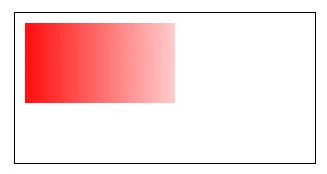
Gradient
Gradients can be used to fill a rectangle, circle, line, text, etc. The fill color need not be a fixed hue.
We offer two methods of color gradient:
createLinearGradient(x, y, x1, y1) generates a linear gradient.
createCircularGradient(x, y, r) creates a gradient originating from the center of the circle.
Upon creating a gradient object, it is imperative to add two color gradient points.
The addColorStop(position, color) method is used to designate the location and color of the color gradient point, with the position necessarily falling between 0 and 1.
The gradient can be set using the setFillStyle and setStrokeStyle methods, followed by a graphical description.
Customizing the tabBar allows developers to flexibly set the tabBar style, catering to a wider range of personalized scenarios.
Under custom tabBar mode
To ensure compatibility with older versions and distinguish which pages are tab pages, the related configuration items of the tabBar must be fully declared. However, these fields will not affect the rendering of the customized tabBar.
At this point, developers are required to provide a custom component to render the tabBar, with all tabBar styles rendered by this custom component. It is recommended to use the fixed <cover-view> + <cover-image> components at the bottom to render styles, ensuring a relatively higher tabBar hierarchy.
Interfaces related to tabBar style, such as wx.setTabBarItem, will become ineffective.
Each custom tabBar component instance under each tab page is unique. The current page's custom tabBar component instance can be obtained through the getTabBar interface under the custom component.
Note:
To implement the tab selection status, one must obtain the component instance through the getTabBar interface under the current page and call setData to update the selection status. See the example code in the Configuration Information section below.
Configuration Information
In the app.json file, specify the custom field in the tabBar item, while also completing the rest of the tabBar related configurations.
All tab pages' json must declare the usingComponents item, or it can be globally enabled in the app.json file.
Add an entry file in the root directory of the code:
custom-tab-bar/index.js
custom-tab-bar/index.json
custom-tab-bar/index.wxml
custom-tab-bar/index.wxss
Write tabBar code
Write using a custom component, which fully takes over the rendering of the tabBar. Additionally, the custom component introduces a new getTabBar interface, which can obtain the custom tabBar component instance under the current page.
Sample code:
// page/index/index.js
Page({
onShow:function(){
// Get the tabBar instance of the current page and set the selected state
if (typeof this.getTabBar === 'function' && this.getTabBar()) {


 Yes
Yes
 No
No
Was this page helpful?