Form Component
Download
Focus Mode
Font Size
button
Feature description:Button.
Parameter and description:
Property | Type | Valid values and description | Default value | Required | Description |
size | string | default: Default size mini: Small size | default | false | Button size. |
type | string | primary: Green default: White warn: Red | default | false | Button style type. |
plain | Boolean | - | false | false | Whether the button is hollow with a background color. |
disabled | Boolean | - | false | false | Whether the button is disabled. |
loading | Boolean | - | false | false | Whether to show a loading icon before the button name. |
form-type | string | submit: Submits the form reset: Resets the form | - | false | |
open-type | string | share: Triggers user forwarding, by default sharing to the channels configured in the superapp; you can also set the share-mode attribute to specify the sharing channel. getPhoneNumber (public cloud only): Gets the user’s phone number from the bindgetphonenumber callback getEmailAddress (public cloud only): Gets the user’s email address from the bindgetemailaddress callback getUserInfo: Gets user information from the bindgetuserinfo callback openSetting: Opens the authorization settings page feedback: Opens the Feedback page, where users can submit feedback and upload logs chooseAvatar (public cloud only): Gets the user’s profile photo from the bindchooseavatar callback | - | false | Superapp capabilities. |
hover-class | string | - | button-hover | false | Specifies the style class when the button is tapped. When hover-class="none"; is set, no tap effect is available. |
hover-start-time | Number | - | 20 | false | Time in milliseconds before the tap effect appears after pressing. |
hover-stay-time | number | - | 70 | false | Time in milliseconds the tap effect remains after the finger is released. |
lang | string | en: English zh_CN: Simplified Chinese zh_TW: Traditional Chinese | en | false | Specifies the language for returning user information. |
bindgetuserinfo | eventhandle | - | - | false | When this button is tapped, the acquired user information will be returned. The callback detail is consistent with that returned by wx.getUserInfo. Effective when open-type="getUserInfo". |
bindgetphonenumber | eventhandle | - | - | false | Callback for quick phone number verification, effective when open-type="getPhoneNumber".Note: After triggering the bindgetphonenumber callback, immediately hide the phone number button component or set it to disabled to avoid extra charges from repeated authorizations. |
bindopensetting | eventhandle | - | - | false | Callback after opening the authorization setting page. Effective when open-type=openSetting. |
Note:
Currently, a button with form-type will only be effective for the form within the current component. Therefore, encapsulating the button in a custom component and the form outside the custom component will make the form-type of the button invalid.
For buttons with the open-type set to share, if you specify multiple sharing channels using the share-mode attribute, the channels you set must be custom sharing channels configured in the superapp; otherwise, the specified channels will be invalid and won’t be displayed.
Example:
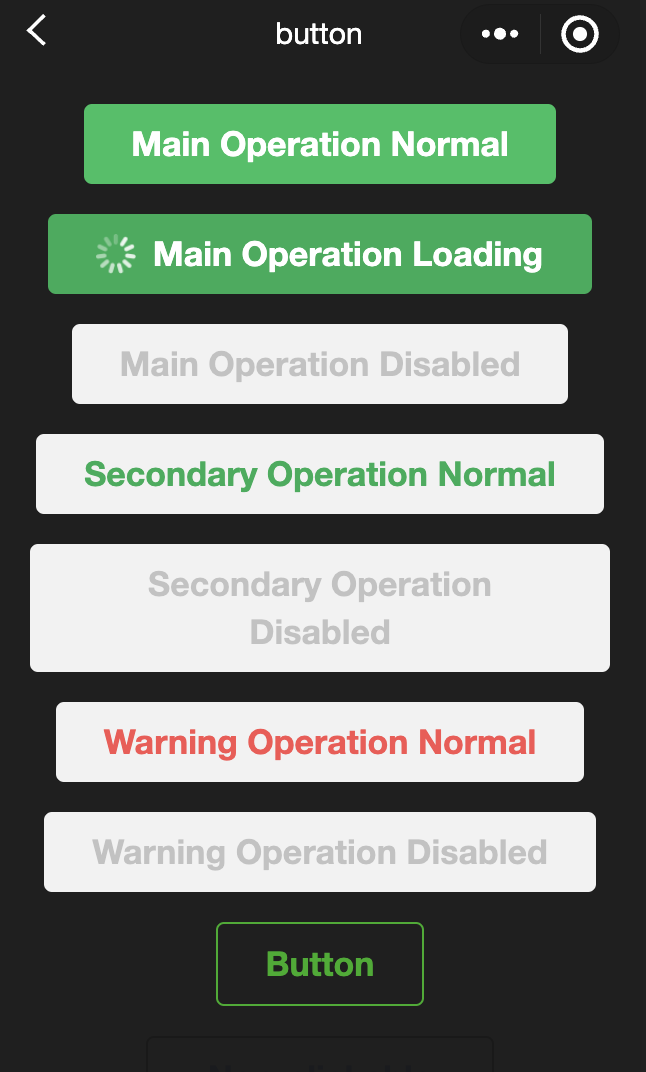
<view class="page-body"><view class="btn-area" id="buttonContainer"><button type="primary">Main Operation Normal</button><button type="primary" loading="true">Main Operation Loading</button><button type="primary" disabled="true">Main Operation Disabled</button><button type="default">Secondary Operation Normal</button><button type="default" disabled="true">Secondary Operation Disabled</button><button type="warn">Warning Operation Normal</button><button type="warn" disabled="true">Warning Operation Disabled</button><view class="button-sp-area"><button type="primary" plain="true">Button</button><button type="primary" disabled="true" plain="true">Disabled button</button><button type="default" plain="true">Button</button><button type="default" disabled="true" plain="true">Button</button><button class="mini-btn" type="primary" size="mini">Button</button><button class="mini-btn" type="default" size="mini">Button</button><button class="mini-btn" type="warn" size="mini">Button</button></view><button open-type="share">Share</button><button open-type="share" share-mode="{{shareMode}}">Share button</button></view></view>
const types = ['default', 'primary', 'warn']const pageObject = {data: {defaultSize: 'default',primarySize: 'default',warnSize: 'default',disabled: false,plain: false,loading: false,shareMode: ['whatsapp','twitter']},onShareAppMessage() {return {title: 'button',path: 'page/component/pages/button/button'}},setDisabled() {this.setData({disabled: !this.data.disabled})},setPlain() {this.setData({plain: !this.data.plain})},setLoading() {this.setData({loading: !this.data.loading})},handleContact(e) {console.log(e.detail)},handleGetPhoneNumber(e) {console.log(e.detail)},handleGetUserInfo(e) {console.log(e.detail)},handleOpenSetting(e) {console.log(e.detail.authSetting)},handleGetUserInfo(e) {console.log(e.detail.userInfo)}}for (let i = 0; i < types.length; ++i) {(function (type) {pageObject[type] = function () {const key = type + 'Size'const changedData = {}changedData[key] =this.data[key] === 'default' ? 'mini' : 'default'this.setData(changedData)}}(types[i]))}Page(pageObject)
button{margin-top: 30rpx;margin-bottom: 30rpx;}.button-sp-area{margin: 0 auto;width: 60%;}.mini-btn{margin-right: 10rpx;}
checkbox
Feature description:Checkbox.
Parameter and description:
Property | Type | Default value | Required | Description |
value | string | - | false | The checkbox identifier. When selected, it triggers the change event of the checkbox-group, and carries the checkbox's value. |
disabled | Boolean | false | false | Whether the checkbox is disabled. |
checked | Boolean | false | false | Whether the checkbox is currently selected. The checkbox can be set to selected by default. |
color | string | #09BB07 | false | Checkbox color, similar to the CSS color property. |
Example:
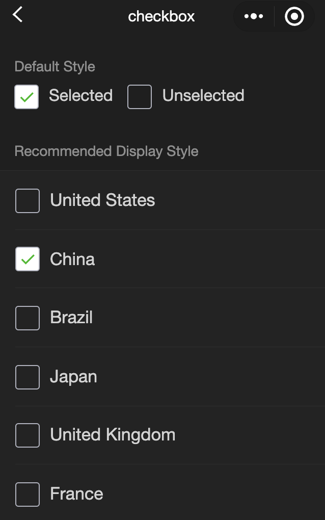
<view class="container"><view class="page-body"><view class="page-section page-section-gap"><view class="page-section-title">Default style</view><label class="checkbox"><checkbox value="cb" checked="true"/>Selected</label><label class="checkbox"><checkbox value="cb" />Unselected</label></view><view class="page-section"><view class="page-section-title">Recommended Display Style</view><view class="weui-cells weui-cells_after-title"><checkbox-group bindchange="checkboxChange"><label class="weui-cell weui-check__label" wx:for="{{items}}" wx:key="{{item.value}}"><view class="weui-cell__hd"><checkbox value="{{item.value}}" checked="{{item.checked}}"/></view><view class="weui-cell__bd">{{item.name}}</view></label></checkbox-group></view></view></view></view>
Page({onShareAppMessage() {return {title: 'checkbox',path: 'page/component/pages/checkbox/checkbox'}},data: {items: [{value: 'USA', name: 'United States'},{value: 'CHN', name: 'China', checked: 'true'},{value: 'BRA', name: 'Brazil'},{value: 'JPN', name: 'Japan'},{value: 'ENG', name: 'United Kingdom'},{value: 'FRA', name: 'France'}]},checkboxChange(e) {console.log('A change event is triggered in the checkbox, and the carried value is', e.detail.value)const items = this.data.itemsconst values = e.detail.valuefor (let i = 0, lenI = items.length; i < lenI; ++i) {items[i].checked = falsefor (let j = 0, lenJ = values.length; j < lenJ; ++j) {if (items[i].value === values[j]) {items[i].checked = truebreak}}}this.setData({items})}})
checkbox-group
Feature description:A multiple selection component, which consists of multiple checkbox.
Parameter and description:
Property | Type | Default value | Required | Description |
bindchange | eventhandle | - | false | When the selected items in the checkbox-group change, the change event is triggered, detail = {value:[array of selected checkbox values]}. |
editor
Feature description:A rich text editor that allows editing of images and text.
The editor can export content as
htmlandtext. Internally, it uses thedeltaformat for storage.When content is set via the
setContentsAPI, parsing the inserted html may result in errors due to illegal tags. It is recommended to use delta in the mini program.The rich text component includes basic styles to ensure proper content display, which can be overridden during development.
The configurations to the image controls are only effective if set during initialization.
Parameter and description:
Property | Type | Default value | Required | Description |
read-only | Boolean | false | false | Sets the editor to read-only. |
placeholder | string | - | false | Placeholder text. |
show-img-size | Boolean | false | false | Displays image size controls when an image is tapped. |
show-img-toolbar | Boolean | false | false | Displays toolbar controls when an image is tapped. |
show-img-resize | Boolean | false | false | Displays resize controls when an image is tapped. |
bindready | eventhandle | - | false | Triggered when the editor is initialized. |
bindfocus | eventhandle | - | false | Triggered when the editor gains focus. event.detail = {html, text, delta}. |
bindblur | eventhandle | - | false | Triggered when the editor loses focus, detail = {html, text, delta}. |
bindinput | eventhandle | - | false | Triggered when the editor content changes. detail = {html, text, delta}. |
bindstatuschange | eventhandle | - | false | Triggered when the editor's internal style is changed via Context methods. Returns the styles set in the selection. |
The editor supports some
htmlfile tags and inline styles, but it does not supportclassand idSupported tags
Tags that do not meet the requirements are ignored, for example, the
<div>will be converted to <p>for storage.Type | Node |
Inline elements | <span> <strong> <b> <ins> <em> <i> <u> <a> <del> <s> <sub> <sup> <img> |
Block-level elements | <p> <h1> <h2> <h3> <h4> <h5> <h6> <hr> <ol> <ul> <li> |
Supported inline styles
Inline styles can only be applied to inline elements or block elements, but not both simultaneously. For example,
font-size is classified as an inline element, and it is ineffective when setting on theptag.Type | Style |
Block-level styles | text-align , direction , margin , margin-top , margin-left , margin-right , margin-bottompadding , padding-top , padding-left , padding-right , padding-bottom , line-height , text-indent |
Inline styles | font , font-size , font-style , font-variant , font-weight , font-family , letter-spacing , text-decoration , color , background-color |
Note:
Event bindings in the inserted HTML will be removed.
When pasting, only the plain text content will be copied into the editor.
When inserting HTML into the editor, some unnecessary tags will be deleted to ensure the consistency of the content. For example<p><span>xxx</span></p> will be rewritten as <p>xxx</p>>.
The page will be pushed up when the editor gains focus to ensure the editing area is visible, which is a system behavior.
form
Feature description:A form, which submits user input from components like slider, picker, checkbox, radio, switch, input entered by users in the component.
When a user taps the button component where the form-type is set to submit in the form, the values of the form component will be submitted. Each form component should have a name attribute to serve as the key.
Parameter and description:
Property | Type | Default value | Required | Description |
bindsubmit | eventhandle | - | false | A submit event is triggered when the form is submitted, carrying the data from the form. event.detail = {value : {'name': 'value'} , formId: ''} |
bindreset | eventhandle | - | false | A reset event is triggered when the form is reset. |
Example:
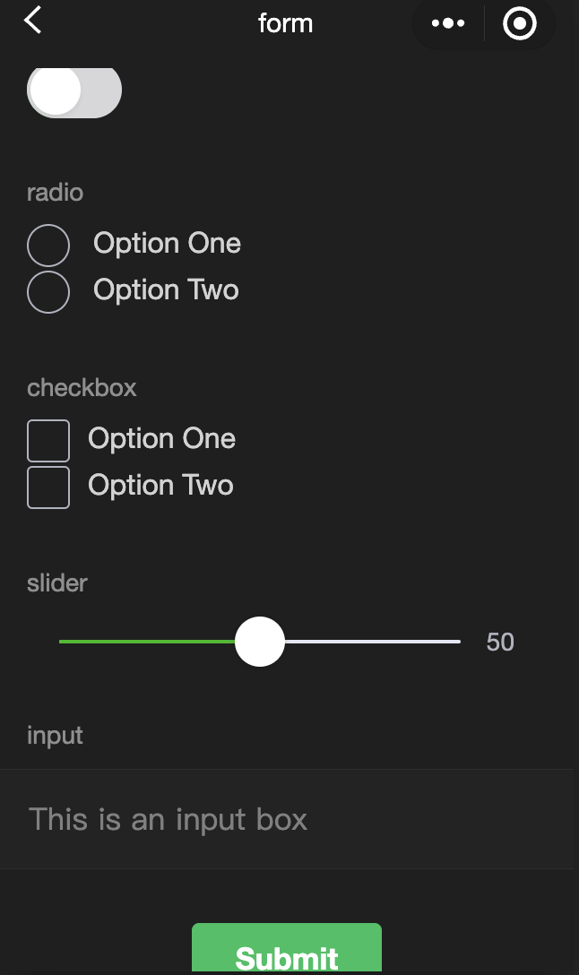
<view class="container"><view class="page-body"><form catchsubmit="formSubmit" catchreset="formReset"><view class="page-section page-section-gap"><view class="page-section-title">switch</view><switch name="switch"/></view><view class="page-section page-section-gap"><view class="page-section-title">radio</view><radio-group name="radio"><label><radio value="radio1"/>Option One</label><label><radio value="radio2"/>Option Two</label></radio-group></view><view class="page-section page-section-gap"><view class="page-section-title">checkbox</view><checkbox-group name="checkbox"><label><checkbox value="checkbox1"/>Option One</label><label><checkbox value="checkbox2"/>Option Two</label></checkbox-group></view><view class="page-section page-section-gap"><view class="page-section-title">slider</view><slider value="50" name="slider" show-value ></slider></view><view class="page-section"><view class="page-section-title">input</view><view class="weui-cells weui-cells_after-title"><view class="weui-cell weui-cell_input"><view class="weui-cell__bd" style="margin: 30rpx 0" ><input class="weui-input" name="input" placeholder="This is an input box" /></view></view></view></view><view class="btn-area"><button style="margin: 30rpx 0" type="primary" formType="submit">Submit</button><button style="margin: 30rpx 0" formType="reset">Reset</button></view></form></view></view>
Page({onShareAppMessage() {return {title: 'form',path: 'page/component/pages/form/form'}},data: {pickerHidden: true,chosen: ''},pickerConfirm(e) {this.setData({pickerHidden: true})this.setData({chosen: e.detail.value})},pickerCancel() {this.setData({pickerHidden: true})},pickerShow() {this.setData({pickerHidden: false})},formSubmit(e) {console.log('The form has triggered a submit event, carrying the following data: ', e.detail.value)},formReset(e) {console.log('The form has triggered a submit event, carrying the following data: ', e.detail.value)this.setData({chosen: ''})}})
input
Feature description:An input field. This component is a native component, and there are some restrictions for using it.
Parameter and description:
Property | Type | Valid values and description | Default value | Required | Description |
value | string | - | - | true | Initial content of the input field. |
type | string | text: Text input keyboard number: Numeric input keyboard idcard: ID number input keyboard digit: Numeric keyboard with a decimal point nickname (public cloud only): Nickname input keyboard | text | false | Input type. |
password | Boolean | - | false | false | Specifies whether the input is a password. |
placeholder | string | - | | true | Placeholder text when the input field is empty. |
placeholder-style | string | - | - | true | Specifies the placeholder style. |
placeholder-class | string | - | input-placeholder | false | Specifies the placeholder style class. |
disabled | Boolean | - | false | false | Whether the checkbox is disabled. |
maxlength | number | - | 140 | false | Maximum input length. Set to -1 for no limit. |
cursor-spacing | number | - | 0 | false | Distance between the cursor and the keyboard. The minimum value between the input's bottom distance and cursor-spacing is used. |
auto-focus | Boolean | - | false | false | (Deprecated, use focus instead) Automatically focuses and brings up the keyboard |
focus | Boolean | - | false | false | Specifies whether to get the focus. |
confirm-type | string | send: Sets the button in the bottom-right corner to "Send" search: Sets the button in the bottom-right corner to "Search" next: Sets the button in the bottom-right corner to "Next" go: Sets the button in the bottom-right corner to "Go" done: Sets the button in the bottom-right corner to "Done" | done | false | Sets the text of the button in the bottom-right corner of the keyboard. Effective only when type='text'. |
confirm-hold | Boolean | - | false | false | Whether to keep the keyboard open when the button in the bottom-right corner is tapped. |
cursor | number | - | - | true | Specifies the position of the cursor when the input field gets focus. |
selection-start | number | - | -1 | false | Start position of the selection, effective when auto-focusing, should be used with selection-end. |
selection-end | number | - | -1 | false | End position of the selection, effective when auto-focusing, should be used with selection-start. |
adjust-position | Boolean | - | true | false | Whether to automatically adjust the page position when the keyboard pops up. |
hold-keyboard | Boolean | - | false | false | Whether to keep the keyboard open when tapping on the page. |
bindinput | eventhandle | - | - | true | Triggered when the keyboard input occurs. event.detail = {value, cursor, keyCode}. The handler can return a string to replace the input field content. |
bindfocus | eventhandle | - | - | true | Triggered when the input field gets focus. event.detail = { value, height }, where height is the keyboard height. |
bindblur | eventhandle | - | - | true | Triggered when the input box loses focus, event.detail = { value, encryptedValue, encryptError }. |
bindconfirm | eventhandle | - | - | true | Triggered when the user taps the Confirm button, event.detail = { value }. |
bindkeyboardheightchange | eventhandle | - | - | true | Triggered when the keyboard height changes, event.detail = {height: height, duration: duration} |
Note:
The final behavior of confirm-type depends on the implementation of the mobile input method itself. Some Android system input methods and third-party input methods may not support or fully support it.
The input component is a native component, and the font is the system font, so font-family cannot be set.
Avoid using CSS animations during the input focus period.
If the input is wrapped in a custom component and the form is outside of this custom component, the form will not be able to retrieve the value of the input within the custom component.
When the keyboard height changes, the keyboardheightchange event may be triggered multiple times. Developers should ignore events with the same height value to avoid redundant processing.
Example:
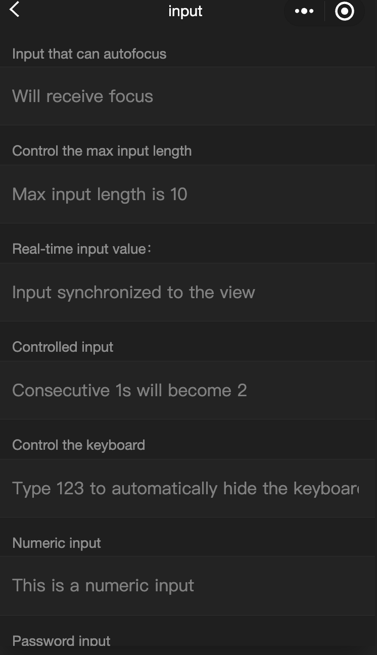
<view class="page-body"><view class="page-section"><view class="weui-cells__title">Inputs that can autofocus</view><view class="weui-cells weui-cells_after-title"><view class="weui-cell weui-cell_input"><input class="weui-input" auto-focus placeholder="Will receive focus"/></view></view></view><view class="page-section"><view class="weui-cells__title">Control the max input length</view><view class="weui-cells weui-cells_after-title"><view class="weui-cell weui-cell_input"><input class="weui-input" maxlength="10" placeholder="Max input length is 10" /></view></view></view><view class="page-section"><view class="weui-cells__title">Real-time input value: {{inputValue}}</view><view class="weui-cells weui-cells_after-title"><view class="weui-cell weui-cell_input"><input class="weui-input" maxlength="10" bindinput="bindKeyInput" placeholder="Input synchronized to the view"/></view></view></view><view class="page-section"><view class="weui-cells__title">Controlled input</view><view class="weui-cells weui-cells_after-title"><view class="weui-cell weui-cell_input"><input class="weui-input" bindinput="bindReplaceInput" placeholder="Consecutive 1s will become 2" /></view></view></view><view class="page-section"><view class="weui-cells__title">Control the keyboard</view><view class="weui-cells weui-cells_after-title"><view class="weui-cell weui-cell_input"><input class="weui-input" bindinput="bindHideKeyboard" placeholder="Type 123 to automatically hide the keyboard" /></view></view></view><view class="page-section"><view class="weui-cells__title">Numeric input</view><view class="weui-cells weui-cells_after-title"><view class="weui-cell weui-cell_input"><input class="weui-input" type="number" placeholder="This is a numeric input" /></view></view></view><view class="page-section"><view class="weui-cells__title">Passport input</view><view class="weui-cells weui-cells_after-title"><view class="weui-cell weui-cell_input"><input class="weui-input" password type="text" placeholder="This is an password input box" /></view></view></view><view class="page-section"><view class="weui-cells__title">Input with a decimal point</view><view class="weui-cells weui-cells_after-title"><view class="weui-cell weui-cell_input"><input class="weui-input" type="digit" placeholder="Numeric keyboard with a decimal point"/></view></view></view><view class="page-section"><view class="weui-cells__title">ID card input</view><view class="weui-cells weui-cells_after-title"><view class="weui-cell weui-cell_input"><input class="weui-input" type="idcard" placeholder="ID card keyboard" /></view></view></view><view class="page-section"><view class="weui-cells__title">Control placeholder color</view><view class="weui-cells weui-cells_after-title"><view class="weui-cell weui-cell_input"><input class="weui-input" placeholder-style="color:#F76260" placeholder="Placeholder font is red" /></view></view></view></view>
Page({data: {focus: false,inputValue: ''},bindKeyInput: function (e) {this.setData({inputValue: e.detail.value})},bindReplaceInput: function (e) {var value = e.detail.valuevar pos = e.detail.cursorvar leftif (pos !== -1) {// The cursor is in the middleleft = e.detail.value.slice(0, pos)// Calculate the cursor positionpos = left.replace(/11/g, '2').length}// Return an object to filter the input and control the cursor positionreturn {value: value.replace(/11/g, '2'),cursor: pos}// Alternatively, return a string with the cursor at the end// return value.replace(/11/g,'2'),},bindHideKeyboard: function (e) {if (e.detail.value === '123') {// Hide the keyboardwx.hideKeyboard()}}})
label
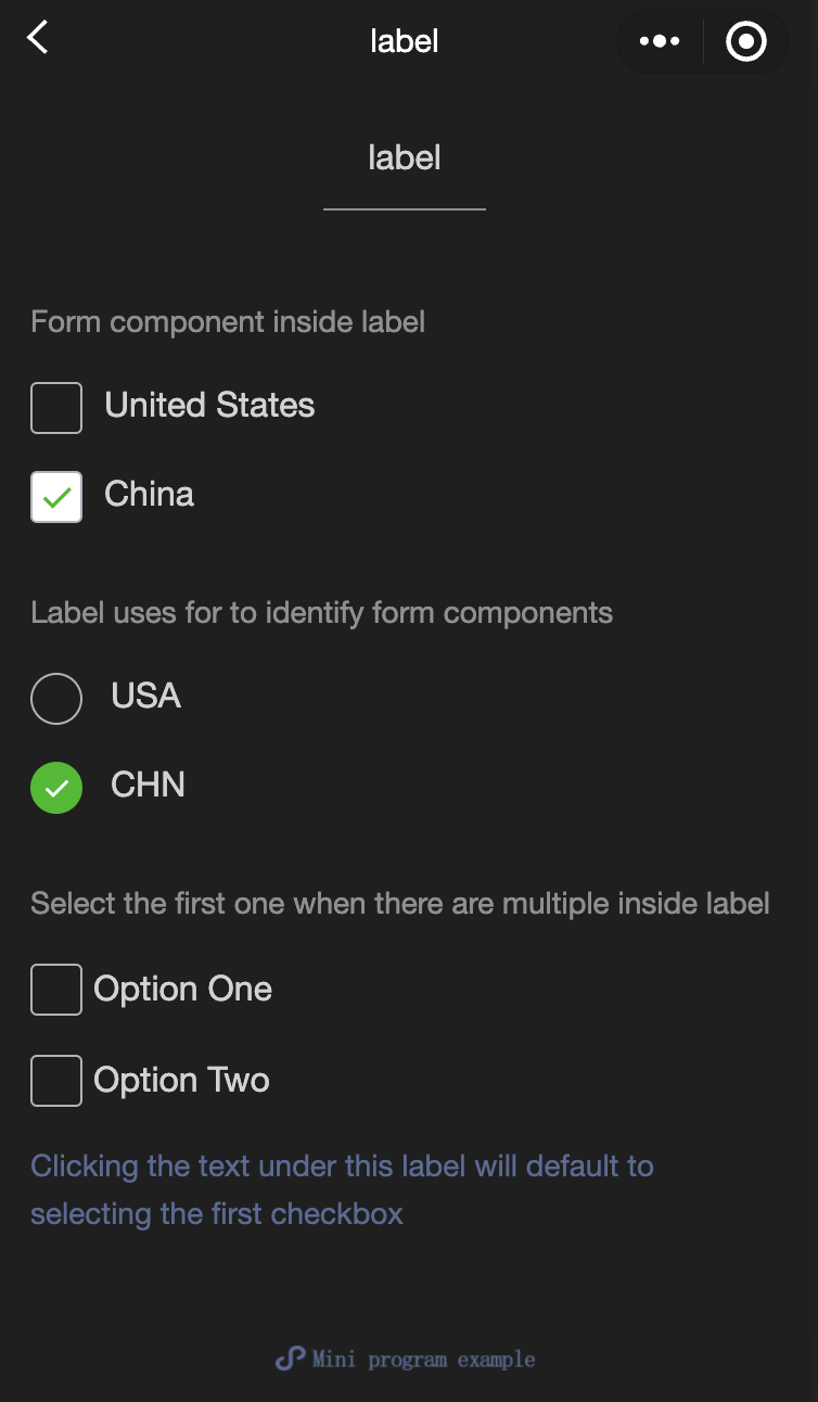
Feature description:This component is used to improve the usability of form components.
Use the for property to find the corresponding id, or place the control under the label. When tapping, the corresponding control will be triggered. The for property has a higher priority than internal controls. When there are multiple internal controls, the first control is triggered by default. Currently, the following controls can be bound:button, checkbox, radio, switch, input.
Parameter and description:
Property | Type | Default value | Required | Description |
for | string | - | false | The ID of the bound control. |
Example:
<view class="container"><view class="page-body"><view class="page-section page-section-gap"><view class="page-section-title">Form component inside label</view><checkbox-group class="group" bindchange="checkboxChange"><view class="label-1" wx:for="{{checkboxItems}}"><label><checkbox value="{{item.name}}" checked="{{item.checked}}"></checkbox><text class="label-1-text">{{item.value}}</text></label></view></checkbox-group></view><view class="page-section page-section-gap"><view class="page-section-title">Label uses for to identify form components</view><radio-group class="group" bindchange="radioChange"><view class="label-2" wx:for="{{radioItems}}"><radio id="{{item.name}}" value="{{item.name}}" checked="{{item.checked}}"></radio><label class="label-2-text" for="{{item.name}}"><text>{{item.name}}</text></label></view></radio-group></view><view class="page-section page-section-gap"><view class="page-section-title">Select the first one when there are multiple inside labels</view><label class="label-3"><checkbox class="checkbox-3">Option One</checkbox><checkbox class="checkbox-3">Option Two</checkbox><view class="label-3-text">Checking the text under this label will default to selecting the first checkbox</view></label></view></view></view>
Page({onShareAppMessage() {return {title: 'label',path: 'page/component/pages/label/label'}},data: {checkboxItems: [{name: 'USA', value: 'United States'},{name: 'CHN', value: 'China', checked: 'true'}],radioItems: [{name: 'USA', value: 'United States'},{name: 'CHN', value: 'China', checked: 'true'}],hidden: false},checkboxChange(e) {const checked = e.detail.valueconst changed = {}for (let i = 0; i < this.data.checkboxItems.length; i++) {if (checked.indexOf(this.data.checkboxItems[i].name) !== -1) {changed['checkboxItems[' + i + '].checked'] = true} else {changed['checkboxItems[' + i + '].checked'] = false}}this.setData(changed)},radioChange(e) {const checked = e.detail.valueconst changed = {}for (let i = 0; i < this.data.radioItems.length; i++) {if (checked.indexOf(this.data.radioItems[i].name) !== -1) {changed['radioItems[' + i + '].checked'] = true} else {changed['radioItems[' + i + '].checked'] = false}}this.setData(changed)},tapEvent() {console.log('the button is tapped')}})
.label-1, .label-2{margin: 30rpx 0;}.label-3-text{color: #576B95;font-size: 28rpx;}.checkbox-3{display: block;margin: 30rpx 0;}
picker
Feature description:A scroll picker that pops up from the bottom.
Parameter and description:
Property | Type | Valid values and description | Default value | Required | Description |
mode | string | selector: Normal picker multiSelector: Multi-column picker time: Time picker date: Date picker region: Region picker | selector | false | Type of the picker. |
disabled | Boolean | - | false | false | Whether the checkbox is disabled. |
bindcancel | eventhandle | - | - | false | Triggered when selection is canceled. |
In addition to the common properties above, the
pickerhas different properties for different modes. Normal picker: mode = selector
Property | Type | Default value | Description |
range | array/object array | [] | Effective when mode is selector or multiSelector. |
range-key | string | - | When range is an object array, specifies the key in the Object Array to display as the content of the picker. |
value | number | 0 | Specifies which one in the range is selected (index starts from 0). |
bindchange | eventhandle | - | The change event is triggered when value changes, event.detail = {value}. |
Multi-column picker: mode = multiSelector
Property | Type | Default value | Description |
range | array/object array | [] | Effective when mode is selector or multiSelector. |
range-key | string | - | When range is an object array, specifies the key in the Object Array to display as the content of the picker. |
value | array | [] | Specifies which one in the range is selected (index starts from 0). |
bindchange | eventhandle | - | The change event is triggered when value changes, event.detail = {value}. |
bindcolumnchange | eventhandle | - | Triggered when the column changes. |
Time picker: mode = time
Property | Type | Default value | Description |
value | string | - | Indicates the selected time, format is "hh:mm". |
start | string | - | Indicates the start of the valid time range, format is "hh:mm". |
end | string | - | Indicates the end of the valid time range, format is "hh:mm". |
bindchange | eventhandle | - | The change event is triggered when value changes, event.detail = {value}. |
Date picker: mode = date
Property | Type | Valid values | Default value | Description |
value | string | - | Current day | Specifies the selected date in YYYY-MM-DD format. |
start | string | - | - | Indicates the start of the valid date range, format is "YYYY-MM-DD". |
end | string | - | - | Indicates the end of the valid date range, format is "YYYY-MM-DD". |
fields | string | year: Year month: Month day: Day | day | Indicates the granularity of the picker. |
bindchange | eventhandle | - | - | The change event is triggered when value changes, event.detail = {value}. |
Region picker: mode = region
Property | Type | Default value | Description |
value | Array | [] | Specifies the selected regions. The first value in each column is selected by default. |
custom-item | string | - | Adds a custom item at the top of each column. |
bindchange | evenhandle | - | The change event is triggered when value changes, event.detail = {value: value, code: code, postcode: postcode}, where the code field is the statistical division code and postcode is the postal code. |
Example:
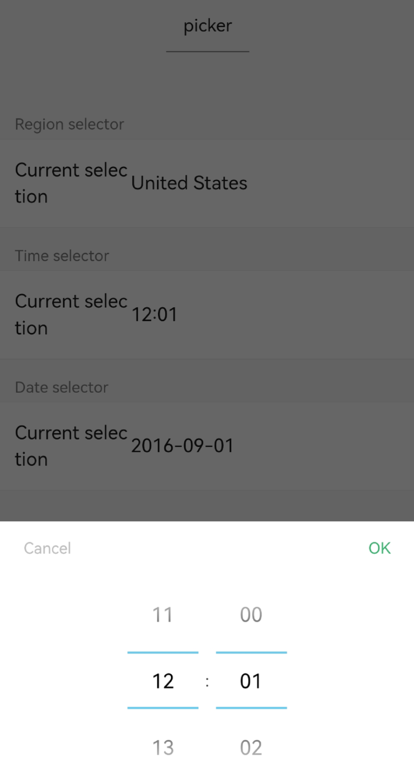
<view class="section"><view class="section__title">Picker</view><picker bindchange="bindPickerChange" value="{{index}}" range="{{array}}"><view class="picker">Current selection: {{array[index]}}</view></picker></view><view class="section"><view class="section__title">Multi-column picker</view><picker mode="multiSelector" bindchange="bindMultiPickerChange" bindcolumnchange="bindMultiPickerColumnChange" value="{{multiIndex}}" range="{{multiArray}}"><view class="picker">Current selection: {{multiArray[0][multiIndex[0]]}}, {{multiArray[1][multiIndex[1]]}}, {{multiArray[2][multiIndex[2]]}}</view></picker></view><view class="section"><view class="section__title">Time selector</view><picker mode="time" value="{{time}}" start="09:01" end="21:01" bindchange="bindTimeChange"><view class="picker">Current selection: {{time}}</view></picker></view><view class="section"><view class="section__title">Date selector</view><picker mode="date" value="{{date}}" start="2015-09-01" end="2017-09-01" bindchange="bindDateChange"><view class="picker">Current selection: {{date}}</view></picker></view><view class="section"><view class="section__title">Region selector</view><picker mode="region" bindchange="bindRegionChange" value="{{region}}" custom-item="{{customItem}}"><view class="picker">Current selection: {{region[0]}}, {{region[1]}}, {{region[2]}}</view></picker></view>
Page({data: {array: ['United States', 'China', 'Brazil', 'Japan'],objectArray: [{id: 0,name: 'United States'},{id: 1,name: 'China'},{id: 2,name: 'Brazil'},{id: 3,name: 'Japan'}],index: 0,multiArray: [['Invertebrates', 'Vertebrates'], ['Flatworms', 'Nematodes', 'Annelids', 'Mollusks', 'Arthropods'], ['Pork tapeworms', 'Blood-sucking worms']],objectMultiArray: [[{id: 0,name: 'Invertebrates'},{id: 1,name: 'Vertebrates'}], [{id: 0,name: 'Flatworms'},{id: 1,name: 'Nematodes'},{id: 2,name: 'Annelids'},{id: 3,name: 'Mollusks'},{id: 4,name: 'Arthropods'}], [{id: 0,name: 'Pork tapeworms'},{id: 1,name: 'Blood-sucking worms'}]],multiIndex: [0, 0, 0],date: '2016-09-01',time: '12:01',region: ['Guangdong Province', 'Guangzhou', 'Haizhu District'],customItem: 'All'},bindPickerChange: function(e) {console.log('Picker selection changed, carrying value: ', e.detail.value)this.setData({index: e.detail.value})},bindMultiPickerChange: function (e) {console.log('Picker selection changed, carrying value: ', e.detail.value)this.setData({multiIndex: e.detail.value})},bindMultiPickerColumnChange: function (e) {console.log('The modified column is', e.detail.column, ', and the value is', e.detail.value);var data = {multiArray: this.data.multiArray,multiIndex: this.data.multiIndex};data.multiIndex[e.detail.column] = e.detail.value;switch (e.detail.column) {case 0:switch (data.multiIndex[0]) {case 0:data.multiArray[1] = ['Flatworms', 'Nematodes', 'Annelids', 'Mollusks', 'Arthropods'];data.multiArray[2] = ['Pork tapeworms', 'Blood-sucking worms'];break;case 1:data.multiArray[1] = ['Fish', ''Amphibians', 'Reptiles'];data.multiArray[2] = ['Carassius auratus', 'Hairtail'];break;}data.multiIndex[1] = 0;data.multiIndex[2] = 0;break;case 1:switch (data.multiIndex[0]) {case 0:switch (data.multiIndex[1]) {case 0:data.multiArray[2] = ['Pork tapeworms', 'Blood-sucking worms'];break;case 1:data.multiArray[2] = ['Roundworms'];break;case 2:data.multiArray[2] = ['Ants', 'Leech'];break;case 3:data.multiArray[2] = ['Mussels', 'Snails', 'Slugs'];break;case 4:data.multiArray[2] = ['Insects', 'Crustaceans', 'Arachnids', 'Myriapods'];break;}break;case 1:switch (data.multiIndex[1]) {case 0:data.multiArray[2] = ['Carassius auratus', 'Hairtail'];break;case 1:data.multiArray[2] = [''Frogs', 'Giant salamanders'];break;case 2:data.multiArray[2] = ['Lizards', 'Turtles', 'Geckos'];break;}break;}data.multiIndex[2] = 0;break;}console.log(data.multiIndex);this.setData(data);},bindDateChange: function(e) {console.log('Picker selection changed, carrying value: ', e.detail.value)this.setData({date: e.detail.value})},bindTimeChange: function(e) {console.log('Picker selection changed, carrying value: ', e.detail.value)this.setData({time: e.detail.value})},bindRegionChange: function (e) {console.log('Picker selection changed, carrying value: ', e.detail.value)this.setData({region: e.detail.value})}})
picker-view
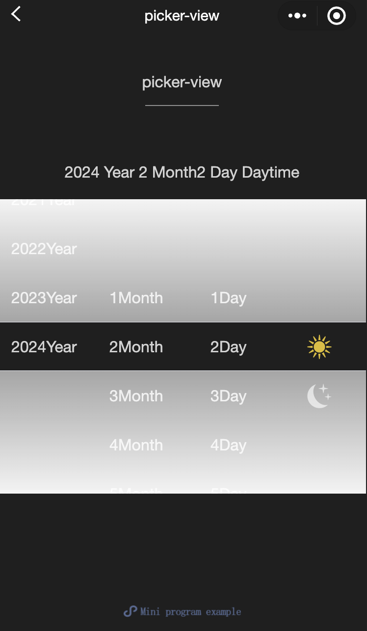
Feature description:An embedded scroll picker for the page. Onlypicker-view-columncomponent can be placed, and other nodes will not be displayed.
Parameter and description:
Property | Type | Default value | Required | Description |
value | Array.<number> | - | false | The numbers in the array represent the selected item in each picker-view-column (index starts from 0). If the number exceeds the length of the options, the last item is selected. |
mask-class | string | - | false | Sets the class name for the mask layer. |
indicator-style | string | - | false | Sets the style of the selected box in the picker. |
bindchange | eventhandle | - | false | The change event is triggered when scrolling selection changes, event.detail = {value}; value is an array indicating the current selection in each picker-view-column (index starts from 0). |
bindpickstart | eventhandle | - | false | The event is triggered when scrolling selection starts. |
bindpickend | eventhandle | - | false | The event is triggered when scrolling selection ends. |
indicator-class | string | - | false | Sets the class name of the selected box in the picker. |
mask-style | string | - | false | Sets the style of the mask layer. |
immediate-change | Boolean | false | false | Whether to trigger the change event immediately when the finger is released. If not enabled, the change event will be triggered after the scrolling animation ends. |
Example:
<view class="container"><view class="page-body"><view class="selected-date">{{year}} Year {{month}} Month {{day}} Day {{isDaytime ?</view> "Day" : "Night"}}</view><picker-view indicator-style="height: 50px;" style="width: 100%; height: 300px;" value="{{value}}" bindchange="bindChange"><picker-view-column><view wx:for="{{years}}" wx:key="{{years}}" style="line-height: 50px; text-align: center; ">{{item}} Year</picker-view-column><picker-view-column><view wx:for="{{months}}" wx:key="{{months}}" style="line-height: 50px; text-align: center; ">{{item}} Month</picker-view-column><picker-view-column><view wx:for="{{days}}" wx:key="{{days}}" style="line-height: 50px; text-align: center; ">{{item}} Day</picker-view-column><picker-view-column><view class="icon-container"><image class="picker-icon" src="../lib/daytime.png" /></view><view class="icon-container"><image class="picker-icon" src="../lib/night.png" /></view></picker-view-column></picker-view></view></view>
const date = new Date()const years = []const months = []const days = []for (let i = 1990; i <= date.getFullYear(); i++) {years.push(i)}for (let i = 1; i <= 12; i++) {months.push(i)}for (let i = 1; i <= 31; i++) {days.push(i)}Page({onShareAppMessage() {return {title: 'picker-view',path: 'page/component/pages/picker-view/picker-view'}},data: {years,year: date.getFullYear(),months,month: 2,days,day: 2,value: [9999, 1, 1],isDaytime: true,},bindChange(e) {const val = e.detail.valuethis.setData({year: this.data.years[val[0]],month: this.data.months[val[1]],day: this.data.days[val[2]],isDaytime: !val[3]})}})
picker-view-column
Feature description:A sub-item of the scroll picker. This component can only be placed inpicker-view, and the height of its child nodes will be automatically match the height of the selection box inpicker-view's selection box.
radio
Feature description:A single selection item.
Parameter and description
Property | Type | Default value | Required | Description |
value | string | - | false | Identifier of the radio. When the radio is selected, the change event ofradio-group is triggered and the radio value will be carried. |
checked | Boolean | false | false | Whether the radio is selected. |
disabled | Boolean | false | false | Whether the checkbox is disabled. |
color | string | #09BB07 | false | The color of the radio, similar to the CSS color property. |
Example:
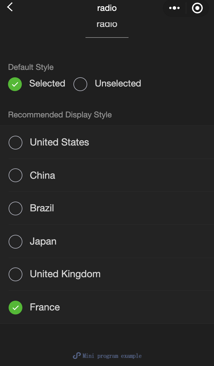
<view class="page-body"><view class="page-section"><view class="page-section-title">Default Style</view><label class="radio"><radio value="r1" checked="true"/>Selected</label><label class="radio"><radio value="r2" />Unselected</label></view><view class="page-section"><view class="page-section-title">Recommended Display Style</view><view class="weui-cells weui-cells_after-title"><radio-group bindchange="radioChange"><label class="weui-cell weui-check__label" wx:for="{{items}}" wx:key="{{item.value}}"><view class="weui-cell__hd"><radio value="{{item.value}}" checked="true"/></view><view class="weui-cell__bd">{{item.name}}</view></label></radio-group></view></view></view>
Page({onShareAppMessage() {return {title: 'radio',path: 'page/component/pages/radio/radio'}},data: {items: [{value: 'USA', name: 'United States'},{value: 'CHN', name: 'China', checked: 'true'},{value: 'BRA', name: 'Brazil'},{value: 'JPN', name: 'Japan'},{value: 'ENG', name: 'United Kingdom'},{value: 'FRA', name: 'France'},]},radioChange(e) {console.log('Radio change event occurred, carrying value: ', e.detail.value)const items = this.data.itemsfor (let i = 0, len = items.length; i < len; ++i) {items[i].checked = items[i].value === e.detail.value}this.setData({items})}})
radio-group
Feature description:A single selection group composed of multiple radio .
Parameter and description
Property | Type | Default value | Required | Description |
bindchange | eventhandle | - | false | A change event is triggered when the selected item in the radio-group component changes, detail = {value:[array of values of selected radio buttons]}. |
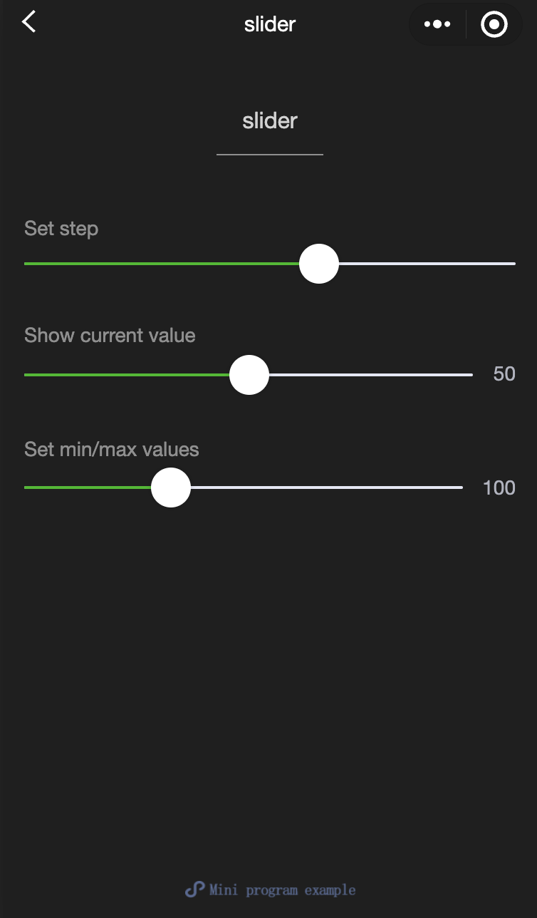
slider
Feature description:A sliding selector.
Parameter and description
Property | Type | Default value | Required | Description |
min | number | 0 | false | Minimum value. |
max | number | 100 | false | Maximum value. |
step | number | 1 | false | Step size, must be greater than 0 and divisible by (max - min). |
disabled | Boolean | false | false | Whether the checkbox is disabled. |
value | number | 0 | false | Current value. |
color | color | #e9e9e9 | false | Background bar color (use backgroundColor). |
selected-color | color | #1aad19 | false | Selected color (use activeColor). |
activeColor | color | #1aad19 | false | Selected color. |
backgroundColor | color | #e9e9e9 | false | Background bar color. |
block-size | number | 28 | false | Size of the slider block, range is 12 - 28. |
block-color | color | #ffffff | false | Color of the slider block. |
show-value | Boolean | false | false | Whether to display the current value. |
bindchange | eventhandle | - | false | Event triggered after a drag is completed, event.detail = {value}. |
bindchanging | eventhandle | - | false | Event triggered during the drag, event.detail = {value}. |
Example:
<view class="page"><view class="page__hd"><text class="page__title">slider</text><text class="page__desc">slider</text></view><view class="page__bd"><view class="page-section page-section-gap"><view class="page-section-title">Set step</view><view class="body-view"><slider value="60" bindchange="slider2change" step="5"/></view></view><view class="page-section page-section-gap"><view class="page-section-title">Show current value</view><view class="body-view"><slider value="50" bindchange="slider3change" show-value/></view></view><view class="page-section page-section-gap"><view class="page-section-title">Set min/max values</view><view class="body-view"><slider value="100" bindchange="slider4change" min="50" max="200" show-value/></view></view></view></view>
var pageData = {}for (var i = 1; i < 5; ++i) {(function (index) {pageData[`slider${index}change`] = function (e) {console.log(slider${index} triggered a change event with value, e.detail.value)}})(i);}Page(pageData)
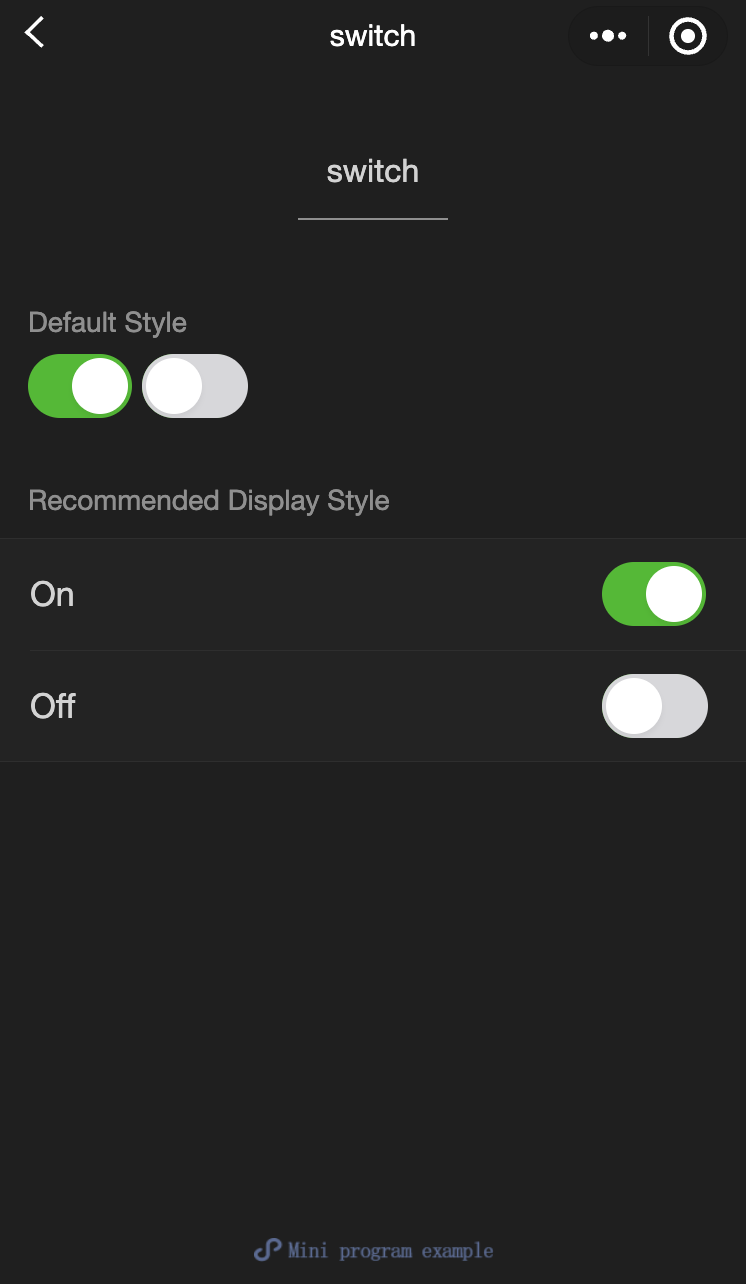
switch
Feature description:A switch selector.
Parameter and description
Property | Type | Default value | Required | Description |
checked | Boolean | false | false | Whether the switch is selected. |
disabled | Boolean | false | false | Whether the switch is disabled. |
type | string | switch | false | Style of the switch, valid values: switch, checkbox. |
color | string | #04BE02 | false | Color of the switch, similar to the CSS color property. |
bindchange | eventhandle | - | false | The change event is triggered when the component is tapped and the value of checked changes, event.detail={ value}. |
Example:
<view class="page"><view class="page__hd"><text class="page__title">switch</text><text class="page__desc">switch</text></view><view class="page__bd"><view class="section section_gap"><view class="section__title">type="switch"</view><view class="body-view"><switch checked="{{switch1Checked}}" bindchange="switch1Change"/></view></view><view class="section section_gap"><view class="section__title">type="checkbox"</view><view class="body-view"><switch type="checkbox" checked="{{switch2Checked}}" bindchange="switch2Change"/></view></view></view></view>
var pageData = {data: {switch1Checked: true,switch2Checked: false,switch1Style: '',switch2Style: 'text-decoration: line-through'}}for (var i = 1; i <= 2; ++i) {(function (index) {pageData[`switch${index}Change`] = function (e) {console.log(switch${index} triggered a change event with value, e.detail.value)var obj = {}obj[`switch${index}Checked`] = e.detail.valuethis.setData(obj)obj = {}obj[`switch${index}Style`] = e.detail.value ? '' : 'text-decoration: line-through'this.setData(obj)}})(i)}Page(pageData)
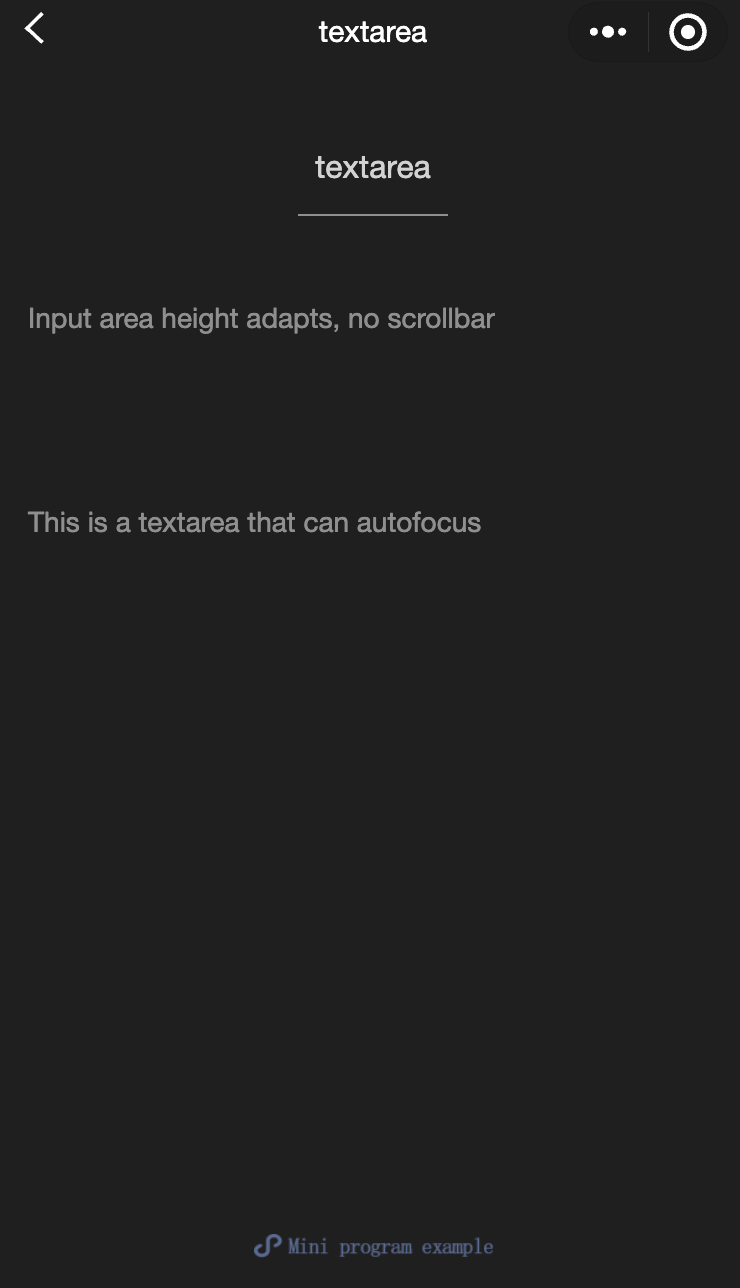
textarea
Feature description:A multi-line input box. This component is a native component,and there are some restrictions for using it.
Parameter and description:
Property | Type | Valid values and description | Default value | Required | Description |
value | string | - | - | false | Content of the input box. |
placeholder | string | - | - | false | Placeholder text when the input field is empty. |
placeholder-style | string | - | - | false | Style for the placeholder, currently supports color, font-size, and font-weight. |
placeholder-class | string | - | textarea-placeholder | false | Specifies the placeholder style class. |
fixed | Boolean | - | false | false | If the textarea is in a position:fixed area, the property fixed should be set to true. |
show-confirm-bar | Boolean | - | true | false | Whether to show the bar with the "Done" button above the keyboard. |
disabled | Boolean | - | false | false | Whether the switch is disabled. |
maxlength | number | - | 140 | false | Maximum input length. Set to -1 for no limit. |
auto-focus | Boolean | - | false | false | Automatically focuses and brings up the keyboard. |
focus | Boolean | - | false | false | Specifies whether to get the focus. |
auto-height | Boolean | - | false | false | Whether to enable automatic height adjustment for the input box. If auto-height is set to true, the style.height is invalid. |
cursor-spacing | number / string | - | 0 | false | Distance between the cursor and the keyboard. Use the smaller value between the distance from the textarea to the bottom and the distance specified by cursor-spacing as the distance between the cursor and the keyboard. |
cursor | number | - | -1 | false | Cursor position when focused. |
selection-start | number | - | -1 | false | Start position of the cursor, effective when auto-focusing, used with selection-end. |
selection-end | number | - | -1 | false | End position of the cursor, effective when auto-focusing, used with selection-start. |
adjust-position | Boolean | - | true | false | Whether to automatically adjust the page position when the keyboard pops up. |
hold-keyboard | Boolean | - | false | false | Whether to keep the keyboard open when tapping on the page. |
confirm-type | string | send: Sets the button in the bottom-right corner to "Send"; search: Sets the button in the bottom-right corner to "Search"; next: Sets the button in the bottom-right corner to "Next"; go: Sets the button in the bottom-right corner to "Go"; done: Sets the button in the bottom-right corner to "Done"; return: Sets the button in the bottom-right corner to “Return”. | return | false | Specifies the text on the button in the bottom-right corner of the keyboard. |
confirm-hold | Boolean | - | false | false | Whether to keep the keyboard open when the button in the bottom-right corner is tapped. |
bindfocus | eventhandle | - | - | false | Triggered when the input field gets focus. event.detail = { value, height }, where height is the keyboard height. |
bindblur | eventhandle | - | - | false | Triggered when the input box loses focus, event.detail = {value, cursor}. |
bindlinechange | eventhandle | - | - | false | This event is triggered when the number of lines in the input box changes, event.detail = {height: 0, heightRpx: 0, lineCount: 0} |
bindinput | eventhandle | - | - | false | When keyboard input occurs, the input event is triggered, with event.detail = {value, cursor, keyCode}. The keyCode represents the key value, but currently, the tool does not support returning the keyCode parameter. The return value of the bindinput handler will not be reflected in the textarea. |
bindconfirm | eventhandle | - | - | false | Confirm event triggered when the user taps the Done button, event.detail = {value: value} |
bindkeyboardheightchange | eventhandle | - | - | false | Triggered when the keyboard height changes, event.detail = {height: height, duration: duration} |
Notes:
The blur event of a textarea occurs later than the tap event on the page. If you need to capture the textarea content on a button tap, consider using the form's bindsubmit event.
It's not recommended to modify user input in a multi-line text field. Therefore, the bindinput handler for a textarea will not reflect its return value back to the textarea.
When the keyboard height changes, the keyboardheightchange event may be triggered multiple times. Developers should ignore events with the same height value to avoid redundant processing.
Example:
<view class="section"><textarea bindblur="bindTextAreaBlur" auto-height placeholder="Automatic height adjustment" /></view><view class="section"><textarea placeholder="The placeholder color is red" placeholder-style="color:red;" /></view><view class="section"><textarea placeholder="This is a textarea that can autofocus" auto-focus /></view><view class="section"><textarea placeholder="This will only be focused when the button is tapped" focus="{{focus}}" /><view class="btn-area"><button bindtap="bindButtonTap">Make the input box focused</button></view></view><view class="section"><form bindsubmit="bindFormSubmit"><textarea placeholder="Textarea in the form component"/><button form-type="submit"> Submit </button></form></view>
Page({data: {height: 20,focus: false},bindButtonTap: function() {this.setData({focus: true})},bindTextAreaBlur: function(e) {console.log(e.detail.value)},bindFormSubmit: function(e) {console.log(e.detail.value.textarea)}})
Help and Support
Was this page helpful?
You can also Contact sales or Submit a Ticket for help.
Help us improve! Rate your documentation experience in 5 mins.
Feedback