Fundamentals
Download
Focus Mode
Font Size
icon
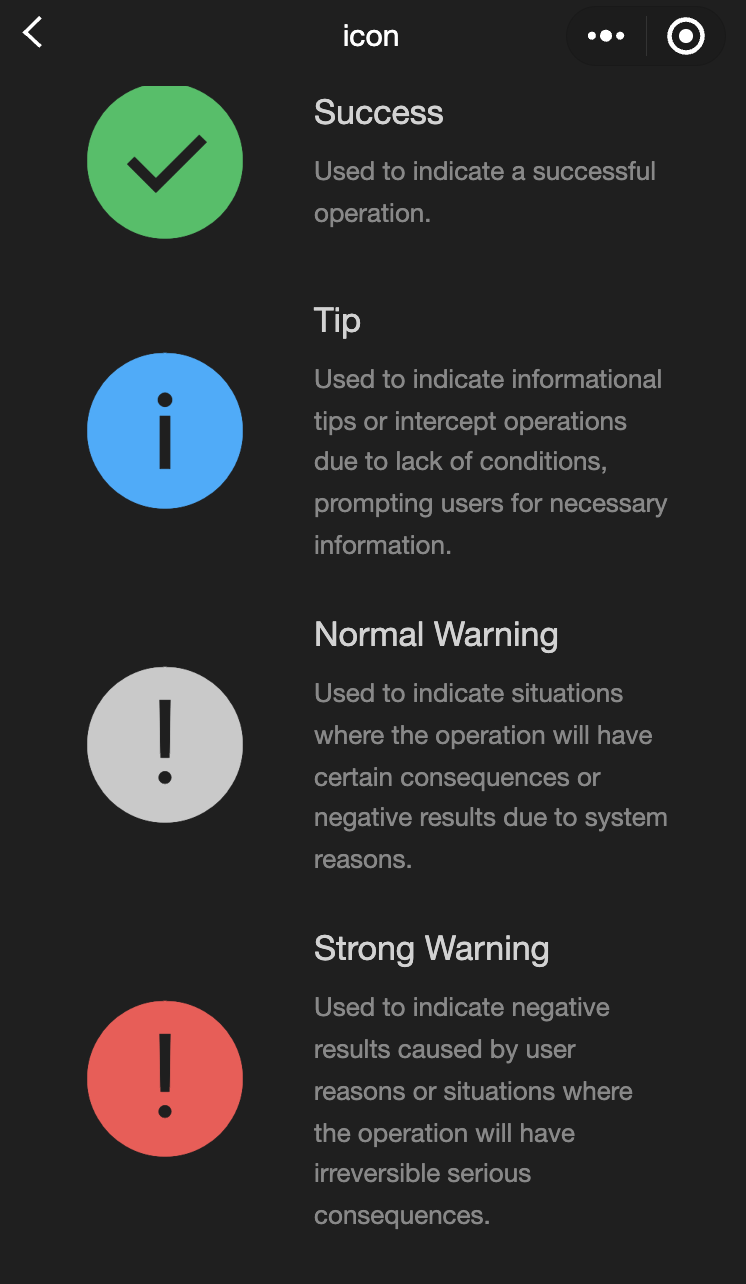
Feature description:Icon component.
Parameter and description:
Property | Type | Default value | Description |
type | string | - | The type of icon. Valid values are: success, success_no_circle, info, warn, waiting, cancel, download, search, clear. |
size | umber/string | 23 | The size of the icon. The default unit is pixel. |
color | string | - | The color of the icon, following the same rules as Cascading Style Sheets (CSS) color. |
Example:
<view class="container"><view class="icon-box"><icon class="icon-box-img" type="success" size="93"></icon><view class="icon-box-ctn"><view class="icon-box-title">Success</view><view class="icon-box-desc">Used to indicate a successful operation.</view></view></view><view class="icon-box"><icon class="icon-box-img" type="info" size="93"></icon><view class="icon-box-ctn"><view class="icon-box-title">Info</view><view class="icon-box-desc">Used for informational prompts and to intercept operations lacking necessary conditions, prompting the user for required information.</view></view></view><view class="icon-box"><icon class="icon-box-img" type="warn" size="93" color="#C9C9C9"></icon><view class="icon-box-ctn"><view class="icon-box-title">Warning</view><view class="icon-box-desc">Indicates potential consequences of an operation or negative outcomes due to system issues.</view></view></view><view class="icon-box"><icon class="icon-box-img" type="warn" size="93"></icon><view class="icon-box-ctn"><view class="icon-box-title">Strong warning</view><view class="icon-box-desc">Indicates negative outcomes from user actions or irreversible serious consequences.</view></view></view><view class="icon-box"><icon class="icon-box-img" type="waiting" size="93"></icon><view class="icon-box-ctn"><view class="icon-box-title">Waiting</view><view class="icon-box-desc">Indicates that the user needs to wait for the result.</view></view></view><view class="icon-box"><view class="icon-small-wrp"><icon class="icon-small" type="success_no_circle" size="23"></icon></view><view class="icon-box-ctn"><view class="icon-box-title">Multi-select icon_Selected</view><view class="icon-box-desc">Used in the multi-select control to indicate that the item has been selected.</view></view></view><view class="icon-box"><view class="icon-small-wrp"><icon class="icon-small" type="circle" size="23"></icon></view><view class="icon-box-ctn"><view class="icon-box-title">Multi-select icon_Not selected</view><view class="icon-box-desc">Used in the multi-select control to indicate that the item is selectable but has not been selected.</view></view></view><view class="icon-box"><view class="icon-small-wrp"><icon class="icon-small" type="warn" size="23"></icon></view><view class="icon-box-ctn"><view class="icon-box-title">Error</view><view class="icon-box-desc">Indicates that an error occurs in the form.</view></view></view><view class="icon-box"><view class="icon-small-wrp"><icon class="icon-small" type="success" size="23"></icon></view><view class="icon-box-ctn"><view class="icon-box-title">Single-select icon_Selected</view><view class="icon-box-desc">Used in the single-select control to indicate that the item has been selected.</view></view></view><view class="icon-box"><view class="icon-small-wrp"><icon class="icon-small" type="download" size="23"></icon></view><view class="icon-box-ctn"><view class="icon-box-title">Download</view><view class="icon-box-desc">Indicates that the item is downloadable.</view></view></view><view class="icon-box"><view class="icon-small-wrp"><icon class="icon-small" type="info_circle" size="23"></icon></view><view class="icon-box-ctn"><view class="icon-box-title">Info</view><view class="icon-box-desc">Indicates that there is an information prompt in the form.</view></view></view><view class="icon-box"><view class="icon-small-wrp"><icon class="icon-small" type="cancel" size="23"></icon></view><view class="icon-box-ctn"><view class="icon-box-title">Stop or close</view><view class="icon-box-desc">Indicates close or stop in the form.</view></view></view><view class="icon-box"><view class="icon-small-wrp"><icon class="icon-small" type="search" size="14"></icon></view><view class="icon-box-ctn"><view class="icon-box-title">Search</view><view class="icon-box-desc">Used in the search control to indicate that search can be implemented.</view></view></view></view>
Page({data: {iconSize: [20, 30, 40, 50, 60, 70],iconColor: ['red', 'orange', 'yellow', 'green', 'rgb(0,255,255)', 'blue', 'purple'],iconType: ['success', 'success_no_circle', 'info', 'warn', 'waiting', 'cancel', 'download', 'search', 'clear']}})
progress
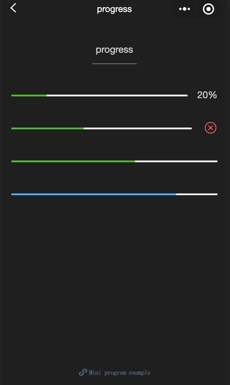
Feature description:Progress bar.
Parameter and description:
Property | Type | Default value | Description |
percent | float | - | Percentage (0-100). |
show-info | boolean | false | Displays the percentage on the right side of the progress bar. |
border-radius | number / string | 0 | Border radius in pixel. |
font-size | number / string | 16 | Font size of the percentage on the right side in pixel. |
stroke-width | number / string | 6 | Width of the progress bar line. |
color | color | #09BB07 | Progress bar color (use activeColor) |
activeColor | color | #09BB07 | Color of the selected progress bar. |
backgroundColor | color | #EBEBEB | Color of the unselected progress bar. |
active | boolean | false | Animation of the progress bar moving from left to right. |
active-mode | string | backwards | backwards: Animation starts from the beginning. forwards: Animation continues from the last end point. |
bindactiveend | eventhandle | - | Event triggered when the animation completes. |
Example:
<view class="progress-box"><progress percent="20" show-info stroke-width="3"/></view><view class="progress-box"><progress percent="40" active stroke-width="3" /><icon class="progress-cancel" type="cancel"></icon></view><view class="progress-box"><progress percent="60" active stroke-width="3" /></view><view class="progress-box"><progress percent="80" color="#10AEFF" active stroke-width="3" /></view>
text
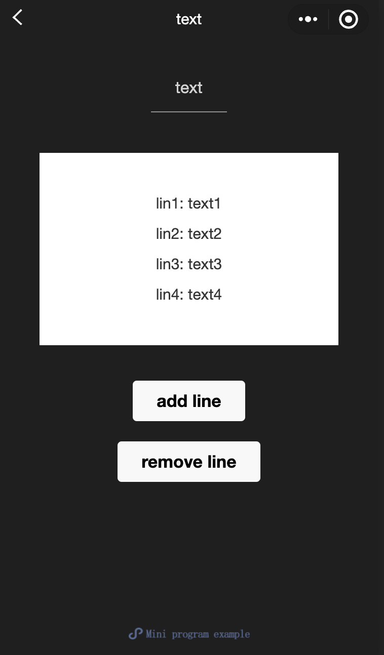
Feature description:Text.
Parameter and description:
Property | Type | Default value | Description |
selectable | boolean | false | Whether the text is selectable. |
space | string | - | Displays continuous spaces: ensp: Half-width space of a Chinese character emsp: Full-width space of a Chinese character nbsp: Space size based on font settings. |
decode | boolean | false | Whether to decode the character entities in the text. |
Notes:
Decode can be parsed with
< > & '    .The standard of whitespace is not consistent across operating systems.
Nodes other than text cannot be pressed and held to select.
<view class="container"><view class="page-body"><view class="page-section page-section-spacing"><view class="text-box" scroll-y="true" scroll-top="{{scrollTop}}"><text>{{text}}</text></view><button disabled="{{!canAdd}}" bindtap="add">add line</button><button disabled="{{!canRemove}}" bindtap="remove">remove line</button></view></view></view>
const texts = ['lin1: text1','lin2: text2','lin3: text3','lin4: text4','lin5: text5','lin6: text6','lin7: text7','lin8: text8','lin9: text9','lin10: text10','lin11: text11','lin12: text12','......']Page({onShareAppMessage() {return {title: 'text',path: 'page/component/pages/text/text'}},data: {text: '',canAdd: true,canRemove: false},extraLine: [],add() {this.extraLine.push(texts[this.extraLine.length % 12])this.setData({text: this.extraLine.join('\\n'),canAdd: this.extraLine.length < 12,canRemove: this.extraLine.length > 0})setTimeout(() => {this.setData({scrollTop: 99999})}, 0)},remove() {if (this.extraLine.length > 0) {this.extraLine.pop()this.setData({text: this.extraLine.join('\\n'),canAdd: this.extraLine.length < 12,canRemove: this.extraLine.length > 0,})}setTimeout(() => {this.setData({scrollTop: 99999})}, 0)}})
rich-text
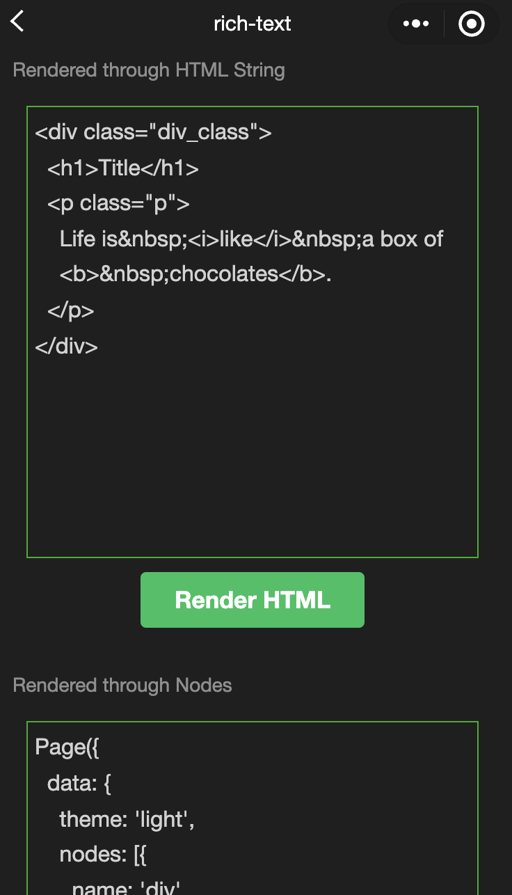
Feature description:Rich text.
Parameter and description:
Property | Type | Default value | Description |
nodes | array/string | [] | List of nodes/HTML string. |
space | string | - | Displays continuous spaces: ensp: Half-width space of a Chinese character emsp: Full-width space of a Chinese character nbsp: Space size based on font settings. |
Supports default events, including:
tap,touchstart,touchmove,touchcancel,touchendandlongtap.nodes
The nodes property is recommended to be used as an Array type. Using a String type will result in a performance decrease since the component converts it to an Array.Two types of nodes are supported, distinguished by the type: Element nodes and text nodes. By default, it is an element node, which is the displayed HTML nodes within the rich text area.
Element node: type = node
Property | Description | Type | Required | Note |
name | Tag name | string | True | Supports a subset of trusted HTML nodes. |
attrs | Property | object | False | Supports a subset of trusted properties, following PascalCase naming convention. |
children | List of child nodes | array | False | The structure is the same as the nodes. |
Text node: type=text
Property | Description | Type | Required | Note |
text | Text | string | True | Supports entities. |
Trusted HTML nodes and properties
Globally supports the class and style properties,but does not support the id property.
Node | Property | Node | Property |
a | - | img | alt,src,height,width |
abbr | - | ins | - |
b | - | label | - |
br | - | legend | - |
code | - | li | - |
col | span,width | ol | start,type |
colgroup | span,width | p | - |
dd | - | q | - |
del | - | span | - |
div | - | strong | - |
dl | - | sub | - |
dt | - | sup | - |
em | - | table | width |
fieldset | - | tbody | - |
h1 | - | td | colspan,height,rowspan,width |
h2 | - | tfoot | - |
h3 | - | th | colspan,height,rowspan,width |
h4 | - | thead | - |
h5 | - | tr | - |
h6 | - | ul | - |
hr | - | - | - |
Notes:
Using a String type for nodes is not recommended due to performance degradation.
All node events within the rich-text component will be blocked to ensure that users cannot tap, touch, or trigger any events.
The attrs property does not support id, but it does support class.
The name property is case-insensitive.
If an untrusted HTML node is used, the nodes and all their children will be removed.
The img tag only supports online images.
If the rich-text component is used within a custom component, only the custom component's WeiXin Style Sheets (WXSS) styles will apply to classes within rich-text.
Example
<view class="container"><view class="page-body"><view class="page-section"><view class="page-section-title">Render via HTML String</view><view class="page-content"><scroll-view scroll-y>{{htmlSnip}}</scroll-view><button style="margin: 30rpx 0" type="primary" bindtap="renderHtml">Render HTML</button><block wx:if="{{renderedByHtml}}"><rich-text nodes="{{htmlSnip}}"></rich-text></block></view></view><view class="page-section"><view class="page-section-title">Render via nodes</view><view class="page-content"><scroll-view scroll-y>{{nodeSnip}}</scroll-view><button style="margin: 30rpx 0" type="primary" bindtap="renderNode">Render nodes</button><block wx:if="{{renderedByNode}}"><rich-text nodes="{{nodes}}"></rich-text></block></view></view></view></view>
const htmlSnip =`<div class="div_class"><h1>Title</h1><p class="p">Life is <i>like</i> a box of<b> chocolates</b>.</p></div>`const nodeSnip =`Page({data: {nodes: [{name: 'div',attrs: {class: 'div_class',style: 'line-height: 60px; color: red;'},children: [{type: 'text',text: 'You never know what you're gonna get.'}]}]}})`Page({onShareAppMessage() {return {title: 'rich-text',path: 'page/component/pages/rich-text/rich-text'}},data: {htmlSnip,nodeSnip,renderedByHtml: false,renderedByNode: false,nodes: [{name: 'div',attrs: {class: 'div_class',style: 'line-height: 60px; color: #1AAD19;'},children: [{type: 'text',text: 'You never know what you\\'re gonna get.'}]}]},renderHtml() {this.setData({renderedByHtml: true})},renderNode() {this.setData({renderedByNode: true})},enterCode(e) {console.log(e.detail.value)this.setData({htmlSnip: e.detail.value})}})
Help and Support
Was this page helpful?
You can also Contact sales or Submit a Ticket for help.
Help us improve! Rate your documentation experience in 5 mins.
Feedback