查看图表
本文将为您介绍如何查看监控图表。
准备工作
1. 登录 腾讯云可观测平台控制台。
2. 在左侧导航栏中单击【Dashboard列表】,进入 Dashboard 列表页。
3. 在 Dashboard 列表中找到您需要查看的 Dashboard ,单击面板名,进入 Dashboard 管理页。
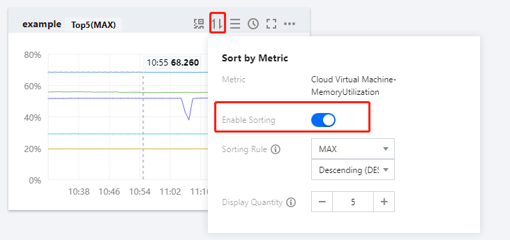
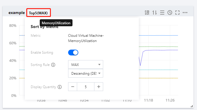
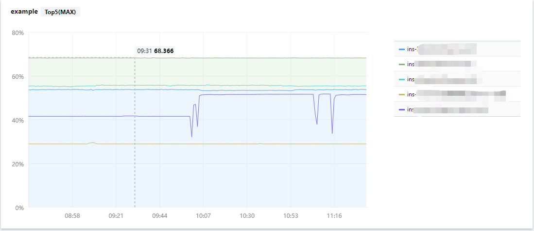
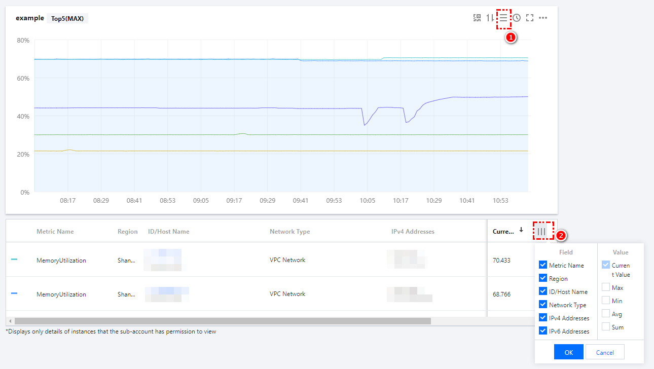
使用指标排序功能查看图表
单击图表中单击【
全屏查看图表
单击图表右上方的更多图标【

查看实例详情
单击图表右上方的【

图表缩放和移动
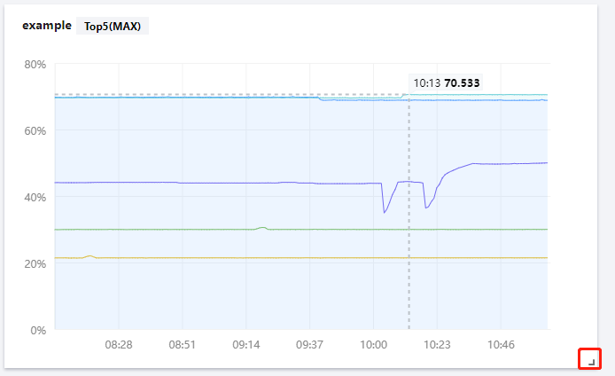
图表缩放:您可以把鼠标移动到图表右下方,当出现如下图所示的直角图标时,进行图表缩放。
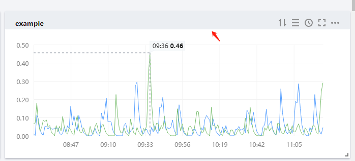
图表移动:您可以把鼠标移动到图表名称处,当出现如下图所示的移动图表时,对图表进行移动。
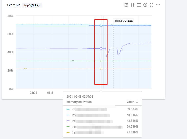
查看某时刻监控数据
您可以把鼠标移动到监控图表处,查看某一时刻的监控数据。如下图所示:
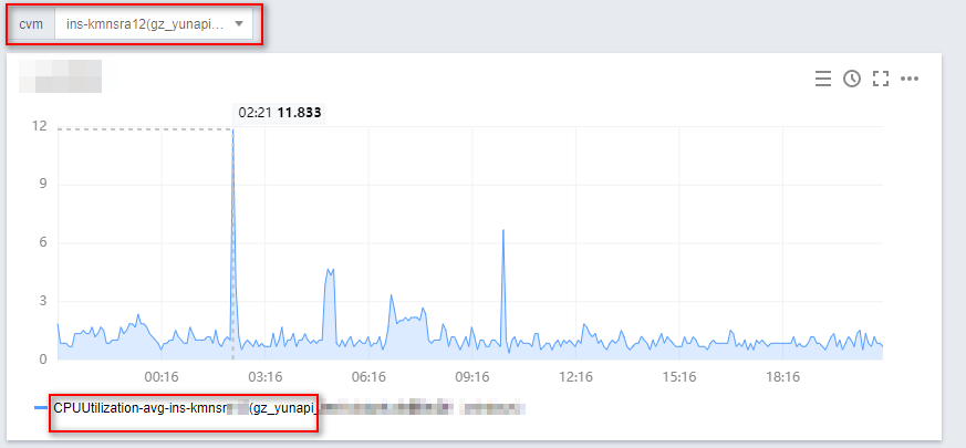
使用变量选择器查看
当您实例数量过多时,可以定义一个模板变量进行动态切换标签,在同一个监控图表中查看不同实例的监控数据。
说明:
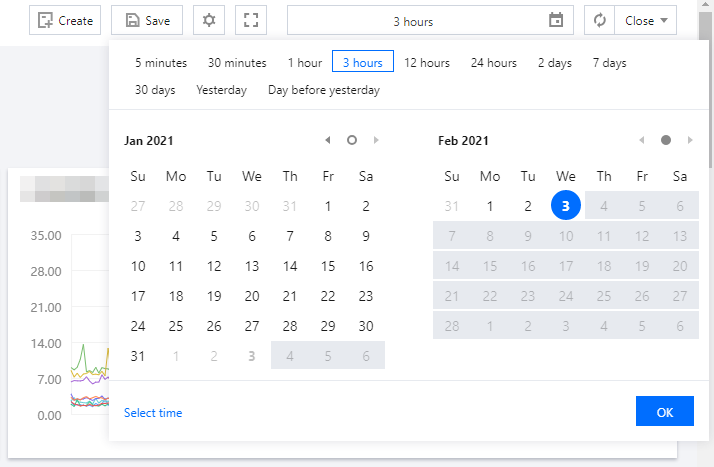
调整图表时间跨度查看监控数据
Dashboard 默认展示近12小时的数据。
通过 Dashboard 右上角的时间选择控件,可调整 Dashboard 中所有图表展示的数据区间和粒度。用户可回顾历史监控数据、进行排障定位问题。
时间周期和图表颗粒度对照表
时间范围 | 默认统计周期 |
<=1h | 1min |
(1h,12h] | 1min |
(12h,3d] | 5min |
(3d,30d] | 1h |
(30d,186d] | 1d |
文档反馈