- News and Announcements
- Product Introduction
- Purchase Guide
- Free Demos
- Download
- Get Started
- Chat Interaction (UI Included)
- Video Call (UI Included)
- Desk
- Quick Start
- Integration Guide
- Configure Channels
- Admin Operation Manual
- Configure Agent to Proactively Contact Chat Users
- Login to Management End
- Third-party extension
- Agent Management
- Agent Role Permission Management
- Online Status and Reasons for Short Break
- Skill Group Management
- Session Service Flow Management
- Satisfaction Evaluation
- Quick Reply
- Session Routing and Reception Settings
- Agent Operation Manual
- AI Chatbot
- More Practices
- How to intergrate TUIChat independently in Uniapp(Vue2 & Vue3)
- How to intergrate TUIChat independently in Web(Vue2 & Vue3)
- AI Chatbot
- End-to-end encrypted chat with Virgil
- Super Large Entertainment and Collaboration Community
- Live Room Setup Guide
- How to integrate Tencent IM with Salesforce
- How to integrate Tencent IM with Zendesk
- How to integrate chat widget to your Shopify online store
- Discord Implementation Guide
- How to Integrate Chat into Games
- Flutter Avchatroom
- No UI Integration
- SDK Integration
- Initialization
- Login and Logout
- Message
- Message Overview
- Sending Message
- Receiving Message
- Historical Message
- Forwarding Message
- Modifying Message
- Message Inserting
- Deleting Message
- Clearing Messages
- Recalling Message
- Online Message
- Read Receipt
- Querying Message
- Group @ Message
- Targeted Group Message
- Notification Muting
- Message Extension
- Message Reaction
- Message Translation
- Message Pinning
- Conversation
- Group
- Community Topic
- User Profile and Relationship Chain
- Offline Push
- Local Search
- Signaling
- Client APIs
- Server APIs
- Generating UserSig
- RESTful APIs
- RESTful API Overview
- RESTful API List
- Message Related
- Session Related
- Group Related
- User Management
- Global Mute Management
- Operations Management
- Chatbots
- Webhooks
- Webhook Overview
- Webhook Command List
- Online Status Webhooks
- Relationship Chain Webhooks
- One-to-One Message Webhooks
- Group Webhooks
- Before a Group Is Created
- After a Group Is Created
- Before Applying to Join a Group
- Before Inviting a User to a Group
- After a User Joins a Group
- After a User Leaves a Group
- Before Group Message Is Sent
- After a Group Message Is Sent
- After a Group Is Full
- After a Group Is Disbanded
- After Group Profile Is Modified
- Callback After Recalling Group Messages
- Webhook for Online and Offline Status of Audio-Video Group Members
- Webhook for Exceptions When Group Messages Are Sent
- Before a Topic Is Created
- After a Topic Is Created
- After a Topic Is Deleted
- Topic Profile Change Webhook
- Webhook Mutual Authentication Configuration Guide
- Chatbot webhooks
- Console Guide
- FAQs
- Security Compliance Certification
- Chat Policies
- Migration
- Error Codes
- Contact Us
This document describes how to set the UI styles for Android.
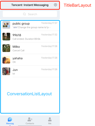
Setting the Conversation List UI Styles
The conversation list UI consists of the title bar TitleBarLayout and list area ConversationListLayout. Each part provides UI styles and event registration APIs that can be modified.
Setting the title style
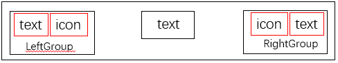
The title bar itself has all the features of a view. In addition, it is divided into three parts: left group (LeftGroup), middle, and right group (RightGroup).
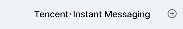
mainTitleBar.setTitle(getResources().getString(R.string.conversation_title), ITitleBarLayout.Position.MIDDLE);mainTitleBar.getLeftGroup().setVisibility(View.GONE);mainTitleBar.getRightGroup().setVisibility(View.VISIBLE);mainTitleBar.setRightIcon(R.drawable.more_btn);
The effect is shown below:
Menu menu = new Menu(this, mainTitleBar);mainTitleBar.setOnRightClickListener(new View.OnClickListener() {@Overridepublic void onClick(View v) {if (menu == null) {return;}if (menu.isShowing()) {menu.hide();} else {menu.show();}}});
Setting the conversation list style
The custom conversation list layout is inherited from RecyclerView. After the user logs in, TUIKit reads the user's conversation list from the SDK.You can customize common features for the conversation list. For example, you can configure the background, font size, click event, long press event, and whether the profile photo has rounded corners. The following is a code sample:
public static void customizeConversation(final ConversationLayout layout) {// Get the conversation list from ConversationLayoutConversationListLayout listLayout = layout.getConversationList();listLayout.setItemTopTextSize(16); // Set the font size of the top text of the itemlistLayout.setItemBottomTextSize(12); // Set the font size of the bottom text of the itemlistLayout.setItemDateTextSize(10); // Set the font size of the timeline text of the itemlistLayout.setItemAvatarRadius(5); // Set the size of the rounded corners of the item profile photolistLayout.disableItemUnreadDot(false); // Set whether to display an unread badge for the item. The badge is displayed by default.// Click and hold to pop up the menulistLayout.setOnItemLongClickListener(new ConversationListLayout.OnItemLongClickListener() {@Overridepublic void OnItemLongClick(View view, int position, ConversationInfo conversationInfo) {startPopShow(view, position, conversationInfo);}});}
Setting the profile photo style
The Chat SDK does not store profile photos. Therefore, the integrator needs to have a profile photo storage API to get profile photo URLs. The following shows how to use TUIKit to set a profile photo by using a random profile photo API as an example.First, you need to upload a profile photo to your personal profile page and call the profile modification API.
V2TIMUserFullInfo v2TIMUserFullInfo = new V2TIMUserFullInfo();// Profile photoif (!TextUtils.isEmpty(mIconUrl)) {v2TIMUserFullInfo.setFaceUrl(mIconUrl);}V2TIMManager.getInstance().setSelfInfo(v2TIMUserFullInfo, new V2TIMCallback() {@Overridepublic void onError(int code, String desc) {}@Overridepublic void onSuccess() {}});
conversationIconView.setConversation(conversation);
Setting the Chat UI Styles
The chat UI includes the tile bar (TitleBarLayout), which is the same as that of the conversation list UI. The chat UI also includes the notice area (NoticeLayout), message area (MessageRecyclerView), and input area (InputView), as shown in the following figure:
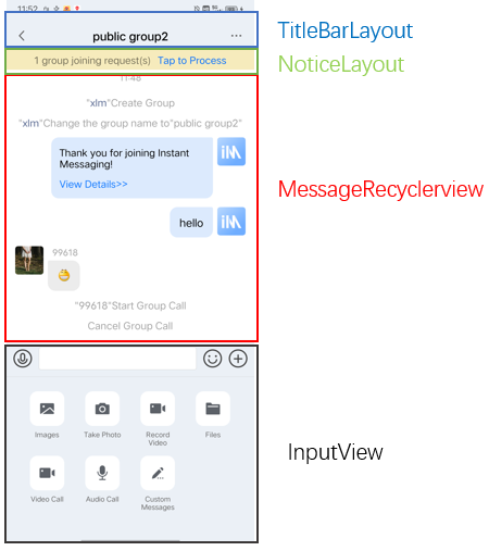
/*** Get the input area layout in the chat UI** @return*/InputView getInputLayout();/*** Get the message area layout in the chat UI** @return*/MessageRecyclerView getMessageLayout();/*** Get the notice area layout in the chat UI** @return*/NoticeLayout getNoticeLayout();
Setting the notice area (NoticeLayout) style
The notice area consists of two TextViews, as shown in the following figure:
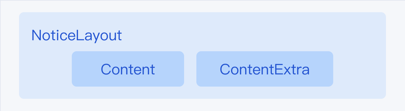
The effect is shown below:
// Get NoticeLayout from ChatViewNoticeLayout noticeLayout = layout.getNoticeLayout();// You can configure to always display the notice areanoticeLayout.alwaysShow(true);// Set the notice titlenoticeLayout.getContent().setText("This is an ad");// Set notice textnoticeLayout.getContentExtra().setText("Click to view your gift");// Set the click event of noticenoticeLayout.setOnNoticeClickListener(new View.OnClickListener() {@Overridepublic void onClick(View v) {ToastUtil.toastShortMessage("You've received a bonus");}});
Setting the message area (MessageRecyclerView) style
MessageRecyclerView is inherited from RecyclerView. This document describes how to customize the chat background, bubbles, text, and nicknames. For more information, see IMessageProperties.java.
Setting the chat UI background color
You can customize the chat UI background color. The following is a code sample:
// Get MessageRecyclerView from ChatViewMessageRecyclerView messageRecyclerView = layout.getMessageLayout();////// Set the chat background //////messageRecyclerView.setBackground(new ColorDrawable(0xB0E2FF00));
Setting the sender's profile photo style
When displaying a user, TUIKit reads the URL of the user's profile photo from the user's profile and displays the profile photo.Sample code:
// Setting a profile photo for the chat UIif (!TextUtils.isEmpty(msg.getFaceUrl())) {List<Object> urllist = new ArrayList<>();urllist.add(msg.getFaceUrl());if (isForwardMode) {leftUserIcon.setIconUrls(urllist);} else {if (msg.isSelf()) {rightUserIcon.setIconUrls(urllist);} else {leftUserIcon.setIconUrls(urllist);}}} else {rightUserIcon.setIconUrls(null);leftUserIcon.setIconUrls(null);}
If the user does not set a profile photo, the default profile photo is displayed. You can customize the default profile photo, whether the profile photo has rounded corners, and the profile photo size.Sample code:
// Get MessageRecyclerView from ChatViewMessageRecyclerView messageRecyclerView = layout.getMessageLayout();////// Set the chat background //////messageRecyclerView.setBackground(new ColorDrawable(0xFFEFE5D4));////// Set the profile photo //////// Set the default profile photo. The receiver uses the same profile photo by default.messageRecyclerView.setAvatar(R.drawable.core_default_user_icon_light);// Set the rounded corners for the profile photomessageRecyclerView.setAvatarRadius(50);// Set the profile photo sizemessageRecyclerView.setAvatarSize(new int[]{68, 68});
Setting bubble background colors
The receiver's bubbles are on the left and your own bubbles are on the right. You can customize the bubble background for both parties.
Sample code:
// Get MessageRecyclerView from ChatViewMessageRecyclerView messageRecyclerView = layout.getMessageLayout();// Set your own bubble backgroundmessageRecyclerView.setRightBubble(context.getResources().getDrawable(R.drawable.chat_bubble_self_bg_lively));// Set the bubble background for the receivermessageRecyclerView.setLeftBubble(context.getResources().getDrawable(R.drawable.chat_bubble_other_bg_lively));
You can customize the nickname style, including the font size and color. The nickname styles of both parties must be the same.
Sample code:
// Get MessageRecyclerView from ChatViewMessageRecyclerView messageRecyclerView = layout.getMessageLayout();////// Set the nickname style (the receiver uses the same style) //////messageRecyclerView.setNameFontSize(12);messageRecyclerView.setNameFontColor(0x8B5A2B00);
Setting the chat content style
You can customize the font size and color for both parties, but the sender and receiver must use the same font size.
Sample code:
// Get MessageRecyclerView from ChatViewMessageRecyclerView messageRecyclerView = layout.getMessageLayout();// Set the chat content font size. The sender and the receiver use the same font size.messageRecyclerView.setChatContextFontSize(15);// Set your own chat content font colormessageRecyclerView.setRightChatContentFontColor(0xA9A9A900);// Set the chat content font color for the receivermessageRecyclerView.setLeftChatContentFontColor(0xA020F000);
Setting the chat timeline style
You can customize the background, font size, and font color of the chat timeline.
Sample code:
// Get MessageRecyclerView from ChatViewMessageRecyclerView messageRecyclerView = layout.getMessageLayout();// Set the background of the chat timelinemessageRecyclerView.setChatTimeBubble(new ColorDrawable(0x8B691400));// Set the font size of the chat timelinemessageRecyclerView.setChatTimeFontSize(20);// Set the font color of the chat timelinemessageRecyclerView.setChatTimeFontColor(0xEE00EE00);
Setting the tips message style
You can customize the background, font size, and font color of tips messages in chats.
Sample code:
// Get MessageRecyclerView from ChatViewMessageRecyclerView messageRecyclerView = layout.getMessageLayout();// Set the background of tipsmessageRecyclerView.setTipsMessageBubble(new ColorDrawable(0xA020F000));// Set the font size of tipsmessageRecyclerView.setTipsMessageFontSize(20);// Set the font color of tipsmessageRecyclerView.setTipsMessageFontColor(0x7CFC0000);
Setting the input area InputView
The input area (InputView) contains audio, text, emoji, and more (+) input options.
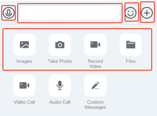
Hiding undesired features
You can hide or show the image sharing, photo taking, video recording, and file sending features on the "+" panel.
// Get InputLayout from ChatViewInputView inputView = layout.getInputLayout();// Hide "take photo and send"inputView.disableCaptureAction(true);// Hide "send file"inputView.disableSendFileAction(true);// Hide "send image"inputView.disableSendPhotoAction(true);// Hide "record video and send"inputView.disableVideoRecordAction(true);
Adding custom features
You can customize and add action units to the "+" panel to provide more features.
The following code shows how to hide the "send file" feature and add an action unit which sends a message:
// Get InputView from ChatViewInputView inputView = layout.getInputLayout();// Hide "send file"inputView.disableSendFileAction(true);// Define an action unitInputMoreActionUnit unit = new InputMoreActionUnit();unit.setIconResId(R.drawable.default_user_icon); // Set the unit iconunit.setTitleId(R.string.profile); // Set the text title of the unitunit.setOnClickListener(unit.new OnActionClickListener() { // Define the click event@Overridepublic void onClick() {ToastUtil.toastShortMessage("Custom more features");MessageInfo info = MessageInfoUtil.buildTextMessage("Who am I");layout.sendMessage(info, false);}});// Add the action unit to the "+" panelinputView.addAction(unit);
Replacing the "+" click event
You can customize features to replace the action units on the "+" panel.
// Get InputView from ChatViewInputView inputView = layout.getInputLayout();// Replace the feature entry on the "+" panel with a custom eventinputView.replaceMoreInput(new View.OnClickListener() {@Overridepublic void onClick(View v) {ToastUtil.toastShortMessage("Custom “+” button event");MessageInfo info = MessageInfoUtil.buildTextMessage("Custom message");layout.sendMessage(info, false);}});
Replacing the panel displayed upon "+" clicking
You can customize the style of the "+" panel, the action units, and their features.
// Get InputView from ChatViewInputView inputView = layout.getInputLayout();// Use a custom fragment to replace more featuresinputView.replaceMoreInput(new CustomInputFragment());
The implementation of the new panel CustomInputFragment is the same as that of an ordinary Fragment. Inflate the view at onCreateView and set the event. The following sample code shows how to add two buttons and pop up a toast when clicked:
public static class CustomInputFragment extends BaseInputFragment {@Nullable@Overridepublic View onCreateView(LayoutInflater inflater, @Nullable ViewGroup container, Bundle savedInstanceState) {View baseView = inflater.inflate(R.layout.test_chat_input_custom_fragment, container, false);Button btn1 = baseView.findViewById(R.id.test_send_message_btn1);btn1.setOnClickListener(new View.OnClickListener() {@Overridepublic void onClick(View v) {ToastUtil.toastShortMessage("Send a hyperlink message");}});Button btn2 = baseView.findViewById(R.id.test_send_message_btn2);btn2.setOnClickListener(new View.OnClickListener() {@Overridepublic void onClick(View v) {ToastUtil.toastShortMessage("Send a message containing video and text");}});return baseView;}}

 Yes
Yes
 No
No
Was this page helpful?