TUI components have four built-in themes by default: Light, Serious, Lively, and Dark. They also support the Auto mode (automatically switching the Dark mode on/off to match your system settings). You can switch or modify the built-in themes or add new themes as needed.
Theme Resources
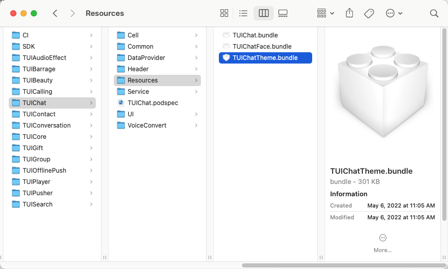
You can see the theme resources supported by any TUI component in the Resources folder inside that component. For example, in TUIChat/Resources/ of the TUIChat component, you can see the TUIChatTheme.bundle file, which is the built-in theme resource of TUIChat.
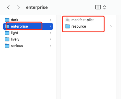
Locate the TUIChatTheme.bundle file and right-click it to choose Show Package Contents. Then, you can see the four built-in theme resources (the folder names are theme IDs).
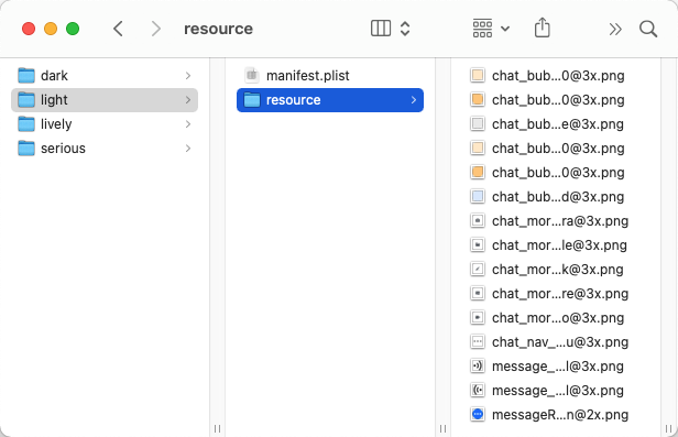
For example, the theme ID of the Light theme is light. Each theme folder contains two items: manifest.plist file and resource resource folder.
The manifest.plist file stores the values of the image, font, color and other elements used by the current theme. The keys in the manifest.plist files under different themes in the same component are the same.
The resource folder stores the resources used by the current theme. The following is an example:
The manifest.plist file under each component must be modified no matter whether you are modifying a built-in theme or creating a theme.
Applying Themes
After selecting a theme, you need to configure the theme for TUI components and your app's main project. You can call the -applyTheme:forModule: method of TUIThemeManager to apply the theme for specified components.
For operation details, refer to the +applyTheme: method of ThemeSelectController of TUIKitDemo.
You can follow the steps below to customize the colors, fonts, images, and other elements of the built-in themes of TUI components:
Copy the built-in resource package of TUI components to your project and modify the corresponding theme elements in each theme.
When your app is started, register the modified theme resource package path to TUI components.
After you switch to the corresponding theme, TUI components automatically apply the modified theme package.
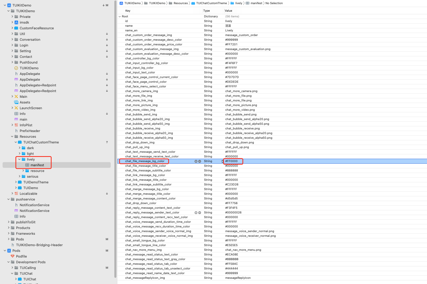
For example, in the TUIChat component, the background colors of file messages under different themes are different. Under the built-in Lively theme, the color value of this background color is #FFFFFF. If you want to change it to #FF0000, you only need to perform the steps below:
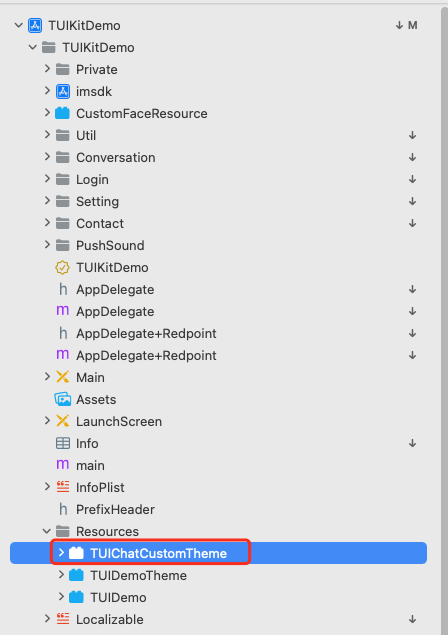
1. Copy the TUIChat/Resources/TUIChatTheme.bundle file of the TUIChat component to your primary project and rename it TUIChatCustomTheme.bundle.
2. Change the value of the key that specifies the file message background color in the manifest.plist file. For meanings of each key in the file, see Chat UI styles.
3. In the - application:didFinishLaunchingWithOptions: method, call TUIRegisterThemeResourcePath to register the path of the modified theme resource package and use the modified theme package to overwrite the built-in theme package of TUIChat. For more information, see the AppDelegate file of TUIKitDemo.
// -- 2. Register the customized theme resource package path for the TUIChat component to overwrite built-in themes. Note that only the themes of TUIThemeModuleChat can be overwritten in this case.
4. Start your app again and you can see that the corresponding background color has been modified successfully.
Note:
Similarly, if you want to modify a built-in icon, you can place the icon resource in the Resource folder under the theme folder and change the value of the corresponding key in the manifest file.
Creating a Theme
If the four built-in themes do not meet your requirements, you can create a theme for a component as needed.
Copy the built-in resource package of the TUI component to your project. In the theme resource package, create a theme resource folder, whose name is the themeID of the new theme.
Copy the manifest.plist file in the light folder in the built-in theme resource package of the TUI component, and modify the values of id, name, and name_en in the manifest.plist file.
Create a resource folder in the newly created theme folder to store the resource file of the new theme.
Modify the manifest.plist file of the new theme as needed.
When your app is started, register the modified theme resource package path to the TUI component and apply the current new theme.
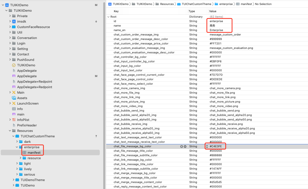
Assume that you want to create a theme called Enterprise (themeID: enterprise) for the TUIChat component. The steps are as follows:
1. Copy the TUIChat/Resources/TUIChatTheme.bundle file of the TUIChat component to your primary project and rename it TUIChatCustomTheme.bundle.
2. Copy the light folder in TUIChatCustomTheme.bundle and rename it enterprise.
3. Change the values in the manifest.plist file in the enterprise folder as needed. For the meanings of each key value, see Chat UI styles.
For example, you can change the file message background color to #C4E3FE.
4. When your app is started, register the modified theme resource package path to the TUI component and apply the current new theme.
5. Start your app again and you can see the newly created Enterprise theme is successfully applied to the app.
Theme Styles
Basic styles
Storage location
All basic styles are stored in the TUICore component and are referenced by each component.
You can view the keys of the basic styles of a theme in the manifest.plist file in the folder of that theme in TUICore/Resources/TUICoreTheme.bundle of the TUICore component.
The basic styles of TUICore provide common UI specifications, such as the preferred background color and dividing line color. Modifications on the basic styles apply to all components.
UI styles
Icons
Style Key
Style Description
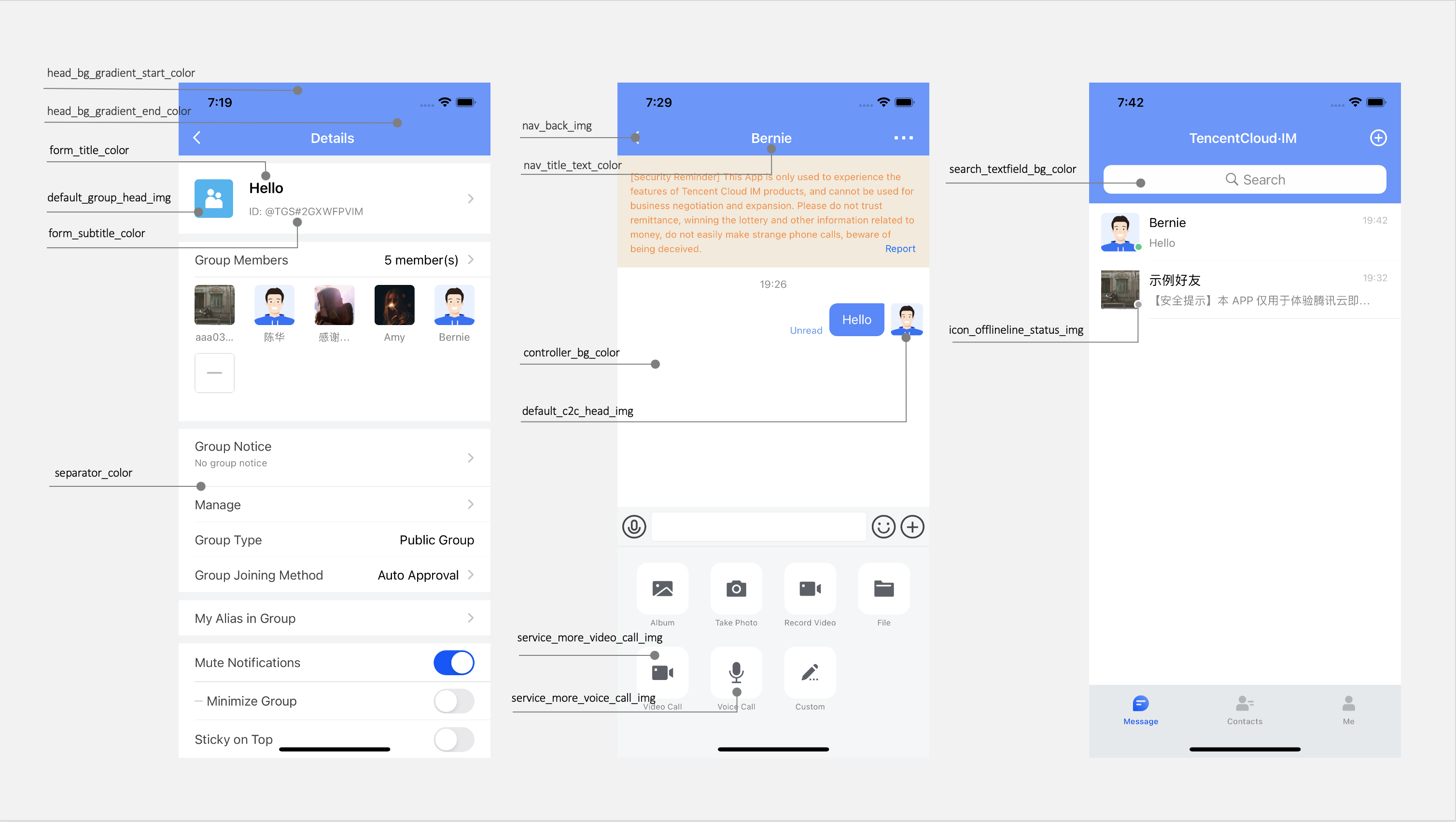
nav_back_img
Image name of the topbar return button
default_group_head_public_img
Default profile photo of a Public group chat
default_group_head_meeting_img
Default profile photo of a Meeting group chat
default_group_head_avchatroom_img
Default profile photo of an audio-video group chat
default_group_head_img
Default profile photo of a group
default_c2c_head_img
Default profile photo of a user
service_more_video_call_img
Chat page: Video call icon on the "+" tab (More tab)
service_more_voice_call_img
Chat page: Audio call icon on the "+" tab (More tab)
icon_online_status_img
User online status icon
icon_offline_status_img
User offline status icon
Colors
Style Key
Style Description
primary_theme_color
Theme color, indicating the average hue under the current theme
common_switch_on_color
Color of the common UISwitch component switch when turned on
head_bg_gradient_start_color
Start gradient color, background color of the topbar
head_bg_gradient_end_color
End gradient color, background color of the topbar
separator_color
Dividing line color
controller_bg_color
Controller background color
form_title_color
Form: UITableViewCell title text color
form_subtitle_color
Form: UITableViewCell subtitle text color
form_desc_color
Form: UITableViewCell description text color
form_bg_color
Form: UITableViewCell background color
form_green_button_text_color
Form: Text color of green-theme buttons in UITableViewCell
form_green_button_bg_color
Form: Background color of green-theme buttons in UITableViewCell
form_green_button_highlight_bg_color
Form: Text color of highlighted green-theme buttons in UITableViewCell
form_white_button_text_color
Form: Text color of white-theme buttons in UITableViewCell
form_white_button_bg_color
Form: Background color of white-theme buttons in UITableViewCell
form_key_text_color
Form: Description text color in UITableViewCell
form_value_text_color
Form: Value text color in UITableViewCell
nav_title_text_color
Topbar text color
nav_back_img
Image name of the topbar return button
search_textfield_bg_color
Background color of the search input box
Chat UI styles
Storage location
All chat UI styles are stored in the TUIChat component and are used by chat UIs.
You can view the keys of the basic styles of a theme in the manifest.plist file in the folder of that theme in TUIChat/Resources/TUIChatTheme.bundle of the TUIChat component.
UI styles
Icons
Style Key
Style Description
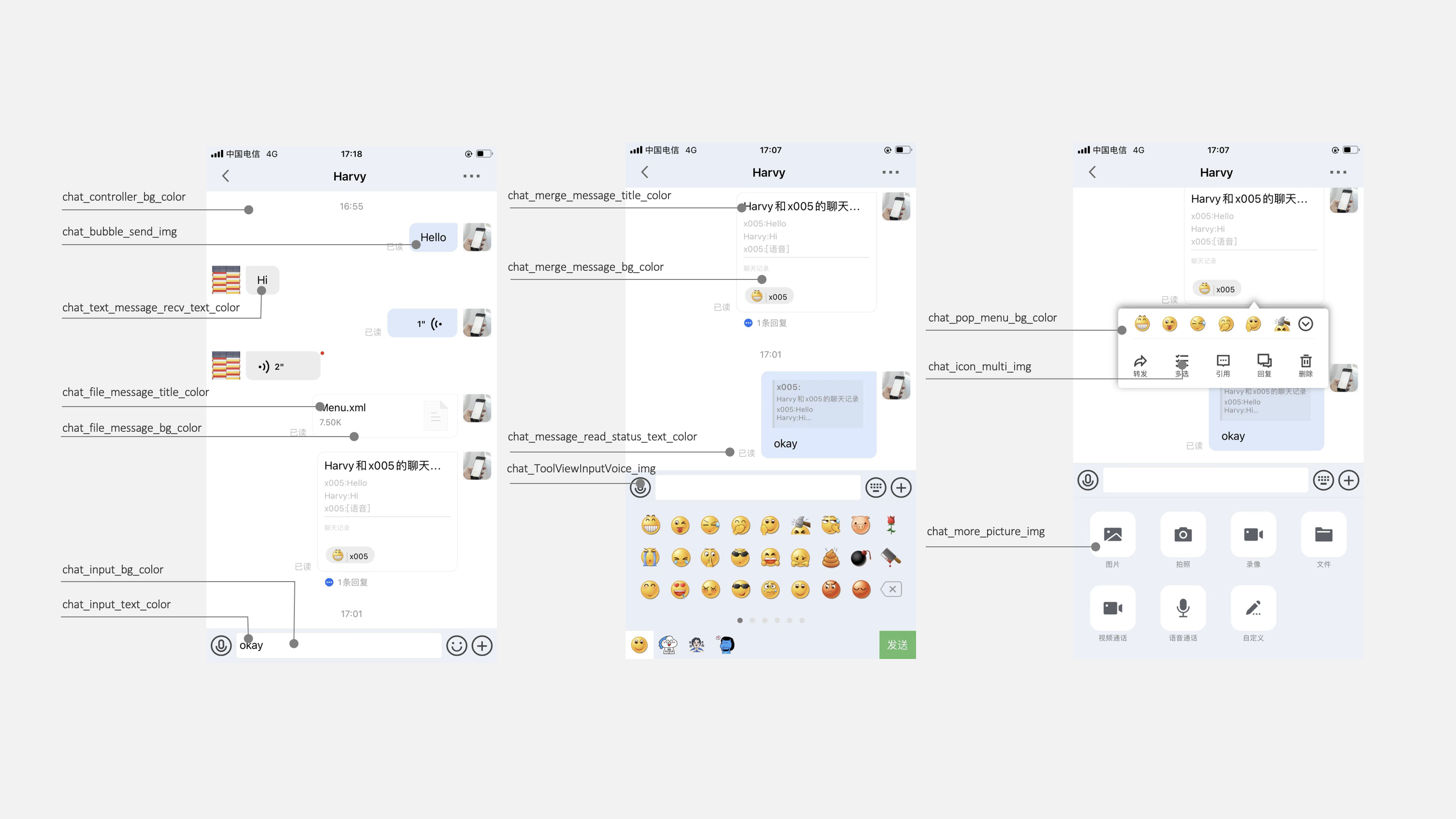
chat_more_camera_img
"+" tab (More tab): Camera icon
chat_more_file_img
"+" tab (More tab): File icon
chat_more_link_img
"+" tab (More tab): Custom icon
chat_more_picture_img
"+" tab (More tab): Image icon
chat_more_video_img
"+" tab (More tab): Video recording icon
chat_bubble_send_img
Message bubble: Background color for messages sent
chat_bubble_receive_img
Message bubble: Background color for messages received
chat_voice_message_sender_voice_normal_img
Voice message: Normal status background image for messages sent
chat_voice_message_receiver_voice_normal_img
Voice message: Normal status background image for messages received
chat_icon_copy_img
Chat UI: "Copy" icon on the menu page that pops up when you long press a message
chat_icon_delete_img
Chat UI: "Delete" icon on the menu page that pops up when you long press a message
chat_icon_recall_img
Chat UI: "Recall" icon on the menu page that pops up when you long press a message
chat_icon_multi_img
Chat UI: "Select" icon on the menu page that pops up when you long press a message
chat_icon_forward_img
Chat UI: "Forward" icon on the menu page that pops up when you long press a message
chat_icon_reply_img
Chat UI: "Reply" icon on the menu page that pops up when you long press a message
chat_icon_reference_img
Chat UI: "Quote" icon on the menu page that pops up when you long press a message
chat_ToolViewInputVoice_img
Chat UI: "Voice/Keyboard" switching button icon on the input bar
chat_ToolViewEmotion_img
Chat UI: "Emoji/Keyboard" switching button icon on the input bar
chat_ToolViewKeyboard_img
Chat UI: "Keyboard" button icon on the input bar
Colors
Style Key
Style Description
chat_controller_bg_color
Chat UI: Background color
chat_input_controller_bg_color
Chat UI: Background color of the input control page
chat_input_bg_color
Chat UI: Background color of the input box
chat_input_text_color
Chat UI: Text color of the input box
chat_face_page_control_current_color
Emoji tab: Color of the current page of the pagination control
chat_face_page_control_color
Emoji tab: Default color of the pagination control
chat_text_message_send_text_color
Text message: Color of the text displayed in messages sent
chat_text_message_receive_text_color
Text message: Color of the text displayed in messages received
chat_file_message_bg_color
File message: Background color
chat_file_message_title_color
File message: Title text color
chat_file_message_subtitle_color
File message: Subtitle text color
chat_merge_message_bg_color
Combined message: Background color
chat_merge_message_title_color
Combined message: Title text color
chat_merge_message_content_color
Combined message: Content text color
chat_drop_down_color
Chat UI: Color of the down arrow
chat_voice_message_send_duration_time_color
Voice message: Duration text color displayed for messages sent
chat_voice_message_recv_duration_time_color
Voice message: Duration text color displayed for messages received
chat_small_tongue_bg_color
Chat UI: Background color of the "Back to the latest position" component
chat_small_tongue_line_color
Chat UI: Dividing line color of the "Back to the latest position" component
chat_pop_menu_bg_color
Chat UI: Background color of the menu page that pops up when a message is long pressed
chat_pop_menu_text_color
Chat UI: Text color of the menu page that pops up when a message is long pressed
chat_message_read_status_text_color
Chat UI: Text prompt color of the read status of a message
Conversation UI styles
Storage location
All conversation UI styles are stored in the TUIConversation component and are used by the conversation UI.
You can view the keys of the basic styles of a theme in the manifest.plist file in the folder of that theme in TUIConversation/Resources/TUIConversationTheme.bundle of the TUIConversation component.
UI styles
Style Key
Style Description
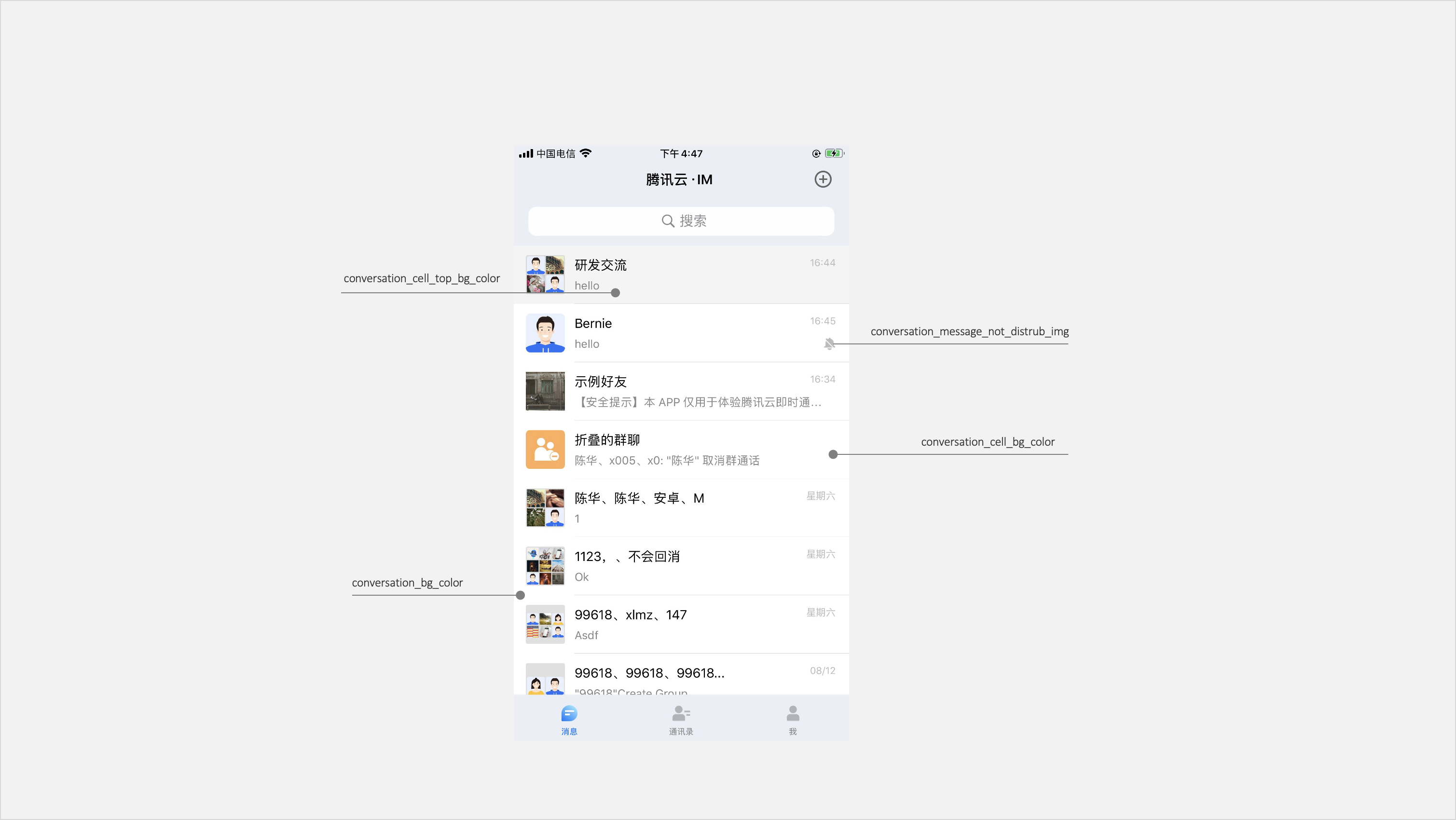
conversation_cell_bg_color
Conversation list UI: UITableViewCell background color of common conversations
conversation_cell_top_bg_color
Conversation list UI: UITableViewCell background color of sticky conversations
conversation_bg_color
Conversation list UI: Background color
conversation_message_not_disturb_img
Conversation list UI: Mute Notifications icon
Contacts UI styles
Storage location
All contacts UI styles are stored in the TUIContact component and are used by the contacts UI.
You can view the keys of the basic styles of a theme in the manifest.plist file in the folder of that theme in TUIContact/Resources/TUIContactTheme.bundle of the TUIContact component.
UI styles
Style Key
Style Description
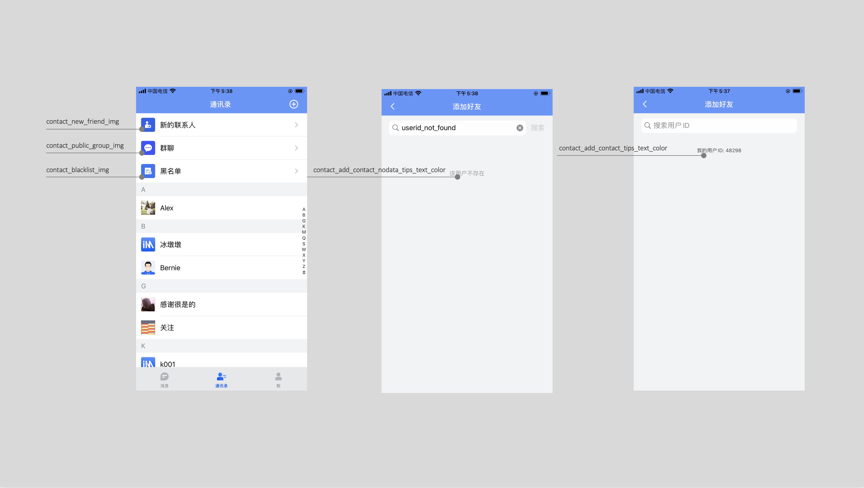
contact_new_friend_img
Contacts page: New Contacts icon
contact_blacklist_img
Contacts page: Blocklist icon
contact_public_group_img
Contacts page: Group Chats icon
contact_add_contact_tips_text_color
Contacts addition page: Text color of my user ID tip
contact_add_contact_nodata_tips_text_color
Contacts addition page: Text color of the tip indicating that the queried user does not exist
UI styles
Style Key
Style Description
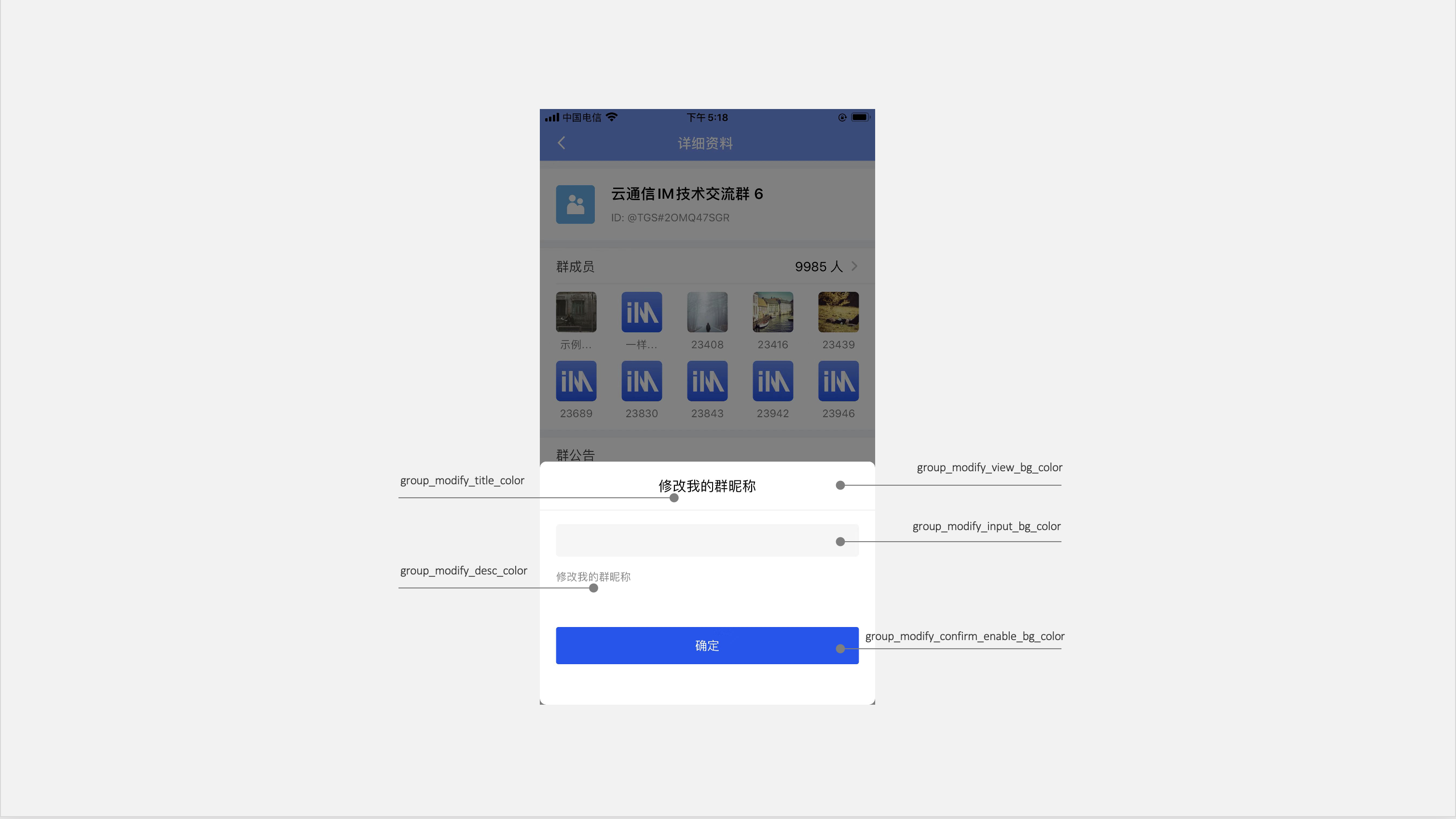
group_modify_view_bg_color
Group/Individual information modification page: Background color
group_modify_container_view_bg_color
Group/Individual information modification page: Container color
group_modify_title_color
Group/Individual information modification page: Title text color
group_modify_desc_color
Group/Individual information modification page: Descriptive information text color
group_modify_input_bg_color
Group/Individual information modification page: Input box background color
group_modify_input_text_color
Group/Individual information modification page: Input box text color
group_modify_confirm_enable_bg_color
Group/Individual information modification page: Background color of the clickable state of the confirmation button
group_modify_confirm_disable_bg_color
Group/Individual information modification page: Background color of the non-clickable state of the confirmation button
Common UI Styles
Common page styles are all found in the TIMCommon component, which is part of the IM component's common module and referenced by various components.
You can see the corresponding style key in the manifest.plist file within any theme folder under TIMCommon/Resources/TIMCommonTheme.bundle of the TIMCommon component.
In the basic styles, TIMCommon provides common UI specifications, such as preferred background color and divider color. You can modify the basic styles to simultaneously affect other components.